
The past five years have been an era of austerity in local government employment. In some states, as I will show when I finish compiling Census Bureau data on state and local government finances, tax revenues have fallen relative to income even as pension costs – due to past taxpayer underfunding – have soared. In other states the tax burden has increased, but rising pension and other retirement costs, due to retroactive pension increases scored by politically powerful public employee unions, have forced cuts in active employees even so. In either case public service recipients have been pushed to the back of the bus if, in fact, the bus still runs at all.
A longer term perspective, however, shows that in the U.S. as a whole, and in the parts of New York State outside New York City, the cuts in local government employment over the past five years followed a long boom. During that period the number of people working for the government increased relative to those working in the private sector. Even after five years of cutback, the relationship between those who work for the government and those who carry it still favors the former.
This analysis is based on the latest, rebenchmarked Current Employment Survey data from the U.S. Bureau of Labor Statistics. It was released last week, along with annual average employment data for 2014.
http://www.bls.gov/sae/
You can use the Series ID codes in this spreadsheet, along with the Series Report data tool, to get the data for other periods. I used annual average data from 1990, the earliest readily available online, to 2014, the most recent.
NY Local Government BLS 1990-14
For the U.S. as a whole, local government education employment increased by 36.9% from 1990 to 2009, and other local government employment increased by 29.2%.
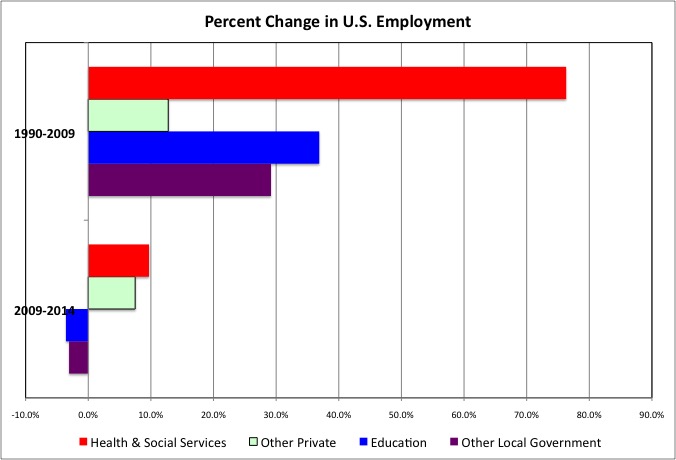
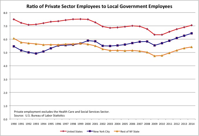
Private employment in the Health Care and Social Services sector nearly doubled, with a 76.3% increase, but this sector is substantially government-funded and undertaken by tax-exempt non-profits. It thus competes for, rather than generates, tax dollars. Excluding Health Care and Social Services, total private sector employment only increased by 12.8% nationally. The ratio of private sector workers (excluding Health Care and Social Assistance) to local government workers fell from 7.5 in 1990 to 6.3 in 2009. This was a local government boom.
It has partially reversed since then. Local government education employment fell by 3.6% from 2009 to 2014, and other local government employment fell by 3.1 %. This represented absolute declines of 287,600 and 192,400 workers, respectively. Health and Social Services employment increased 9.7% from 2009 to 2014 and other private sector employment, rebounding from the depths of the recession, increased by 7.5%. The ratio of private sector workers (excluding Health Care and Social Assistance) to local government workers increased from 6.3 in 2009 to 7.0% in 2014, about where it was before the recession. This is the recent local government austerity.
U.S. local government employment, however, remains much higher than it had been in 1990, by 1.9 million for local government education and 1.27 million for local government non-education. Then there are the retired. As shown in the Census Bureau database I tabulated and linked here,
https://larrylittlefield.wordpress.com/2014/06/22/public-employee-pensions-in-2012-2002-and-1993-census-bureau-data/
the number of beneficiaries (retired and disabled) of U.S. state and local government public employee pension funds increased by about 4.5 million from 1993 to 2012, or approximately doubled. The number of active (working) members of those pension funds increased by just 2.6 million state and local government workers.
In theory those extra 4.5 million retired pension beneficiaries shouldn’t cost anything, because their retirement benefits should have been paid for while they were working. In practice states and local governments face a pension crisis. Due to a combination of powerful public employee unions scoring retroactive pension increases beyond what the workers had been promised, and politicians funding tax cuts by not making the taxpayer contributions required to pay what public workers had been promised to begin with, back when they were hired.
At the national level, are we facing local government austerity because of tax cuts? Not really. Taxes have been cut in some places, but increased in others, based on the tabulation of 2012 Census of Governments data I’m working (and working and working) on. Overall any decrease is slight, from a total state and local tax burden of 10.37% of U.S. residents’ personal income in FY 1992 to $10.06% of income in FY 2012. Local government taxes alone have increased from 4.235% of everyone’s income in FY 1992 to 4.244% of income in FY 2012.
What this shows is that the U.S. as a whole has followed the same pattern of local government boom from 1990 to 2009, and local government bust from 2009 to 2014, that I had previously showed for the portion of New York State outside New York City. But to a lesser extent. Let’s repeat some of the charts from last year’s post for New York, with another year of data.
Annoyingly, rather than provide data for local government education and local government non-education for New York City and New York State, as it does for everywhere else, the BLS and NY State Department of Labor instead provide data for elementary and secondary schools. The rest of local government education, basically community colleges, is not included, so the data is not directly comparable with the national data (and data for other areas within NY State), though it is close.
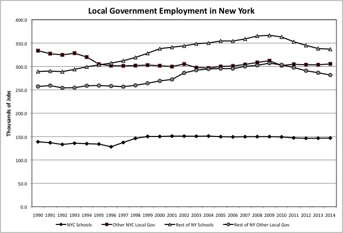
The data shows that from 1990 to 2009 employment public elementary and secondary schools increased by 77,500 (26.8%) in the portion of New York State outside New York City. Due in part to Governor Pataki’s STAR program, a unique school aid program that provided more state aid to those school districts that spent the most, except for New York City which has a local income tax rather than high residential property taxes. Employment in the category subsequently decreased by 29,700 (8.1%) from 2009 to 2014, a period of soaring pension costs and Governor Cuomo’s property tax cap. Which is the real reason the teacher’s union wanted to get rid of him.
The same pattern holds for the rest of local government employment in the rest of New York State. It increased by 49,900 (194%) from 1990 to 2009, but fell by 25,400 (8.3%) from 2009 to 2014.
For both public elementary and secondary schools and other employment, local government employment was much higher in 2014 than it was back in 1990, by 47,800 and 24,500. Despite very limited population growth and whatever productivity gains the state’s local governments might have achieved.
The swing of rising local government employment from 1990 to 2009 and falling local government employment from 2009 to 2014 took place in every part of the state aside from New York City.
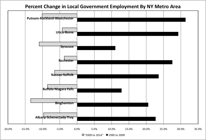
The only part of the state where local government employment has fallen back to its 1990 level is metro Syracuse, although metro Binghamton and Buffalo are close. On Long Island there were 20,600 more local government workers in 2014 than there had been in 1990.
What about private sector employment, however?
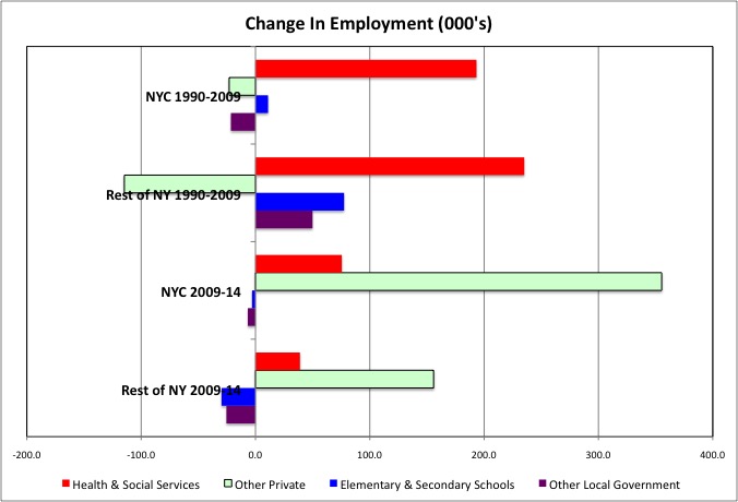
In the portion of New York State outside New York City, and excluding the Health Care and Social Services sector, it plunged by 114,700 from 1990 to 2009 but increased by 155,800 from 2009 to 2014. But with fewer jobs in high wage industries and more jobs in low wage industries. It is only this year, in 2014, that the number of private sector jobs in the portion of New York State outside NYC pulled well ahead of its 1990 level, if the Health Care and Social Assistance sector is excluded. The ratio of these private sector workers to local government workers in the rest of the state was 6.1 in 1990, well below the U.S. ratio of 7.5. It fell to 4.7 in 2009 before rebounding to 5.4 in 2014, well below the U.S. ratio of 7.0.
Moreover, the number of beneficiaries of the New York State Teachers Pension Fund more than doubled from 1990 to 2014, with an increase of 89,156. The number of beneficiaries of the New York State Public Employees Retirement System, which also includes non-teaching local government workers in the portion of New York State outside New York City, increased by 171,324 from 1990 to 2012.
And what about the state and local tax burden? It increased from 13.68% of income in FY 1992 to 13.87% of income in FY 2012 in the Downstate Suburbs, from 12.33% of income to 12.37% of income in the Upstate Urban Counties, and from 12.58% of income to 12.98% of income in rural counties upstate. That’s slightly higher taxes than in the administration of Mario Cuomo, but with local government austerity. With New York State’s public employee unions protesting against decreases in the public services they are producing even as taxpayers pay a higher share of their income for those services. It is as if NYC landlords were protesting against reductions in the quality of NYC housing despite higher rents.
In New York City, the state and local tax burden increased from 15.34% of city residents’ personal income in FY 1992 to 15.70% of personal income in FY 2012. Despite nearly 25 years of local government austerity, outside of elementary and secondary schools. Local elementary and secondary school employment increased by 8,000 in New York City from 1990 to 2014, but other local government employment fell by 28,200. Despite a growing population. Moreover, excluding the Health Care and Social Assistance sector, NYC private employment increased by 332,200 from 1990 to 2014 even as local government employment trended down. In stark contrast with the trend in the rest of New York State and the U.S.
And how about that ratio of private sector workers (outside Health Care and Social Assistance) to local government workers? It was 5.5 in NYC in 1990, compared with 6.1 in the rest of NY State and 7.5 for the entire U.S. It was 6.4 in NYC in 2014, well below the 5.4 in the rest of NY State but still above the 7.0 for the U.S.
Then again, the U.S. doesn’t have proportionately as many government workers in the public transit, public housing, and public hospital categories as NYC. And a lot of that excess local government employment in NYC, relative to the U.S. average (and even the rest of the state), is in the NYPD, which no one (else) seems to want to acknowledge.
https://larrylittlefield.wordpress.com/2014/04/26/public-safety-2012-census-of-governments-employment-and-payroll-data/
So where did all those NYC tax dollars go? I’ll have more on that when my compilation of Census of Governments finance data is finally complete.