The 2013 data from the U.S. Census Bureau’s American Community Survey was been rolling out over the last few weeks, and I’m disappointed there hasn’t been more coverage. The Bureau typically releases reports with the data, but these focus on national trends and perhaps static state and large area rankings. Other data users include special interests, which like to quote the data selectively in their own interest. Some of the most powerful interests, based on the position of those who pander to them by proposing to eliminate the American Community survey, would apparently prefer to just do away with objective facts about the American economy and society altogether.
http://www.nytimes.com/2012/05/20/sunday-review/the-debate-over-the-american-community-survey.html?_r=0
Public knowledge about our society and economy could then be limited to what is screamed by the loudest voices, which in a media age would be those who already have the most money to pay for advertizing and flacks of various kinds. While the internet age promised far more widespread access to objective information, it seems most people can’t be bothered to use it. With this in mind, I’ve downloaded comparative ACS economic data for 2009 to 2013 for New York City, New York State, and the United States.
A few charts and notes on what the data show follow.
This post is a brief, partial update of a series of posts I wrote back in early 2013, when annual average data showed that New York City’s private employment (those working in the city) had finally surpassed the previous all time peak way back in 1969.
http://larrylittlefield.wordpress.com/2013/03/12/has-new-york-city-recovered-from-the-1970s/
I asked the question whether New York City had finally recovered from its decline in the 1970s, and the answer was mixed. If you want a long-term perspective (I included data going back decades) and haven’t already read these posts, I suggest you do so, and download the spreadsheets (I had not yet learned to insert charts into posts when I wrote them). The subsequent posts covered the employment of city residents
http://larrylittlefield.wordpress.com/2013/03/20/has-new-york-city-recovered-from-the-1970s-employment-of-city-residents/
The mean income of city residents, and of those working in the city.
http://larrylittlefield.wordpress.com/2013/03/28/has-new-york-city-recovered-from-the-1970s-average-mean-earnings-of-city-workers-and-income-of-city-residents/
The median income of city workers and households, compared with those living the suburbs and the U.S.
http://larrylittlefield.wordpress.com/2013/04/06/has-new-york-city-recovered-from-the-1970s-average-median-income/
Poverty
http://larrylittlefield.wordpress.com/2013/04/08/has-new-york-city-recovered-from-the-1970s-poverty/
And the quality of life.
http://larrylittlefield.wordpress.com/2013/04/19/has-new-york-city-recovered-from-the-1970s-quality-of-life/
Let’s take a shorter-term look at some of these factors, comparing New York City with New York State and the U.S. average. All of the charts are in the same column format, to make them easier to understand.
New York City was once the nation’s welfare capital, with more than 1 million people on public assistance and countless more on SSI. During the suburbanization era as city real estate became cheaper (to the point there thousands of buildings were simply abandoned), countless localities around the metro area and the country made a point of dumping the mentally or physically ill into NYC, while the suburbs made a point of zoning the poor out by banning multifamily housing. In addition, when young families moved to the suburbs from the 1950s to the 1970s they often left their parents behind in the city, leading to a relatively old population and large number of non-working retirees. “Granny carts” are called granny carts for a reason – they are what your urban grandmother used to go to the supermarket. The share of NYC adults who were part of the labor force, working or looking for work, fell to far below the U.S. average.
In 2013, however, the share of NYC adults who were in the labor force was virtually identical to the share in New York State and the U.S. as a whole.
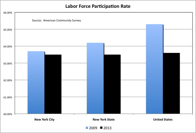
New York City’s labor force has soared, with young workers flowing into the city to seek a decent life away from the weaker economies in the places they come from. Today, at least in Brooklyn, that not only includes poor, developing countries as in the past but also suburban America in the Midwest and South. At the same time, post-WWII suburbs and Sunbelt cities are aging, and many of their residents are leaving the labor force. From 2009 to 2013 the labor force participation rate fell in NYC, but it fell in NY State and the U.S. as a whole far more, in the latter case reaching a 36-year low.
http://www.marketwatch.com/story/labor-force-participation-hits-a-new-36-year-low-2014-10-03
This has become the most important trend in the economy. “Part of the story of course is simply demographic. A Federal Reserve paper puts half of the decline to the aging of the baby-boom generation. While there are more older workers than ever, due to increased longevity, better health, and the need to work due to destroyed wealth from the Great Recession, this cohort is still retiring in great numbers.” This trend will continue, leading to a shrinking labor force and a drag on the economy. Attracting young workers, particularly the educated and talented, has become an important economic edge, which is why businesses are flooding into the limited number of central cities that are doing so – despite soaring costs there.
While NYC residents are more likely to want to work than in the past, the city’s unemployment rate remains relatively high, in part because of all the competition from that soaring labor force, in part because of a greater number of low-skill would-be workers relative to the number of low-skill jobs.
http://www.bls.gov/opub/btn/volume-3/pdf/persistence-of-a-high-unemployment-rate-in-new-york-city.pdf
City employers have gotten used to hiring suburbanites, in-migrants from elsewhere in the U.S., and hard working immigrants, rather than the offspring of New York City’s single parents who were uneducated in the city’s bad schools. Those who had the misfortune to grow up here, without benefitting from being educated in a private or “special deal” public school, have trouble getting jobs if they stay.
The share of New York City households with public assistance or SSI income remains relatively high, in fact, though the gap with the U.S. average has shrunk. Public assistance and SSI dependency increased in NYC from 2009 to 2013, as it did statewide and nationwide.
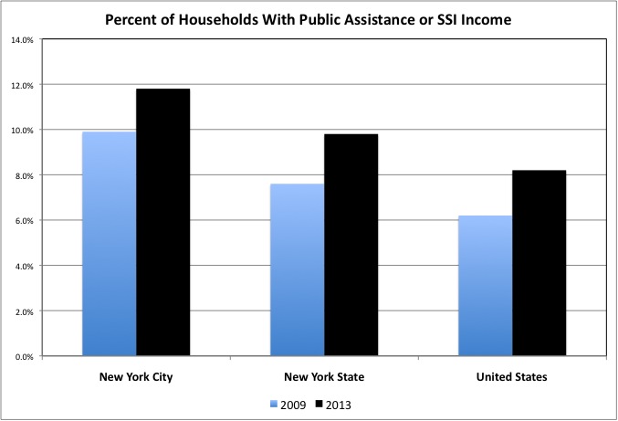
Today, however, NYC’s relatively high share of dependent and disabled people is offset by a relatively low share of households with retirement or Social Security income, as the city’s adult population skews young. While 17.9% of U.S. households had non-Social Security retirement income in 2013, that was true of just 11.9% of NYC households. While NYC’s public employees have perhaps the richest retirement benefits in the country, and have had those benefits retroactively enriched repeatedly at a high cost to NYC residents, they tend to live in the suburbs and retire to Florida.
While members of Generation Greed take their winnings and rides off into the sunset, from 2009 to 2013 families with children under age 6 became more likely to have all their adults in the labor force– in New York City, New York State and the U.S. Perhaps this was increasingly necessary to make ends meet, and pay the higher rents and taxes on the lower wages people were getting.
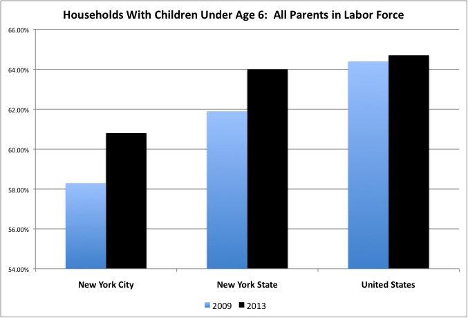
Compared with the state and U.S. average, however, NYC families with children under age 6 are significantly less likely to have all parents in the labor force, something that has been true for decades. In certain populations, both among the affluent and poor, NYC women still expect to stay home with the kids.
Lower labor force participation and downward pressure on wages has meant lower wages for private sector workers. As I have noted, just dividing total payroll by total employment, the average private sector worker in Downstate New York, excluding the overpaid Finance and Insurance sector, has typically earned about 30 percent more than the U.S. average (a gap that has recently fallen to 28 percent). Even with Wall Street excluded, this statistic is pulled upward by the large number of New York area workers with very high salaries. The median earnings per worker better captures how well the typical person is paid. By this measure, the median earnings for workers living in NYC ($35,057) was just 15.1% above the U.S. average ($30,454) in 2013; for those living in New York State as a whole it was just 8.6% above average ($33,062). Yes, that all the average person gets paid.
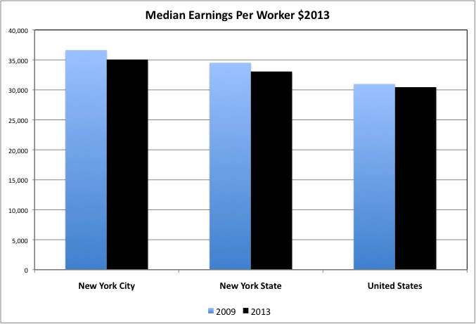
Moreover, while median workers earnings fell 4.3% in New York City (adjusted for inflation) from 2009 to 2013, and 4.2% for all of New York State, it fell just 1.7% in the U.S. as a whole. New York. High taxes and high living costs? Sure. High wages for most workers? Not outside the politically powerful on Wall Street and in state and local government.
Nationwide, wage stagnation – and declines generation by generation at each point in life – is actually a long-term trend, as I noted in this post.
http://larrylittlefield.wordpress.com/2013/11/10/donald-trump-the-man-of-his-generation/
Generations born after 1956 or so have had to go deeper and deeper into debt, send more family workers to work, and reduce their savings for retirement, to improve or even maintain the same standard of living of the generations that came before. More recently low wage gains remain a missing element in the recovery from recession.
http://blogs.marketwatch.com/capitolreport/2014/10/03/one-thing-missing-from-good-jobs-report-higher-wages/
Many are surprised by this, given increased retirement and thus falling unemployment. “Half the people thought lower unemployment would mean increased participation. The other half thought it’d mean higher wages. Both wrong.” But I’m not in either half. I expected a future of plenty of jobs, but only at wages that provide a much lower standard of living than prior generations received, a new normal that is taking a long time to arrive. Plenty of jobs because with a shrinking (or at least stagnant) labor force, and less ability to borrow to pay for imports, businesses would need workers – both to do what the retirees once did, and to produce what the U.S. once imported. But low wages because businesses could not pay more to workers and raise prices to cover the increase without losing customers, because those customers – the same people, in the aggregate – are broke.
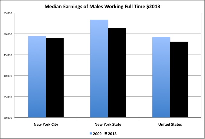
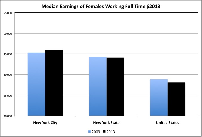
Only examining full time workers New York City residents, particularly females, do somewhat better that NYC workers as a whole. This implies that NYC’s disadvantage is a larger share of workers with spells of unemployment during the year, and with merely part time (or freelance/contractor) work. The average NYC male working full time earned ($49,011) just 1.9% more than the U.S. average ($48,099) in 2013, but their earnings fell just 0.8% from 2009 to 2013. The average U.S. male full time worker saw his earnings fall 2.4% when adjusted for inflation; the decrease for New York State was a whole was 3.6% (to $51,414).
The average NYC resident female working full time earned ($46,036) 20.8% more than the U.S. average ($38,097) in 2013, and saw those earnings rise 1.6% from 2009 to 2013. The average U.S. female working full time saw their earnings fall 1.9% over those years. The decrease for the average female resident of NY State was 0.3% to $44,114, or 15.8% above the U.S. average.
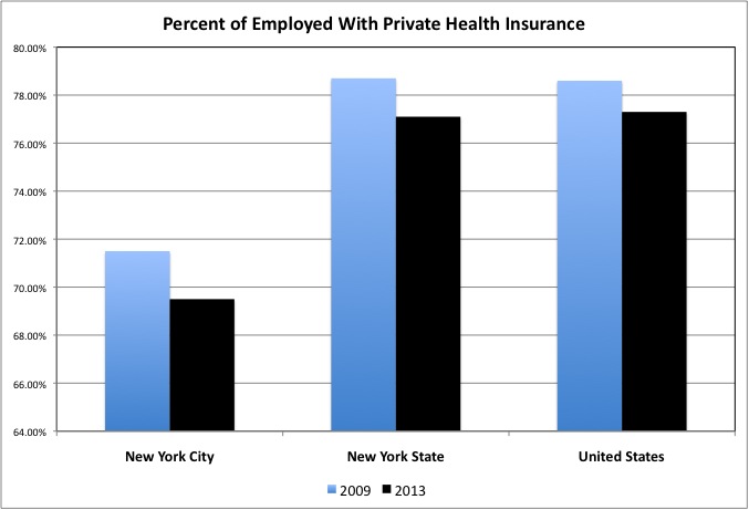
In addition to being more likely to become unemployed and more likely to be forced to work part time or be a freelancer, moreover, workers residing in NYC received less in non-wage benefits than workers elsewhere. ACS data shows just 69.5% of employed NYC residents had private health insurance in 2013, compared with 77.1% for all employed workers in New York State and 77.3% for all employed workers in the United States. This despite the relatively rich and costly benefits of employees of the City of New York. Benefits that, in sort of the words of Al Gore, take money away from public hospitals and give it to the private hospitals by providing vouchers. For all three areas, the percentage of employed workers with private insurance fell from 2009 to 2013, due to the recession and despite the early years of Obamacare. It remains to be seen if a better economy and a fully-functioning Obamacare will reverse the trend.
On the other hand, 14.4% of employed NYC residents had public health insurance coverage in 2013, compared with 10.8% of employed NY State residents and just 7.0% of employed U.S. residents. As noted in the prior series of posts on Medicaid, New York State’s hugely costly Medicaid program spends enormously, relative to the U.S. average, on seniors and the services associated with them, but more modestly (but still generally above average) on children and preventive care for adults. And has for decades.
The constricted pay for NYC workers is associated with constricted income for New York City households.
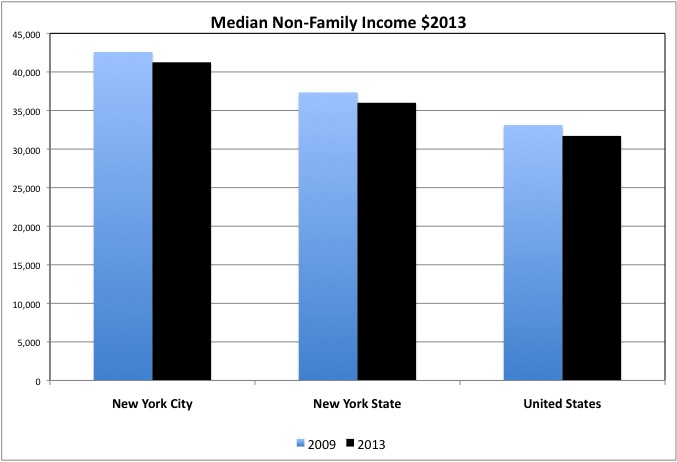
New York City’s non-family households, including singles and non-relatives living together, have a relatively high median income. In 2013 the average New York City’s non-family household had 30.1% more income ($41,247) than the average U.S. household ($31,705). The average NY State non-family household’s income ($35,998), pulled up by NYC, was 13.5% above average. From 2009 to 2013, however, median non-family household income fell 3.1% in NYC, 3.6% in NY State, and 3.5% in the U.S., after adjustment for inflation.
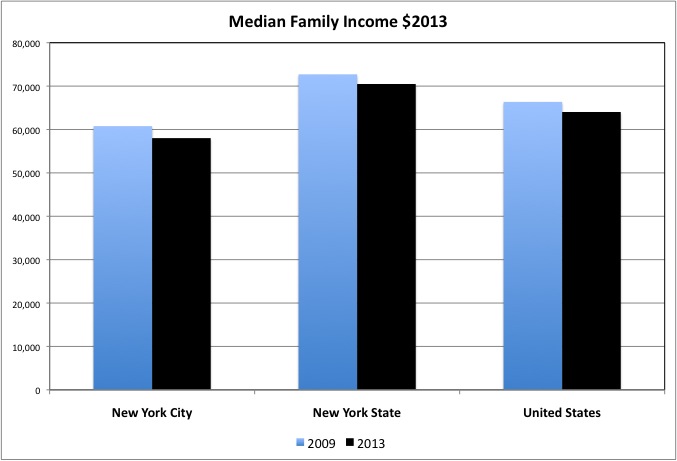
On the other hand the typical NYC family, based on median income, is (and has for decades been) relatively poor. NYC’s median family income was $58,012 in 2013, 9.4% below the U.S. average of $64,030 and down 4.5% from 2009 to 2013. The U.S. median family income was down 3.5%. New York’s State’s median family income is relatively high at $70,485, despite NYC dragging it down, and was down 3.5% from 2009 to 2013.
Note that household characteristics may explain, in part, median non-family and family household income. NYC combines lots of special housing deals for certain long-established households with extreme housing scarcity and high housing prices for the young moving out of their own and new arrivals. As a result, rather than getting their own apartment NYC’s singles are perhaps more likely to live more than one to an apartment, or even more than one to a room. This would increase the median income of non-family households in total, because they would have more workers. Although the data shows the percent of nonfamily households with just one person is similar in NYC and the U.S.
Perhaps it is only the new arrivals that are crushed in and pull up median nonfamily income.
NYC’s family households, on the other hand, are (and for decades have been) more likely to have just one parent/adult. Married couple families were 60.0% of all family households in NYC in 2013, compared with 72.8% for the U.S. and 68.9% for New York State (pulled down by NYC). Over the decades, many of the best off NYC families have left for the suburbs when faced with the prospect of putting their children in the typical NYC school, to receive the education those without connections receive. And many of those suburbs are also outside NY State, in New Jersey or Connecticut.
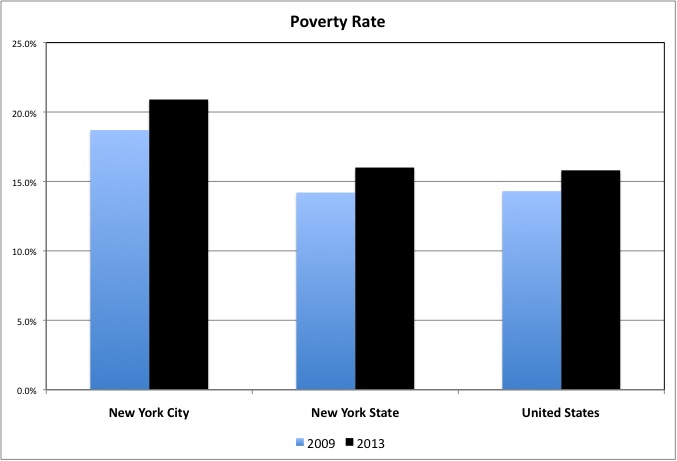
Finally, with regard to poverty, NYC’s poverty rate has been stuck around 20.0% for decades. In part because a substantial share of NYC housing units are reserved for the poor, ensuring a relatively large number of them will continue to reside here. From the low end of the range (18.7%) in 2009, NYC’s poverty rate increased to the high end of the range (20.9%) in 2013 after having peaked at 21.2% in 2012. Poverty is lower in New York State and the U.S. as a whole, but also increased in those areas in the wake of the Great Recession.