
Services have been cut. In public schools, class sizes have been increased and after school activities curtailed in New York City and across the country. Mass transit is increasingly crowded and unreliable. There are far more potholes in the road than there once were. In many places, when someone has a mental health emergency, there is no one to call but the police. With all this happening, one might assume that state and local government expenditures are going down.Как составить семантическое ядро для сайта
But it isn’t so everywhere. Data from the 1992, 2002 and 2012 Census of Governments shows that state and local expenditures in the latter year equaled a higher share of everyone’s personal income than a couple of decades earlier, if taxpayer pension contributions are included. In New York City, in fact, the combination of direct local government spending, an allocated share of direct state government spending, and taxpayer pension contributions totaled 30.5% of city residents personal income in FY 2012. Direct federal government spending would be on top of that. What has happened is not a decline in spending, but rather a shift in spending. This overview will discuss that shift, which will be examined in detail in subsequent posts on specific government functions.
At one time the U.S. government structure was described as a layer cake, with the federal government responsible for some public services and benefits, state governments for others, and local governments for still others – the majority in fact. Federal money for state government services, and state money for local government services, have blurred the lines somewhat, but the following still holds. The federal government collects the most money, but sends most of it right back out again to states, individuals (Social Security) or the private sector (Medicare), and directly operates primarily the military and the post office. Local governments provide the most services, but do so in many cases using federal and state money, in place of or in addition to local taxes, and following federal and state rules. State governments actually make most of the decisions on the margin, but like the federal government the states serve primarily as conduits for funds.
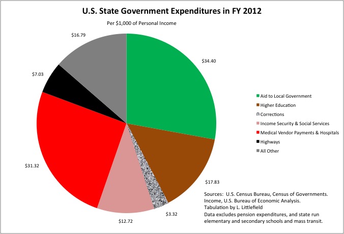
In FY 2012, all U.S. state governments combined spent $123.41 for every $1,000 of personal income received by U.S. residents in 2012. That is 12.3% of everyone’s income, expressed in that form. Of that amount $34.40 per $1,000 of personal income was sent on to local governments, mostly for elementary and secondary schools. Another $31.32 per $1,000 of personal income was sent on to private medical and social services vendors, and to a lesser extent state hospitals, generally using funds provided via the federal/state Medicaid program. Together these two categories accounted for more than half of all national state government spending.
State spending on income security programs (unemployment insurance, worker compensation, federal/state public welfare), their administration, and state-operated public welfare agencies equaled $12.72 per $1,000 of personal income. In many states, notably New York and California, public welfare and social services are administrated by local governments rather than the state, and state spending in these categories counts as local-to-state aid rather than direct spending. What all states spend on directly is public higher education (other that community colleges), at $17.83 per $1,000 of personal income, state prisons, at $3.32, and state highways, at $7.03. State spending on everything else not already mentioned totaled just $16.79 per $1,000 of personal income, or less than state colleges and universities alone.
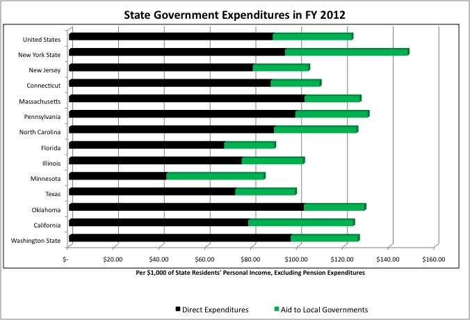
As shown in my post on state taxes, the State of New York’s taxes were 17.2% higher than the U.S. average for states as a share of state residents’ personal income, so not surprisingly its total expenditures were 19.8% above average with pensions excluded. Much of the difference was in state to local aid. In general, state spending and state taxes are a relatively low share of total state-local spending in the Northeast. Massachusetts, where social service programs are administered at the state level and the state police force is relatively large, is an exception. Pennsylvania is another.
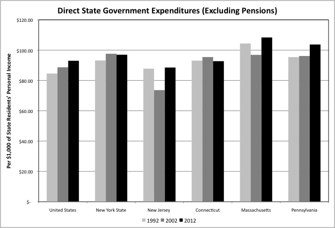
For the U.S. as a whole, state spending was higher per $1,000 of personal income in 2002 than it had been in 1992, and in 2012 that it had been in 2002. Although the level of state spending in 2002 varied from place to place, it was higher in 2012 than it had been in 1992 throughout the Northeast.
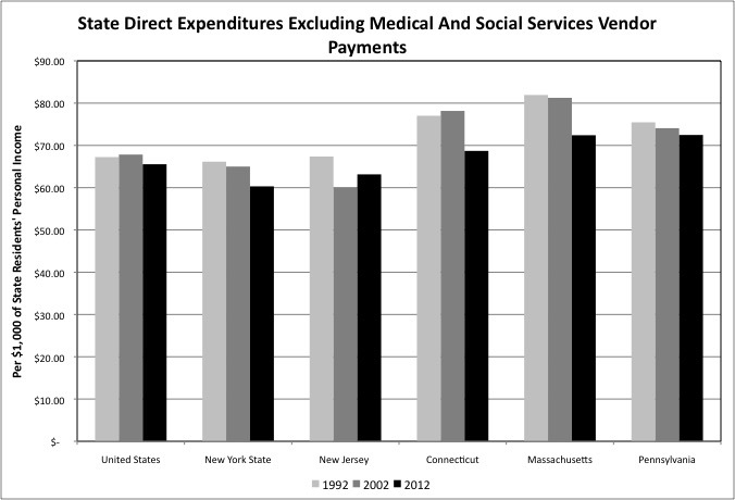
That, however, was only due to rising state payments to private medical and social services vendors, primarily via the Medicaid program. Take that government function out of the picture and direct state spending has been falling otherwise, particularly from FY 2002 to FY 2012, particularly in New York State. In fact, in FY 2012 New York’s direct state spending, aside from vendor payments mostly financed by Medicaid, were below the U.S. average.
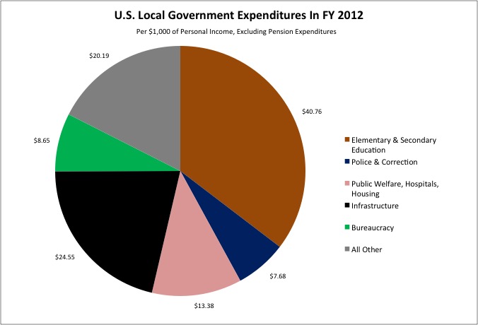
In fiscal year 2012, all U.S. local governments combined directly spent $115.20 for every $1,000 of personal income received by U.S. residents in calendar year 2012, generally excluding taxpayer contributions to public employee pensions. That is 11.5% of everyone’s income, expressed in that form. Of that amount $40.76 per $1,000 of personal income was spent on public elementary and secondary schools. Another $7.68 per $1,000 of personal income was spent on police and corrections, though that often excludes not only pension costs but also other benefits, as in New York City. Across the U.S. virtually every part of the country has public schools, police and jails provided by local governments. (To the extent that states operated public schools, that spending is included here to make it more comparable).
Aside from schools and police, the extent of local government services and benefits varied widely from place to place. Overall, however, in FY 2012 local government public infrastructure and utilities spending, on services such as roads, bridges, mass transit, water, sewer, and electric and gas utilities, equaled $24.55 for every $1,000 of income of U.S residents. Public welfare, hospitals and housing programs, sometimes operated by states and not present in every area, totaled $13.38 per $1,000 of personal income. Everything else accounted for just a quarter of local government spending.
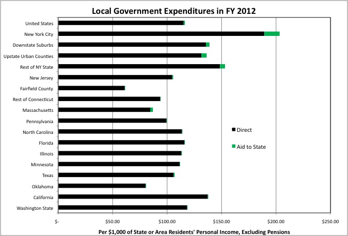
In FY 2012 direct local government spending was far higher, per $1,000 of area residents personal income, in New York City than in other parts of New York State, and far higher in other parts of New York State than the U.S. average or other states. While state aid to local government is an important source of local government funding everywhere in the U.S., local government aid to state government is pretty much something that just happens in New York State – with New York City particularly burdened. Much of that local to state aid is for the Medicaid program.
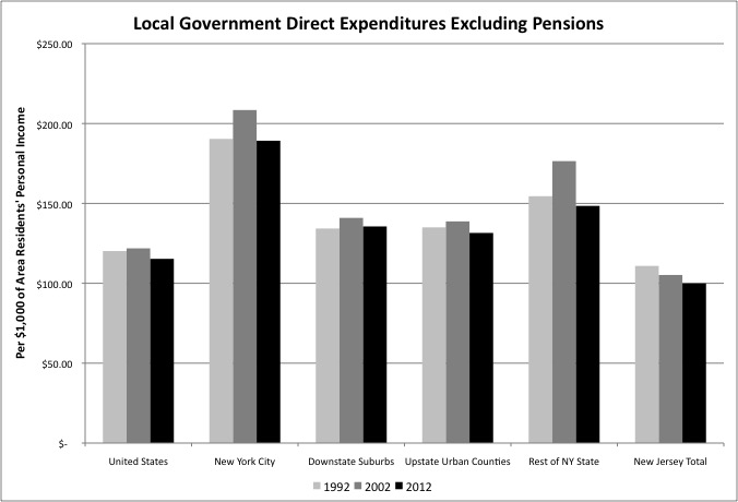
If you exclude taxpayer pension contributions, with the Census Bureau tabulates as revenues and generally puts in another database, local government expenditures fell slightly as a share of personal income nationwide from FY 2002 to FY 2012 in the U.S. as a whole. As we will see, however, pension contributions were rising. In New York City FY 2002 expenditures were inflated by the aftermath of 9/11. Non-pension local government expenditures were about the same in FY 2012 as in FY 1992 in NYC and the Downstate Suburbs, but lower in Upstate New York and New Jersey.
I’ll write some posts with comparisons and trends for individual public functions, such as public school, streets, libraries and parks, in a series of posts over the next month or so. But in this post I was to focus on spending categories that are not well allocated by function in Census Bureau data, on pensions, other benefits and interest, plus wages and salaries in general.
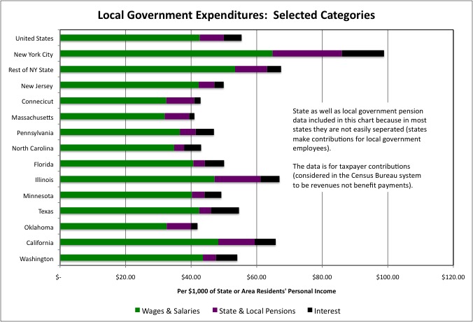
That data show that in FY 2012, measured per $1,000 of area residents personal income, local government spending on wages and salaries was 52.1% higher than the U.S. average in NYC, and 25.3% higher than the U.S. average in other parts of NY State (combined). In other Northeastern states, spending on local government wages and salaries tended to be below average per $1,000 of personal income. This is because average incomes are relatively high in the Northeast, and state-local taxes and spending are concentrated at the local level, so the better off can be separated from the middle class, who are separated from the poor in the multiplicity of small government units that are common in this part of the country.
The level of spending on wages and salaries, per $1,000 of everyone’s personal income, depends on two factors. How many public employees there are relative to the size of the population. And how well off those public employees are, in wage and salary income, compared with their neighbors.
New York City’s public employees were far better off, compared with other New Yorkers, in taxpayer pension contributions rather than in wages. NYC’s taxpayer pension contributions to public employee pensions were nearly triple the U.S. average per $1,000 of city residents’ personal income, at $21.22. That is 2.1% of personal income, or perhaps more than most New Yorkers were saving for their own retirements, out of their incomes and in contributions from their employers. Taxpayer contributions were 32.4% higher than the national average per $1,000 of personal income in the rest of New York State, but below average in New Jersey.
With regard to interest payments on debts New York City spent $12.84 per $1,000 of its residents’ personal income, or 136.9% more than the U.S. average for local governments (more than double). Local government interest payments were 20.8% below the U.S. average as a percentage of personal income in the rest of New York State, and even lower for local governments in New Jersey, Connecticut, and Massachusetts. Pennsylvania was about average. Transportation trust funds may be broke throughout the Northeast, but aside from New York City and the Port Authority of New York and New Jersey, local governments are not deep in debt otherwise.
Let’s examine wages and salaries, pension contributions, interest payments and other factors individually over time.
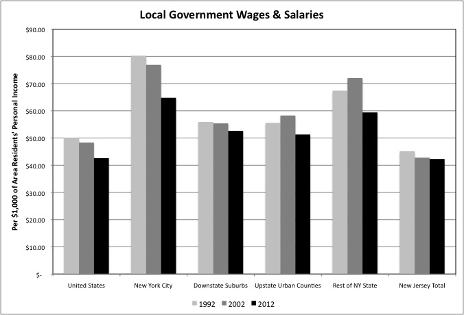
One finds that local government wages and salaries fell per $1,000 of personal income in the U.S. as a whole from FY 1992 to FY 2002, and again from FY 2002 to FY 2012. Local government wages and salaries plunged in New York City over those years and fell modestly but consistently in New Jersey. In other parts of New York State wages and salaries increased per $1,000 of area residents’ personal income from FY 1992 to FY 2002, during Governor Pataki’s state financed local government boom the excluded New York City, then fell from FY 2002 to FY 2012, ending up lower than 20 years earlier.
Falling wages and salaries per $1,000 of personal income can mean one of two things. Either the wages and salaries of the average state and local government workers are falling relative to total personal income of everyone overall (public sector workers have become relatively poorer, at least in cash income). Or the number of public sector workers is falling relative to population, so either their productivity is rising quickly or public services are being cut. We know which in fact happened as a result of the analysis of 2012 Census of Governments employment phase data I posted last year.
https://larrylittlefield.files.wordpress.com/2014/04/chart-1.jpg
Local government employment has been falling as a share of the population, nationally and in New York City. After rising from FY 1992 to 2002, a time when public school enrollment was rising, it fell from FY 2002 to 2012 in Upstate New York and New Jersey.
It should be noted that in New York City from FY 2008 to FY 2012, Mayor Bloomberg – facing soaring pension costs at a time that most New Yorkers’ incomes were going down – refused to negotiate cash wage increases for NYC public employees. So the public employees simply waited for the next Mayor and got cash wage increases for those years retroactively, as part of new contracts. These wage and salary payments will show up in Census Bureau data in future years, although unless the stock market bubble continues to inflate the city will likely have to cut public employment – and services – to pay for them – keeping wages and salaries from rising higher per $1,000 of personal income.
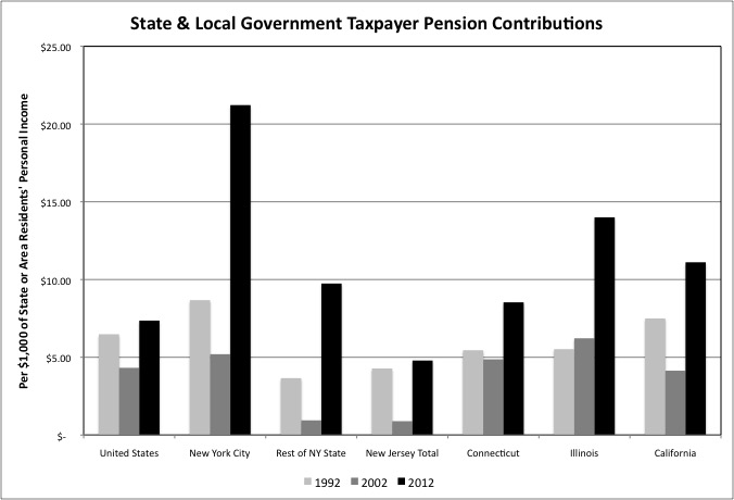
Taxpayer contributions to public employee pension funds fell per $1,000 of personal income from FY 1992 to 2002, when the 1990s stock market bubble was used as an excuse to both cut taxpayer contributions to public employee pension funds and to retroactively increase pension benefits. And then subsequently soared from FY 2002 to FY 2012, as past underfunding and/or retroactive pension increases led to pension crises throughout the country, but particularly in some states and areas. New York City is one of the worst affected, more because of retroactive pension increases than underfunding. So as money spent on former public employees has gone up, the number of public employees still on the job providing public services has gone down.
How about health and other benefits? Unfortunately these aren’t tabulated separately by the U.S. Census Bureau, but there is a proxy. In single-function governments, such as school districts, spending on non-pension benefits is easily assigned to an individual government function. But for multifunction local governments such as the City of New York, it mostly ends up in the Census Bureau’s “Other and Unallocated” category, which also includes judgments and claims (from lawsuits against the city) and small agencies such as the Board of Elections and the Economic Development Corporation. Mostly, particularly for New York City, spending in the “Other and Unallocated” function is non-wage benefits not assigned to particular functions.
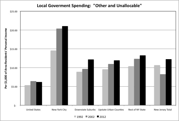
The data shows that NYC’s local government spending in the “Other and Unallocated” category, per $1,000 of city residents’ personal income, is far higher than the U.S. average, other parts of New York State, and New Jersey. It soared from FY 1992 to FY 2002 in New York City, a time of rapid health insurance cost inflation, while also increasing modestly elsewhere. It increased more modestly from in NYC from FY 2002 to FY 2012, and fell in the U.S. as a whole, but probably not because of cheaper health insurance. It probably fell because the number of public employees (though not retirees) receiving those non-wage benefits was going down.
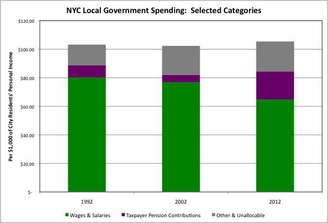
When you add it up, at least for NYC, total local government spending on public employee wages and salaries, taxpayer pension contributions (in this chart for NYC local government alone), and other non-wage benefits (as best as can be measured) was about the same in FY 2002 as it has been in FY 1992, and was slightly higher in FY 2012. So public employment in not falling, and public services not being cut, due to a reduction in local government spending on public employees. At least in New York City the cutbacks are due to a shift in compensation to the retired, and to non-wage benefits, thanks the political power of New York’s public employee unions, and the use of that power to benefit those cashing in and moving out at the expense of both the general public and their own future members.
New York City had a prior round of compensation shifted from those working to those retired, in the wake the retroactive pension increase deals cut by Mayor Lindsay in the 1960s. Those deals contributed to the city’s public services and infrastructure collapse in the 1970s. Another factor in that collapse was soaring interest payments on soaring debts, and in the Generation Greed era NYC’s debts have once again soared.
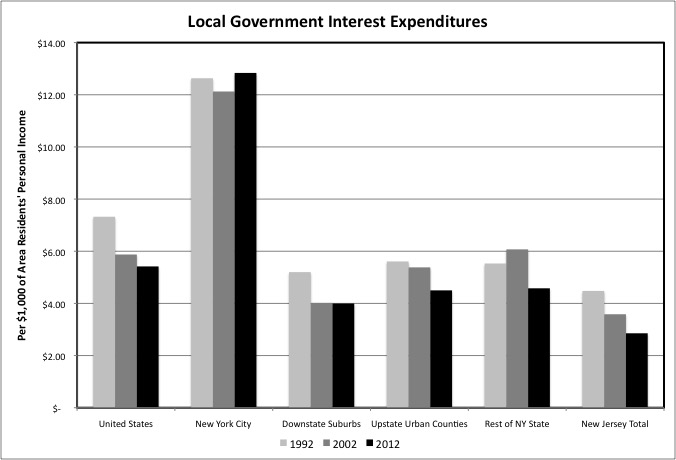
Local government interest payments, however, were about the same for NYC in FY 2012 that they had been in FY 1992, as a result of the zero interest rate policies of the Federal Reserve in the wake of the collapse of two asset price bubbles, in 2000 and 2007. Local government interest payments have fallen as a share of personal income in the U.S. as a whole, other parts of New York State, and New Jersey.
The zero percent interest rates are causing many negative economic effects. But if interest rates were to rise to normal levels, local government debts would have to be refinanced at much higher rates, causing the burden of past debts – for NYC and local governments elsewhere – to soar. Rising interest rates would also cause the purported value of assets in public employee pension funds, inflated by yet another bubble, to collapse, exposing just how underfunded those pensions are (but also allowing more typical investment returns from those diminished values). If interest rates and dividend yields stay low, on the other hand, it would help local governments on the debt side and make pension plans seem better funded in the short run – thanks to lies about future returns. But crush those pension plans in the long term, along with the 401Ks of private sector workers.
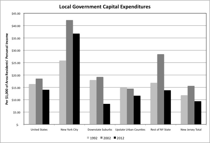
Outside New York City, in the U.S. as a whole, other parts of New York State and in New Jersey, another reason interest costs have fallen is because local government capital expenditures have plunged. This decline has occurred even as the suburban and Sunbelt infrastructure, initially built from 1945 to 1980 and financed by federal dollars collected in part in the older central cities of the Northeast and Midwest, is aging and in need of reconstruction and repair. It is heading for the condition NYC’s infrastructure was in during 1970s and 1980s, following a failure to reinvest in the cities earlier as money was diverted to the newly developing areas.
Despite virtually no infrastructure expansion, New York City’s replacement infrastructure spending has been relatively high since the city began to recover in the 1980s. It was temporarily inflated in FY 2002 by the aftermath of 9/11, but in FY 2012 remained higher than it had been in FY 1992. Much of the NYC’s recent capital expenditure, however, has been in showy, high visibility projects and not basic infrastructure. The U.S. Census Bureau tabulates a separate debt category “public debt for private purpose.” NYC accounted for 8.4% of total U.S. local government debts in this category in FY 2012, but just 3.4% of U.S. personal income. I’ll examine infrastructure, debt and pensions in more detail, and rank states and New York City vs. the rest of the state based on the extent to which their future has been sold out and robbed, in a later post.
The future, and public services in general as measured by the cash wages of public employees, are not the only local government losers in wake of the Generation Greed era. Back in 1992 the poor and troubled, their welfare and social services needs and soaring prison populations, were blamed for fiscal and other problems across the country. That, older folks may recall, was the “welfare reform” era, a time when resentment of the poor, racial minorities, immigrants, and residents of central cities reached its peak.
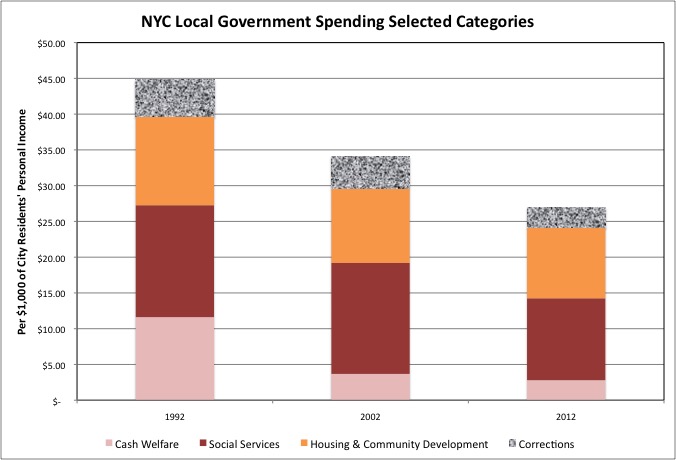
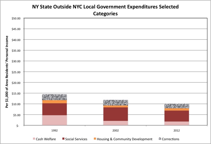
Following a massive crackdown leading to better behavior, if you believe welfare reformers and the police, or the arrival in young adulthood of less problematic, more responsible generations, if you believe otherwise, New York City’s local government spending on the poor (per $1,000 of its residents’ personal income) fell sharply from FY 1992. Taking cash welfare payments, social services, housing and community development, and local government corrections (the NYC Department of Corrections, not including pensions and other non-wage benefits), local government spending fell by nearly 40.0% from 1992 to 2012.
Now even if in 2012 the same sort of people are still working poor and still struggling, it is a good thing if fewer of them are in jail, on welfare, in foster care or in substance abuse programs. In part the trend in this chart represents progress. Moreover, the $26.97 per $1,000 of personal income spent by NYC in these categories in FY 2012 was still more than three times the U.S. average, nearly three times the average for local governments in the rest of New York State, and more than 4.5 times the average for New Jersey.
Even so, however, it isn’t just that there is less spending on people with problems because there are fewer people with problems. In part this decrease in spending on the poor represents a political victory by the public employee unions, and those who benefit from Medicaid-funded services, over the poor and their non-health needs. Particularly in the context of a rising, rather than falling, state and local tax burden as a percentage of personal income, which is what you have in NYC (as opposed to some other states).
The city’s homeless population is at a record level. Moreover, in the 1950s and 1960s, at the same time that the federal government was funding new suburban and Sunbelt infrastructure to allow the middle class and upper middle class to abandon older central cities, it was also funding public housing in those central cities to warehouse the poor and troubled there. And like the suburban and Sunbelt infrastructure, New York City’s public housing is now aging and in need of reinvestment. But NYC’s spending on housing and community development, per $1,000 of its residents’ personal income, fell about 20.0% from FY 1992 to FY 2012.
The only reason the NYC Housing Authority hasn’t collapsed is that the city has used Section 8 housing vouchers, originally a separate program to allow additional poor people to receive subsidized rents in private sector housing, to prop up public housing. This has means fewer poor people receive housing assistance overall. Even as today’s poor are expected – and on average have met those expectations – to be less criminal, less addicted, more hard working, and to have fewer children out of wedlock than the poor of the Generation Greed era.
And of course there is the ongoing cycle of more spending on seniors in every economic upturn and cutbacks in social services for children in every downturn. Until there is the public relations disaster of the horrible death of a child known to city authorities, and then another cycle of “reform” and increased spending on the city’s Administration for Children’s Services.
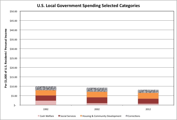
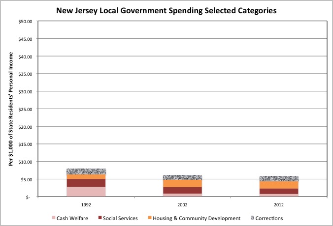
In the U.S. as a whole, and in particular in places that have fewer poor people (perhaps because they are zoned out) or do less for them, local government spending (collectively) on cash welfare, social services, housing and community development and jails are fare lower per $1,000 of personal income than in NYC. The decline from FY 1992 to FY 2012 has also been smaller in these areas. Note that I use the same scale in the U.S. chart as in the NYC chart. What is true for the U.S. as a whole is also true of the rest of NY State and New Jersey – less local government spending on (or due to the behavior of ) the poor, and less of a decrease from FY 1992 to FY 2012.
Areas with little spending on the poor, however, have also benefitted financially from the better behavior of recent generations of poor people. Because most of the associated local government spending was financed by federal and state taxes, rather than local taxes, and thus residents of the suburbs and Upstate New York save federal and state money when less is spent on New York’s poor. But these savings haven’t been noticed, because of soaring spending on senior citizens. Including the poor people who committed street crimes in the 1960s, 1970s and into the 1980s, and affluent people who committed white collar crimes in the late 1980s, 1990s and 2000s.
Looking at the U.S. chart, and seeing how little was spent on the poor (aside from Medicaid) even back in 1992, it is amazing that the poor were ever scapegoated for America’s problems at all. I wrote about this here.
https://larrylittlefield.wordpress.com/2013/07/25/the-new-war-on-the-working-poor/
Public attitudes and public policy are apparently driven by propaganda from the executive/financial class and the political/union class, but if you have read this far (and read my prior posts using 2012 data on state and local governments) you have the opportunity to see things as they are. These posts will continue as I have time to do the analysis and write them.