
It was only a couple of decades ago that aid for the needy, and resentment of that burden by everyone else, seemed to be the biggest issue in public policy. It was an issue that swept the Republicans into control of the U.S. House of Representatives in 1994. With New York City widely believed to be America’s welfare capital, it helped to make Republican George Pataki Governor of New York State that year, one year after Republican Rudy Giuliani became the Mayor of New York City. This anti-welfare reaction followed by three decades the “welfare rights” revolution, a brief period during which the needs and problems of the poor placed a greater claim on America’s then-growing public resources.
Today, however, public discussion of the needs, problems and costs of the poor seems to have essentially disappeared. So what is being spent on the needy, in New York City and other parts of New York State, when compared with other places today? This post uses Census of Governments data to find out.
This is yet another post based on my compilation of 2012 Census of Governments Data from the U.S. Census Bureau. The first post in this series, explaining where the data comes from and how it was tabulated, and linking with spreadsheets with large tables containing data for all types of public services and areas, is here.
https://larrylittlefield.wordpress.com/2015/04/12/background-and-databases-2012-census-of-governments-state-and-local-finance-data/
A reorganized spreadsheet, with tables showing expenditures on the government functions that are the subject of this post, per $1,000 of the personal income of area residents, for every state in the U.S. and every county in New York State, is here.
Health & Social Services AllState
This spreadsheet also includes the charts for the rest of this post.
The government functions discussed in this post are Public Hospitals and Medical Vendor payments, both generally funded via the federal-state Medicaid program, Social Services, Cash Welfare Payments, Regular (not federally funded extended) Unemployment Benefit Payments, and Housing and Community Development.
Unemployment Insurance is a state government function throughout the country, and Housing and Community Development is a local government function. The other public welfare functions, however, are in some cases administered by state governments, in some cases by local governments, and in some cases by both. For example, the State of California has no Cash Welfare expenditures and very little in Social Services expenditures. It simply passes on federal money and some of its own to local governments which carry out the programs, and that’s where the expenditures are counted. In Massachusetts, on the other hand, local governments have virtually no expenditures in these functions, because they are administered directly by the State of Massachusetts.
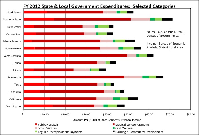
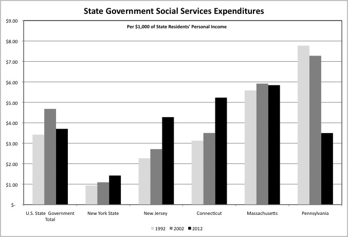
Taking state and local government together, U.S. state-local spending on aid to the needy averaged $52.62 per $1,000 of U.S. residents’ personal income in FY 2012, or 5.26% of all of the personal income earned by everyone in the country. The total for New York State was $71.24 per $1,000 of state residents’ personal income, one of the highest levels in the country. That is an extra 1.86% of my income, perhaps your income, everyone in New York’s income on average spent on services for the needy that year. (As we will see at the end of this post, the added cost in state and local taxes net of federal aid and hospital charges is somewhat lower than that).
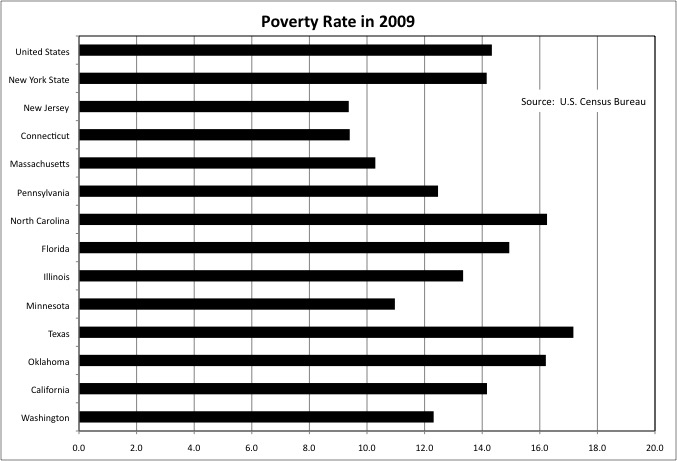
Two of the states with the lowest spending on the needy per $1,000 of their residents’ personal income were New Jersey at $43.05 and Connecticut at $42.96. There are a couple of explanations for this. One is low need. The poverty rate for these states was low in 2009, according to Census Bureau data, at 9.4% each compared with a U.S. average of 14.3%.
Another factor is the denominator of the expenditures per $1,000 of personal income formula, a high level of income. According to the Bureau of Economic Analysis, in 2012 Connecticut and New Jersey had the first and third highest per capita incomes among states. That means a relatively low level of expenditure on the needy, because of low poverty, was even less of a burden on those state’s taxpayers, due to the high level of income available to carry it. Despite this advantage and an above-average tax burden, after a long period of prosperity both New Jersey and Connecticut are mired in fiscal crises.
Income and poverty, however, do not explain all the variation by state in spending on the needy. In 2009 New York State’s poverty rate, like that of California, approximately matched the U.S. average. New York State’s per capita income was above average. And yet New York State’s spending on services for the needy per $1,000 of state residents’ personal income was very high. Minnesota’s poverty rate was below the U.S average at 11.0%, but its spending on the needy, at $66.93 per $1,000 of that state’s residents’ personal income, was also far above average. Oklahoma, on the other hand, had an above average poverty rate of 16.2%, and a below average per capita income, and yet still had below average spending on the needy at $48.32 per $1,000 of that state residents’ personal income.
The official poverty rate does not take into account variations in the cost of living among different places, and the aspect of the cost of living with the greatest variation is the cost of housing. So it is perhaps no surprise that two states with high cost housing in the places where most people live, (downstate) New York and (coastal) California, also had relatively high spending on Housing and Community development. New York State’s spending in that category was $5.12 per $1,000 of state residents’ personal income in FY 2012, and California’s was $4.59, compared with a U.S. average of $3.10. Although New York and California had identical poverty rates, however, California’s overall spending on the needy was only slightly higher than the U.S. average per $1,000 of its residents’ personal income overall, while New York’s was far higher.
Let’s examine these functions in detail, starting with Public Hospitals.
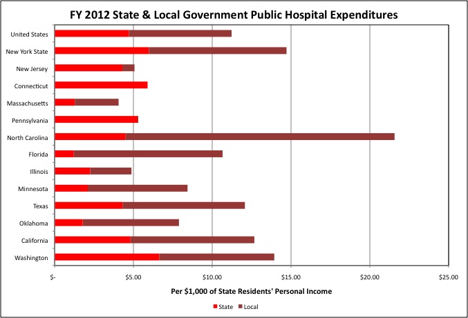
Public Hospital spending is actually highest in many southern states, not in the “liberal” Northeast, but New York State also is above average. The average U.S. expenditure average for state hospitals was $4.72 per $1,000 of personal income, compared with $5.98 for New York State. For local governments, the U.S. average was $6.50 spent on Public Hospitals per $1,000 of personal income, compared with $8.74 for New York State. New York’s state hospitals include mental hospitals, along with two general teaching hospitals affiliated with the State University of New York: Upstate Medical Center in Syracuse and Downstate Medical Center in Brooklyn.
While New York State’s Public Hospital spending is relatively high, most Northeastern states are below the U.S. average. In New Jersey, for example, expenditures on state hospitals totaled $4.30 per $1,000 of personal income in FY 2012, slightly lower than the U.S. average of $4.72, but just $0.77 for local government Public Hospitals. Connecticut had no Public Hospital spending by local governments, and Pennsylvania was close to zero.
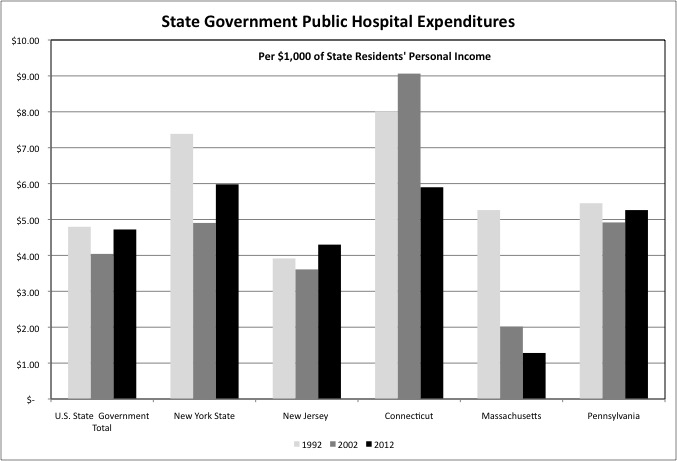
State Public Hospital spending had been falling for decades as a result of the de-institutionalization of the mentally ill. State spending per $1,000 of personal income fell from FY 1992 to FY 2002 in the U.S., New York State, and other states around the northeast other than Connecticut. That trend reversed from FY 2002 to FY 2012 in the U.S. as a whole, New York, New Jersey, and Pennsylvania. I hadn’t heard any press reports about more spending on state hospitals over that decade, but it apparently happened. State hospital spending fell sharply in Connecticut from FY 2002 to FY 2012, but was as high as in New York State in the latter year. In Massachusetts state hospital spending has virtually disappeared.
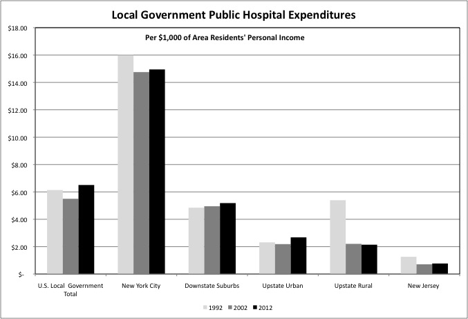
Within New York State, local government Public Hospital expenditures are concentrated downstate. Spending on New York City’s large Health and Hospitals Corporation totaled $14.95 per $1,000 of city residents’ personal income in FY 2012, far above the U.S. local government average of $6.50. This was followed by Nassau County at $5.22 per $1,000 of county residents’ personal income, Westchester at $11.07, and Rockland at $5.84. In Upstate New York public hospitals are present in only a handful of counties, notably Erie (Buffalo) and Monroe (Rochester).
New York City’s Public Hospital Expenditures fell from $15.99 per $1,000 of personal income in FY 1992 to $14.75 per $1,000 in FY 2002, during the Giuliani Administration, and then edged up slightly from FY 2002 to FY 2012, during the Bloomberg Administration. In the Downstate Suburbs both Westchester Medical Center and Nassau Medical Center were privatized and then returned to the public sector, but they were local government operations in FY 1992, 2002 and 2012, with a small uptrend in spending relative to personal income.
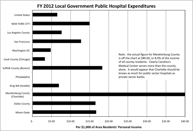
Large urban counties tend to have substantial local government Public Hospital expenditures. This is not the case universally, however. Local government expenditures on this function were below the U.S. average per $1,000 of area residents personal income in Cook County, which includes the city of Chicago, and only slightly above average in Los Angeles County, compared with far above average in New York City. There were no local government Public Hospital expenditures in Philadelphia in FY 2012. Although thought to be associated with “big government” in New York, municipally run hospitals do show up in the so-called “Red States.” Examples include Carolinas Medical Center in Charlotte, NC and Parkland Memorial Hospital in Dallas TX. The states with the highest expenditures on state and local government Public Hospitals, per $1,000 of state residents’ personal income, are (in order) Mississippi, Wyoming, South Carolina, Alabama, and Louisiana.
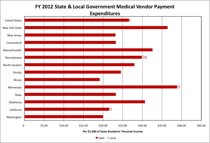
Medicaid is administered by state governments, rather than local governments, throughout the country, the District of Columbia excepted. So in Census of Governments data Medicaid-funded payments to private sector hospitals and other private sector health care providers shows up as state spending in the Medical Vendor Payment category. Given how expensive New York’s Medicaid program is, it is not surprising that New York’s state spending in this category, at $36.42 per $1,000 of state residents’ personal income, was far higher than the U.S. average, at $26.60. Nor is it surprising that in New Jersey and Connecticut, state spending on Medical Vendor Payments was below average at $23.15 and $23.21. I am surprised, however, that Minnesota’s spending in this category, at $38.82, was higher than New York’s. And I have always been surprised that California’s Medicaid spending per recipient is so low. Similarly, that state’s expenditures on Medical Vendor Payments expenditures per $1,000 of personal income was also below the U.S. average at $21.53 in FY 2012.
For those interested I had previously compiled data specifically on Medicaid, and discussed it in a series of posts starting with this one, which includes the spreadsheets.
https://larrylittlefield.wordpress.com/2014/09/04/medicaid-by-state-in-2001-and-2011/
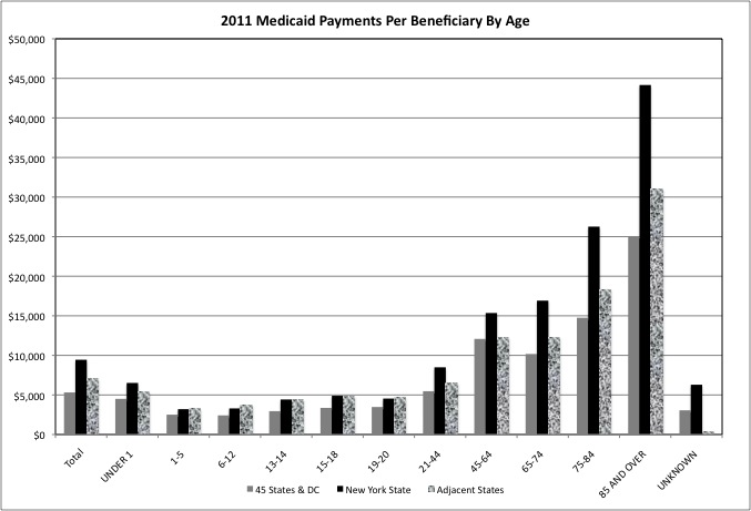
New York State, in particular, spends more per beneficiary than other states, even relatively generous and affluent Northeastern states, on senior citizens.
Returning to Census of Governments data…
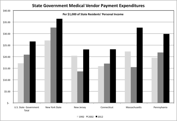
One finds that state government spending on Medical Vendor Payments per $1,000 of personal income increased substantially from FY 1992 to FY 2002, and from FY 2002 to FY 2012, in the U.S. as a whole, New York State, Connecticut and Pennsylvania. Spending on the elderly, and our aging population, is responsible for some of these increases. Ongoing health care cost increases is another factor. In addition, in New York State some Medicaid-funded spending that had been Public Hospital spending is now payments to private and non-profit health care providers, and counted as Medical Vendor Payments. That is due to shrinkage in the public hospital system and expansion in the private hospital system.
Those signing up for Cash Welfare assistance under federal programs are automatically enrolled in Medicaid. As the welfare rolls were purged in the wake of the 1996 welfare reform act, Medicaid spending fell per $1,000 of personal income in many states, including New Jersey and Massachusetts, from FY 1992 to FY 2002. This was a consequence of a decrease in the number of people on Medicaid. It is reflected in falling Medical Vendor Payments per $1,000 of personal income in Census of Governments data. Subsequent Medicaid expansion to a larger share of the working poor led spending to increases in these states as well from FY 2002 to FY 2012, to levels far higher than in FY 1992.
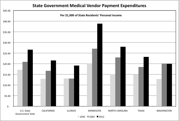
Medical Vendor Payments expenditures also increased in states outside the Northeast, per $1,000 of personal income, over two decades as well. Even in states such as Texas and North Carolina that refused to accept the expansion of Medicaid to additional working poor people under Obamacare.
The reality is that with most Americans in the middle class on down living paycheck to paycheck and having few assets, all were de facto covered by Medicaid for serious illnesses and injuries, even before Obamacare. Because serious illnesses and injuries would probably either prevent them from working, thus making them poor enough to qualify for Medicaid under pre-Obamacare rules, or have treatments that were so expensive that they qualified as “medically needy.” Being uninsured just causes these people to neglect the preventive care that might have allowed them to avoid more serious illnesses, and to act as “free riders” relative to any financial contribution they might have been expected to make to the system before getting sick.
I was surprised to find that if you take all state and local government spending on Public Hospitals and Medical Vendor Payments combined, measure it per $1,000 of state residents’ personal income, and rank the states, New York only comes in ninth at $51.22, compared with the U.S. average of $38.21. And I was surprised that several of the states ahead of New York were among those that have refused to expand Medicaid under Obamacare, including Mississippi, first at $79.57, South Carolina, third at $61.61, Alabama, fourth at $57.98, Louisiana, sixth at $52.62, and Wyoming, eighth at $51.43.
What all the states ahead of New York have in common, however, is that the federal government covers a much higher share of their Medicaid expenditures than it does for New York and other Northeastern states. That means that state and local expenditures on Medical Vendor Payments and Public Hospitals cost far more in state and local taxes in New York than in Wyoming, although the expenditure level per $1,000 of personal income is about the same in both states.
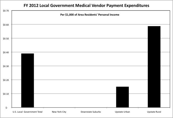
With the State of New York administering Medicaid, any local government Medical Vendor Payments expenditures are outside that program, don’t qualify for federal funding, and perhaps don’t receive any state funding either. There is almost no such spending in downstate New York, but there is a small amount in most counties in Upstate New York. These are expenditures either on people who do not qualify for Medicaid, or on services that Medicaid doesn’t cover.
Social Services expenditures include the operations of public welfare agencies such as New York City’s Human Resources Administration, Administration for Children’s Services, and Department of Homeless Services, and vendor payments to the many non-profit organizations working in the field. In some states, including New York, these services are generally administered by local governments, and that’s where the expenditures show up in Census of Governments data. In other states, such as Massachusetts, virtually all the spending is state spending.
But when you add it up New York’s state and local expenditures on Social Services, at $9.37 per $1,000 of state residents’ personal income, is well above the U.S. average of $6.35, far above New Jersey at $5.84 and Connecticut at $5.73, and eighth highest in the U.S. The states ahead of New York are an eclectic mix including Vermont, New Hampshire and Maine along with Wisconsin, Nebraska and Alaska. Pennsylvania, Illinois and Minnesota are also above average, along with California. Perhaps cold dark winters are the common theme, California excepted.
Nationwide state government expenditures on Social Services rose per $1,000 of personal income from FY 1992 to FY 2002 and fell from FY 2002 to FY 2012, while rising consistently in New York State, New Jersey and Connecticut. State Social Services expenditures plunged in Pennsylvania from FY 2002 to FY 2012, but that may have just been a change in where it was counted. Local government spending accounted for the majority of Social Services expenditures in that state in FY 2012. And a majority of the money is coming from the federal government in any event.
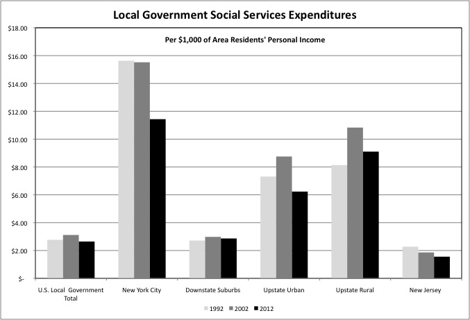
New York’s local government Social Services expenditures, like New York’s poor, are concentrated in New York City and in Upstate New York. There was a large drop in NYC expenditures, per $1,000 of personal income, from FY 2002 to FY 2012, a time when the city’s poverty rate was essentially unchanged. This may be a result of rising income, with 500,000 more people living in the city and most of them working, and/or fewer children in foster care and fewer other people in need of assistance. A quick check of the Administration for Children’s Services website shows 25,678 children in foster care in February 2002, compared with just 11,093 in February 2015. On the other hand, a quick check of the Department for Homeless Services website shows a record number of people receiving services. Thus the lower Social Services spending levels may be the result no of diminished need, but rather of crowding out by rising Social Security and Medicare costs at the federal level, and rising pension costs at the state and local level, as surmised in this post.
https://larrylittlefield.wordpress.com/2015/04/26/overview-of-state-and-local-government-expenditures-census-of-governments-data/
Social services expenditures also fell, relative to area residents’ personal income, in Upstate New York from FY 2002 to FY 2012.
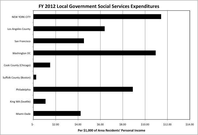
Relatively high local government expenditures on Social Services are characteristic of many major urban counties in states were such services are locally administered, such as California and Pennsylvania, although New York City’s spending is high even compared with these counties. The District of Columbia by itself accounts for all of what would be both state and local government expenditures elsewhere.
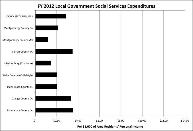
Local government expenditures on Social Services tend to be relatively low in affluent suburban counties, both within New York State and elsewhere.
With New York City’s poverty rate stuck in the vicinity of 20.0% for nearly 50 years, one might ask what the city’s high spending on its social workers has achieved. There is, however, one little known and seldom mentioned statistic for which New York’s social workers might receive some credit. New York State has long had one of the lowest suicide rates in the U.S. among states, and New York City has long had one of the lowest suicide rates among major cities. In 2012, according to the Centers for Disease Control,
http://www.cdc.gov/mmwr/preview/mmwrhtml/mm6345a10.htm
the overall age-adjusted suicide rate in the United States was 12.6 per 100,000 population. Among states, Wyoming had the highest suicide rate (29.6), followed by Alaska (23.0), Montana (22.6), New Mexico (21.3), and Utah (21.0). The District of Columbia had the lowest suicide rate (5.7), followed by New Jersey (7.4), New York (8.3), Massachusetts (8.7), and Rhode Island (9.5).
New York City’s suicide rate is half the U.S. average, according to the New York Times.
http://cityroom.blogs.nytimes.com/2012/02/24/why-is-new-yorks-suicide-rate-so-low/?_r=0
Among the other low suicide states (and equivalents), state and local Social Services expenditures per $1,000 of personal income were above the U.S. average in DC and Rhode Island, and below average in New Jersey and Massachusetts.
Expenditures on Cash Welfare, the type of assistance for the needy that was the focus of the backlash 20 to 25 years ago, have fallen hugely in the years since. Cash Welfare is divided into two programs. The federal program was called Aid for Families with Dependent Children (AFDC) until the welfare reform act of 1996, when it became known as Temporary Assistance to Needy Families (TANF). The federal government covers 50.0% to 80.0% of the cost of this program, as it does for Medicaid, with single mothers with children accounting for most of the caseload. In New York those not eligible for federal welfare, single adults for example, can qualify for what was once called Home Relief and is today called Safety Net Assistance. The cost of that program is split between state and local government, with no federal funding.
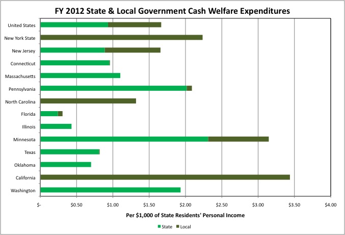
New York’s Cash Welfare expenditures equaled just $2.44 per $1,000 of state residents’ personal income in FY 2012, all at the local government level. That was well above the U.S. average of $1.67 and most other states, but a pittance compared with New York’s spending on Public Hospitals, Medical Vendor Payments, and Social Services.
The states that spent more than New York State on this function are an odd mix. California, with its relatively stingy Medicaid spending, spent $3.44 per $1,000 of personal income on Cash Welfare, relatively generous Minnesota spent $3.15, Maryland spent $4.39, and the District of Columbia spent $3.27. Then again red state Alaska spent $4.16, North Dakota spent $2.92, and Mormon Utah spent the most at $5.45.
While spending more than any other state on Cash Welfare assistance per $1,000 of state residents’ personal income, Utah spent just $2.96 per $1,000 of state residents’ personal income on Social Services, among the lowest in the country. Perhaps if you think the poor are just like you, you are more willing to just give them cash rather than paying people to tell them what to do.
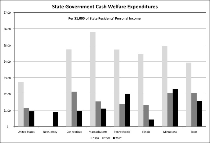
In locations where Cash Welfare is a state function, state government expenditures in the category plunged from FY 1992 to FY 2002, the welfare reform era. They continued to fall nationwide and in many of these states from FY 2002 to FY 2012. In Illinois, a state that is broke as a result of a pension-funding crisis and is in arrears on paying its non-profit Social Services agencies for services already rendered, Cash Welfare expenditures have virtually disappeared. It appears the State of New Jersey started taking over this function in FY 2012.
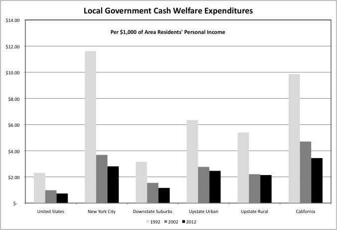
In different parts of New York State and in California, where Cash Welfare is locally administered, one also sees a huge drop in local government expenditures per $1,000 of area residents’ personal income from FY 1992 to FY 2002, followed by a smaller drop from FY 2002 to FY 2012. In FY 2012 New York City spent $2.81 per $1,000 of its residents’ personal income on Cash Welfare, down from $11.62 in FY 1992 when 1 million city residents were on welfare. The more recent spending level for NYC is barely higher than the Upstate Urban Counties average of $2.46 and the Upstate Rural Counties average at $2.14, and lower than the California average of $3.44.
The 1996 welfare reform act put a 5-year lifetime limit on receiving federally financed Cash Welfare. As a result, long time public assistance recipients who have been unable to get or stay off welfare may have ended in New York State’s Safety Net program, which is half financed by the state and half financed by the county where the beneficiary lives. This is more expensive for state and local taxpayers than assistance that is partially federally financed. Federal Cash Welfare still accounted for 76.6% of total Cash Welfare expenditures nationwide in FY 2012, but just 57.0% in New York State. Federal Cash Welfare programs account for virtually all of the spending in California, aside from the near child-free City of San Francisco, with its many transient homeless young adults.
In the wake of welfare reform there was a concerted effort by state and local governments to take full advantage of cash assistance programs for the working poor (food stamps and the Earned Income Tax Credit) and the disabled (Supplementary Security Income – SSI). Since these are entirely paid for by the federal government, with no burden on state and local taxpayers. The result was a shift, rather than a decrease, in federal spending on the needy, even before the Great Recession – from aid to the dependent, non-disabled poor to aid to the working and disabled poor.
While the dependent poor faced a backlash in the 1990s, however, the working poor have faced a backlash over the past few years, as I described here.
https://larrylittlefield.wordpress.com/2013/07/25/the-new-war-on-the-working-poor/
Part of that backlash has to do with Unemployment Benefits. For decades state-funded unemployment insurance carried up to 26 weeks of benefit payments, all across the country. In times of high unemployment, Congress would authorize additional weeks of benefits with federal funding. In the wake of the Great Recession, however, a number of states have been in a bidding war to cut the number of weeks laid off workers are entitled to benefits, with Florida recently in the lead at just 14. (Extended federal benefits for the long-term unemployed ended in early 2014.)
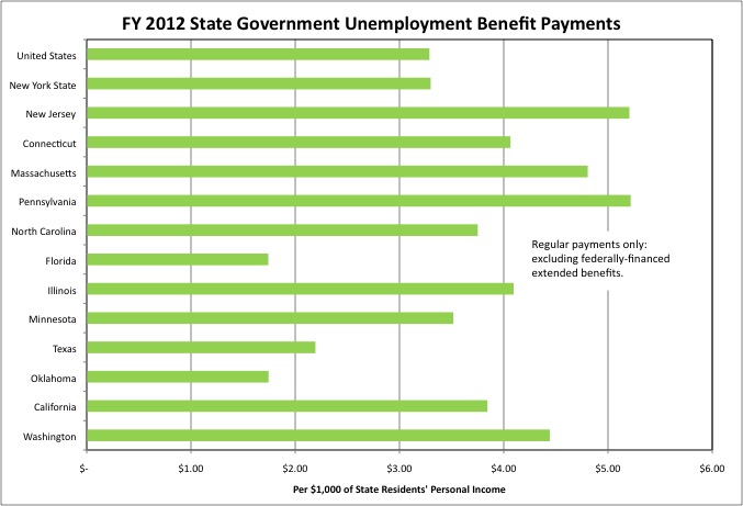
In FY 2012 New York State spent $3.30 per $1,000 of state residents’ personal income on regular (non-federal) Unemployment Benefits, approximately matching the U.S. average of $3.29. The expenditures of other nearby states were much higher – New Jersey at $5.21, Connecticut at $4.06, Massachusetts at $4.81, and Pennsylvania at $5.22. New York’s total spending in this category is kept down by a relatively low cap on the maximum monthly benefit. As a result of that cap, in New York a laid off Wall Street trader may not be paid a much larger monthly benefit than a laid off construction worker or back office worker. A high paid finance worker would get a larger benefit if they worked in the other states nearby. Occasionally one hears calls to increase the maximum benefit in New York based on the needs of the working poor. It isn’t the working poor who would benefit, however.
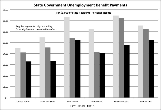
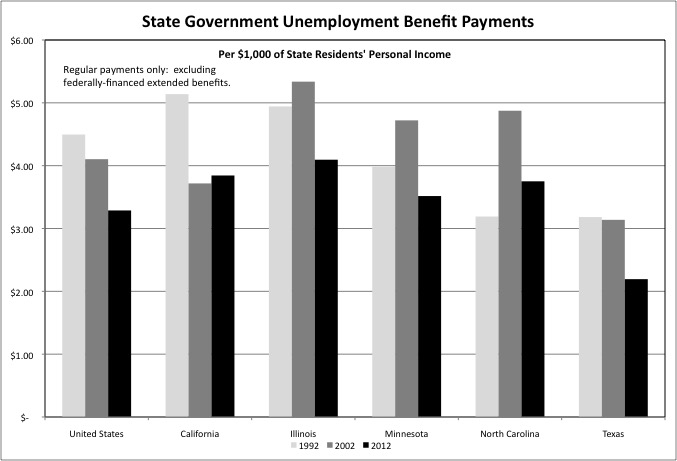
While the long duration of federal extended unemployment benefits in the wake of the Great Recession was unprecedented, expenditures on regular state-funded Unemployment Benefits were lower, per $1,000 of state residents’ personal income, in 2012 that they had been in 2002 or 1992. That was true in the Northeast, where the 1992 recession hit particularly hard (much harder than the two that followed), and the Great Recession was relatively mild. But it was also true for the U.S. as a whole, with Unemployment Benefits expenditures at $4.50 per $1,000 of personal income in FY 1992, $4.10 in FY 2002, and $3.29 in FY 2012.
And it was true in other states around the country. This isn’t because unemployment was lower in 2012 than it had been in those prior years. The Bureau of Labor Statistics put the national unemployment rate at 8.0% in 2012, 5.7% in 2002, and 7.5% in 1992. It is because a backlash had led to lower benefits for the working poor, the same sort of people who bought into the resentment of the dependent poor 20 years ago.
The final category of state and local assistance to the needy to be covered in this post is local government Housing and Community Development expenditures. This is a category of government spending on which New York City has traditionally spent more than just about anywhere else. In a Democratic Administration in Washington, it is more likely than not that the Secretary of Housing and Urban Development will come from New York. Our current Governor was one such Secretary. It is extremely unlikely that any other member of the Cabinet will be from New York.
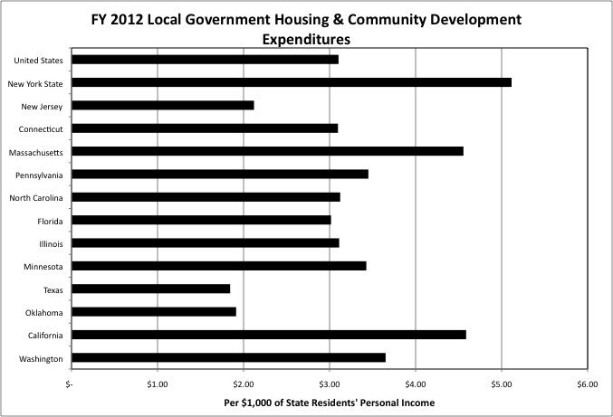
In FY 2012 New York State’s local governments spent $5.12 per $1,000 of state residents’ personal income on Housing and Community Development, well above the U.S. average of $3.10. Among states and their equivalents only the District of Columbia, where rapid urban and industrial decline followed by rapid gentrification have left vast tracts of land in the city’s control and available for city-directed redevelopment, was spending higher.
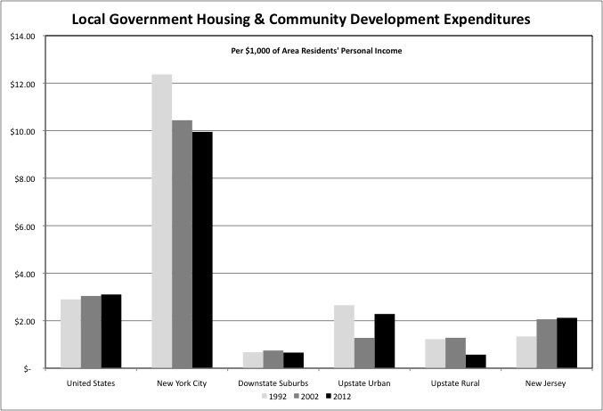
High Housing and Community Development spending, is not a statewide characteristic in New York. New York City was very high at $9.95 per $1,000 of city residents’ personal income in FY 2012, but the only other counties above the U.S average (and not by much) were Albany ($4.20), Erie (Buffalo) ($3.37), Onondaga Syracuse ($3.20), and Rensselaer (Troy) ($3.19). New York City’s expenditures on Housing and Community Development fell per $1,000 of city residents’ personal income from FY 1992 to FY 2002 and from FY 2002 to FY 2012.
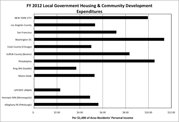
Rare in the U.S. as a whole, high spending on Housing and Urban Development is typical of many older major urban counties, though even among this group NYC is among the highest. In the past local government Housing and Community Development expenditures were primarily federally funded, and presented little or no burden on local taxpayers. Along with the money, however, has come an ever-increasing set of federal requirements to house the poorest and most troubled, those the suburbs did not want, and to absorb their other burdens. After public housing had been concentrated in older central cities and housing project development stopped, federal funding was cut back.
New York City has an estimated 600,000 people living in public housing projects, while many other cities have torn their projects down to make way for redevelopment. The city has responded to cutbacks in federal funding by reducing the number of beneficiaries of housing assistance, by using Section 8 housing assistance funding, originally designed to allow additional beneficiaries not in public housing to receive subsidized rents in private apartment complexes, to subsidize public housing as well.
In FY 2012, according to Census of Governments data, New York City spent $4.7 billion on Housing and Community Development, received $3.2 billion from the federal government, and collected $1 billion in rent and other charges associated with housing programs, for a net cost of about $500 million. The U.S. totals were $43 billion spent by local governments, $29 billion received from the federal government, and $5.6 billion in rent and other charges, for a net cost of $8.4 billion.
The next chart compares all types of local government spending on the needy for New York City in isolation, over 40 years rather than 20.
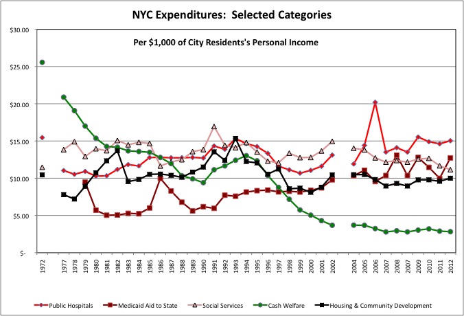
The chart starts in 1972, during the administration of “liberal” Mayor John Lindsay. The next government finance data from the Census Bureau is not available until 1977, the year New York City hit bottom during the urban crisis decade. Annual data began that year, but the Bureau cut back in the early 2000s for financial reasons and missed a year for NYC and two for other places.
One finds that in 1972 NYC spent far more on Cash Welfare than on other forms of assistance to the needy, at $25.56 per $1,000 of city residents’ personal income. “Welfare” equaled more than 2.5% of personal income of city residents that year. In FY 2012 Cash Welfare spending was little more than one-tenth of the FY 1972 level relative to city residents’ income, at $2.82 per $1,000, but not all of the decrease happened after “welfare reform” in 1996. In FY 1994 more than 1 million people were on welfare in New York City, but the city’s spending on Cash Welfare was little more than half the FY 1972 level. Like the minimum wage and the nickel deposit on the bottles and cans many homeless people collect, the welfare benefit level per beneficiary had been left to shrink relative to inflation, becoming worth less year-by-year, even before the number of beneficiaries was reduced.
New York City’s Public Hospital spending was second in cost in FY 1972, at $15.45 in local government expenditures per $1,000 of city residents’ personal income. The city’s 1970s fiscal crisis led to significant cuts in Public Hospital expenditures, with hospitals closed and spending often limited to whatever Medicaid would pay for. After falling to $10.28 per $1,000 of personal income in 1980, NYC’s Public Hospital spending had its ups and downs (and a couple of strange spikes) but has otherwise remained steady through 2005. Expenditures have been higher starting in FY 2005, although the Health and Hospitals Corporation faces ongoing financial problems.
The city was responsible for Medicaid within its borders prior to 1979, when the State of New York took over. Although the state is calling the shots, however, the city is still paying part of the bill in virtually unique aid to state government for Medicaid. The cost of this increased from $5.03 per $1,000 of city residents’ personal income in 1980 to $12.72 in 2012, and it would have increased more had not the federal and state governments increased their percentages of the total costs over the years. To put the total cost of Medicaid in perspective, the city’s share, which is what one sees in the chart above, is only perhaps one-fifth of the total, although some of that spending re-appears in city spending on Public Hospitals. Given that total U.S. healthcare expenditures are approaching 20.0% of GDP, however, that fact that Medicaid spending in NYC might equal 6.0% of city residents’ personal income is so surprising after all.
New York City’s Social Services expenditures peaked in 1991, during the crack epidemic and the peak of the murder wave, at $16.95 per $1,000 of city residents’ personal income. Since then the city’s spending has waxed and waned per $1,000 in personal income, probably due more to changes in the level of city residents’ income than changes in expenditures. Spending on the Administration for Children’s services tends to be reduced in the wake of recessions, when money gets tight, then increased due to “reforms” after the death of an abused child known to the authorities.
In the late 1980s, after federal to local aid for Housing and Community Development had been cut, but also after the cost of NYC public employee pensions, which had soared in the wake of the retroactive pension increases, fell, the city redirected those savings to new, city-funded housing programs. Rather than build new low-income public housing projects, most of which went up from the late 1940s to the early 1970s, the programs undertaken during the administration of Mayor Ed Koch helped to turn abandoned buildings, and lots where buildings had burned down, into new, privately run moderate and middle income housing. Large areas of the Bronx and Brooklyn were rebuilt with city housing subsidies, until the city ran out of abandoned buildings and land, and Housing and Community development expenditures returned to its former level.
Now, however, much of the city’s public housing is more than 50 years old and reaching the point where it will also have to be rebuilt in order to be preserved. And the city’s pension costs have once again soared as a result of the pension increases of the 1995 to 2008 period.
The final two charts concern funding for Welfare, Social Services, Public Hospitals, and (at the local level) Public Health.
After taking office, Mayor Bloomberg had the Office of Management and budget did something the Office of the City Comptroller had always been unwilling to do. Estimate how much of the city’s pension, fringe benefit, and judgment and claim expenditures could be attributed to each agency, to provide a true picture of the total cost of each. And provide information on how much each agency cost in city funds, as opposed to federal and state aid. This data for FY 2012 can be found in a table on page 39 of this document.
http://www.nyc.gov/html/omb/downloads/pdf/sum5_12.pdf
For now the DeBlasio Administration is continuing to provide this take in its budget documents.
What former Mayor Bloomberg showed was that although aid for the needy was the second most costly category of city spending overall, at $16.2 billion in FY 2012 (which included $6 billion in Medicaid aid to the state), it was far less expensive in city funds due to Public Hospital charges for services aid from the State of New York and (via the state) the federal government.
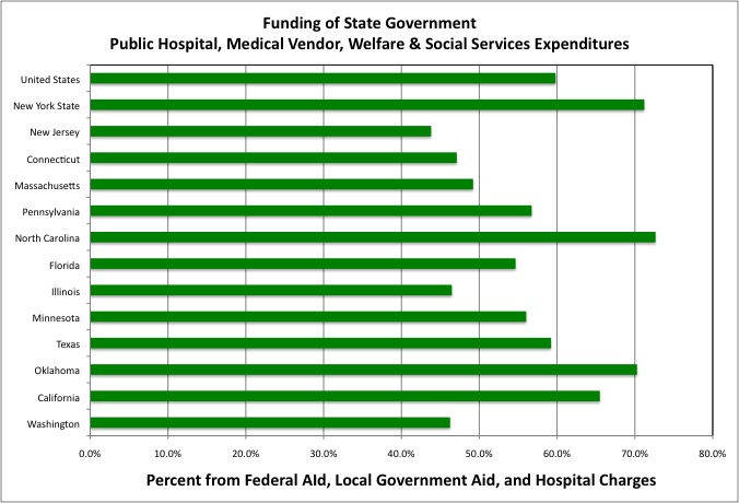
The federal share of state expenditures on programs to aid the needy, such as Medicaid and Social Services, depends on each state’s per capital personal income. In most of the high income Northeast, therefore, the share of funding provided by the federal government is relatively low, forcing those states to pay more for these services in state taxes. At the same time, however, most affluent Northeastern states also have low poverty rates, so the federal government is paying for a lower share of a lower level of spending on the needy. Federal to state aid, local government to state aid, and hospital charges covered 59.8% of state expenditures in these categories nationwide in FY 2012, but just 43.8% for New Jersey, 47.1% for Connecticut, and 49.2% for Massachusetts.
In New York State, however, Federal to state aid, local government to state aid, and hospital charges covered 71.2% of total state expenditures in FY 2012, above the U.S. average. That wasn’t because the federal government covered a higher share of the cost. New York has the disadvantage of having a both a high per capital income, reducing the federal share of the cost of expenditures on the needy, and an average poverty rate, with high spending overall. That ought to make spending on the needy very expensive in state taxes.
To offset this, however, the New York State requires something virtually no other state does – a local government contribution to the cost of welfare and Medicaid. That concentrates the cost of the poor on the places where they are concentrated, notably New York City and parts of Upstate New York. In terms of state taxes, therefore, aid for the needy is no more burdensome in New York State than it is in a poor state such as West Virginia, where the federal government covers a higher share of the cost of the needy.
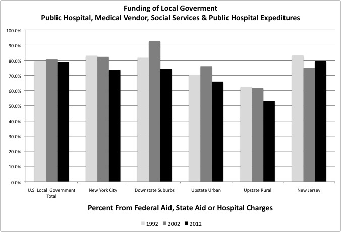
Even so federal aid, state aid, and hospital charges covers most of the cost of direct expenditures on Welfare, Social Services, and Public Hospitals (and Public Health) in New York City and the Downstate suburbs, although the non-local share fell from FY 2002 to FY 2012. Funding from elsewhere covered 83.0% of the city’s spending on these services in FY 1992, but just 73.6% in FY 2012. In Upstate New York, particularly in rural Upstate New York, county taxpayers end up covering a higher share of spending on Welfare, Social Services, and Public Hospitals. The reason is likely higher levels of spending on services or beneficiaries that do not qualify for federal and state aid, as seen in the Medical Vendor Payments category.
Net of federal aid, state aid and hospital charges, New York City’s direct spending on aid to the needy (plus the Department of Health) cost NYC residents about $4 billion in local resources in FY 2012. Add in the $6 billion sent to the State of New York for Medicaid, and the total local cost was $10 billion, or 2.1% of city residents’ personal income. (The Census of Governments data matches the OMB table almost exactly on this). For local governments around the country, the average net local government cost of aid to the needy is 0.3% of personal income, meaning that NYC residents 1.8% pay more of their income in city taxes to pay for aid to the needy (plus any additional local tax costs of Housing and Urban Development).
On the other hand, because the State of New York shifts the cost of aid to the needy to the local level in a way no other state does, net state spending on these categories totaled just 0.7% of state residents’ personal income in FY 2012, less than the 0.9% national average, even though New York’s spending level is relatively high and the federal government covers a relatively low share of it.
As noted in my post on taxes, NYC residents pay 5.7% more of their personal income in state and local taxes than the U.S. average (at 15.7% of personal income compared with around 10.0% for the U.S.). As noted in my post on public schools, NYC residents are paying 1.0% more of their personal income in taxes to fund very high spending on schools. Taking state and local taxes together, spending on aid to the needy costs NYC residents 1.6% of their income in higher taxes. The services discussed thus far explain about half of the excess state and local tax burden in New York City.
In the next post I’ll turn from categories of expenditure in which New York City’s local tax spending is lower than it first appears, to categories in which the city’s spending is far higher: the uniformed services.