
When people think about America’s debt problem, they generally think about the national debt, which is to say the on-the-books debts of the federal government held by the general public. U.S. debts in general, however, have soared from a total of less than 170 percent of GDP from the 1950s to the early 1980s to nearly 350 percent of GDP in 2008, as I noted here.
https://larrylittlefield.wordpress.com/2015/03/18/the-american-economy-hair-of-the-dog-means-more-debt-for-the-doomed/
Consumer debt soared. Business debt soared. And state and local government debt soared, from 12.4% of GDP in 1980 to 20.6% of GDP in 2009, before dropping back. While state and local governments are generally required to run balanced budgets, they also tend to have separate capital budgets, under which money is borrowed for long-term capital investments. While state and local government debt has been trending up, however, infrastructure expenditures have trended in the other direction. The result is a sold-out future.
This is the second of three posts on the extent to which residents of different states face diminished futures as a result of the deals and non-decisions of the past. The first chart, with a spreadsheet of data on state and local government debt, capital construction and pensions for all 50 states from 1972 to 2012, is here.
https://larrylittlefield.wordpress.com/2015/06/24/sold-out-futures-a-state-by-state-ranking-based-on-the-census-of-governments/
It should be read first. This post will go deeper into detail on state and local debts and construction. Lets start with the nationwide trend.
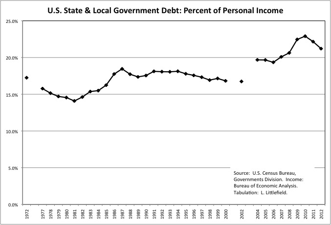
The data show that total U.S. state and local government debts equaled 14.6% of the personal income of all U.S. residents in 1980, but jumped 22.9% in 2010. Debts had fallen in the 1970s, probably because the fixed-rate bonds floated in the 1950s and 1960s (as many suburbs were developed and schools were built for the baby boomers) became worth less in the high inflation 1970s. More recently, however, anyone running up debts in the expectation that their cost would be inflated away has faced a fiscal crunch in the global low-inflation, and in a worst case even deflationary, environment.
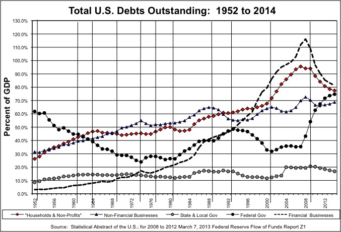
The increase in state and local government debt seems mild compared with the increases in consumer, business, financial and federal debt from 1980 to 2012. The federal debt soared in the Great Recession. If it hadn’t, the indebted private sector would have collapsed. Many losses were socialized after the profits had been privitized, and younger generations of Americans will pay for this – in higher taxes and diminished old age benefits – for decades. The $2.9 trillion in state and local government debt in FY 2012 equaled 21.2% of U.S residents’ personal income in 2012. The $11.6 trillion in federal debt that year equaled 83.5% of U.S. residents’ personal income that year. But let’s return to state and local government, the subject of this analysis.
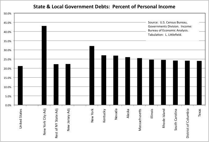
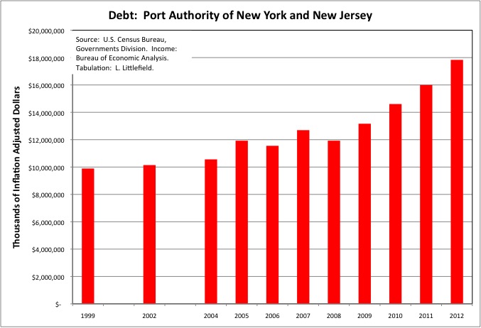
The state with the highest state and local debt as a percent of its residents’ personal income was New York at 32.1%, half again as much as the U.S. average of 21.2%. But that debt is, in reality, concentrated on New York City, where state and local debts equaled 43.0% of city residents’ personal income, double the U.S. average of 21.2%. This assumes that burden of half the debt of the State of New York, and two-thirds of the debt of the Port Authority of New York and New Jersey, will fall on city residents. Other highly indebted states, based on the financial instruments people can see, are (in order from worst) Kentucky at 27.1% of that state’s residents’ personal income, Nevada at 26.9%, Alaska at 26.1%, Massachusetts at 25.5%, Illinois at 24.7%, Rhode Island, and Texas at 24.0%.
California’s state and local government debts are huge at $420 billion according to the U.S. Census Bureau, but so is the total personal income of California residents. Its debt burden is slightly worse than the U.S. average.
The future revenues of the Transportation Trust Funds of both New Jersey and New York State (with the latter paying for roads and bridges outside New York City) have been borrowed against to such an extent that there is little or nothing left of them to pay for today’s transportation. All the money is going for interest on past debts. New York’s Metropolitan Transportation Authority is also loaded with debt.
Outside the transportation segment, however, it appears state and local debts are low to moderate in the rest of New York and New Jersey, because New Jersey and the portion of New York State outside New York City are about average in state and local government debt as a percent of personal income. As of FY 2012 Connecticut’s state and local debt burden was below average when measured this way.
Perhaps the governors of New York and Jersey have loaded the transportation system with debt because those are the bonds investors were willing to buy. Since the collapse of the transportation system would mean the collapse of both state’s economies, the politicians could promise bondholders that future residents of those states could be held hostage to their repayment. But it appears that politicians in both states are prepared to allow the hostage to be shot. With all the money going to past debts, they are unwilling to impose sacrifices to allow transportation reinvestment to continue. Neither New York or New Jersey was able to pass a funding program for transportation in the most recent legislative session. And the main source of real cash money for transportation investment over the past 25 years, the federal government, can’t fund its transportation aid either.
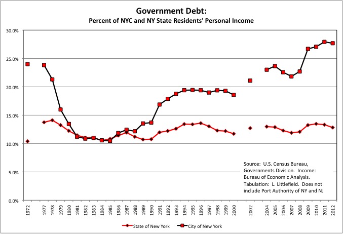
Outside of transportation, in metropolitan New York high state and local debts really are a New York City problem. How bad is it? Including just the debts of the City of New York, not a share of the NY State debts and Port Authority debts city residents will also end up paying for, NYC debt had equaled 24.0% of the income of NYC residents in FY 1972, near the end of the Lindsay Administration. Within three years the City of New York faced a fiscal disaster in which no bank or bond investor would lend to it, the infrastructure was left to rot, the school system collapsed, police were laid off, crime soared, and old women (the bag ladies) were left to die in the street. With the help of 1970s inflation that debt was reduced to just 10.5% of city residents personal income in 1985 (than you Mario Cuomo and Ed Koch). Back then the MTA Capital Plan was funded with actual money, not debt. But as of FY 2012, the debts of the City of New York equaled 27.7% of city residents’ personal income, worse than under Mayor Lindsay. Worse than just before the 1970s fiscal crisis.
The only saving grace is low interest rates. City of New York interest payments equaled 1.34% of city residents’ personal income in FY 1977, but just 1.16% of city residents’ personal income in FY 2012. But how long will the Federal Reserve keep interest rates at zero? And what happens when city and MTA bonds come due, the city and MTA can’t pay them off, and they have to re-borrow at much higher interest rates? It will be the 1970s all over again.
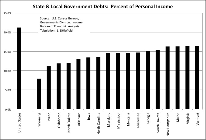
So where is the state and local government debt burden below the U.S. average? In relatively poor states such as Arkansas, Oklahoma and Mississippi, because for politicians to sell a state’s future someone has to be confident enough in repayment to buy it. In low population, spread out states such as Wyoming, Idaho, Iowa, Montana, and North and South Dakota. These states don’t have to borrow to pay for infrastructure because the federal government covers most of their costs. And in a few states in northern New England and the Southeast.
In one sense this group of states makes sense. These are states without a lot of large, urbanized areas. States where relatively few people have public water, public sewer, and public transit. After all, state and local government budgets are supposed to be balanced, and debts are only supposed to be used for capital spending. So does high capital spending, and extensive public infrastructure, go together with high state and local debts? Not necessarily.
First of all, one has to consider what I include in infrastructure. I include state an local government highways and bridges, transit systems, airports, seaports, water systems, sewage systems, solid waste facilities, and capital expenditures by publicly owned electric and gas utilities. I exclude capital investments in parks and recreation and housing and community development because I want to exclude stadiums, convention centers and other gathering places. I don’t dismiss the value of such places. One of the purposes of cities, after all, is to allow people to gather for various reasons. It is my belief, however, that his country has overinvested in such facilities and underinvested in basic infrastructure, to the point where basic infrastructure has been neglected.
It should be noted that state and local governments are also borrowing money for private real estate development in “public-private partnerships.” The U.S. Census Bureau didn’t even track “public debt for private purpose” until FY 1982, when it equaled $64 billion out of $405 billion in debt, or 15.8% of it. In FY 2012 public debt for private purpose was up to $597 billion, or 20.3% of a larger total. The City of New York is not the worst offender. The city’s public debt for private purpose accounted for 13.5% of the total in FY 2012, but since that total was so high that equaled $17.7 billion. Are taxpayers on the hook for revenue bonds for private developments? That question will be answered at the Yankee Stadium parking garages, where one scheme after another is floated to have the city bail out the bondholders the way the federal government bailed out Fannie May and Freddie Mac. This is an example of all the additional issues that can be analyzed for every state by those who downloading the very large spreadsheet that, once again, is can be downloaded from the prior post on Saying The Unsaid in New York.
https://larrylittlefield.wordpress.com/2015/06/24/sold-out-futures-a-state-by-state-ranking-based-on-the-census-of-governments/
I also limit the analysis to capital construction expenditures, and exclude other capital expenditures such as land acquisition and equipment purchases. Growing localities have to acquire land for new facilities, but all localities have to build and then rebuild those facilities. Because New York City has a large transit system, it spends a great deal on capital equipment purchases – subway cars and buses. These purchases, however, are more like the motor vehicles people buy for themselves in other areas than investments in the infrastructure everyplace has to make. In fact, I suggested that farepayers cover the cost of rail transit vehicle purchase, maintenance and operation in metro New York while taxpayers and tollpayers fund the cost of the infrastructure and stations those vehicles use.
https://larrylittlefield.wordpress.com/2014/02/26/the-nyc-subway-and-mta-commuter-rail-lines-need-to-cover-their-costs-on-an-auto-equivalent-basis/
And besides, I get the feeling that the MTA has over-invested in rolling stock and underinvested in infrastructure over the years, because rolling stock is what people can see. New York City has traditionally replaced its subway cars after 40 years, and the average age of a subway car in 2013 was 19.9 years according to the National Transit Database. But since 2000, when past debt was refinanced, the MTA has been borrowing for 50 years to buy subway cars, and the well-made R32s, the first stainless steel subway cars, are still in operation after 50 years. The average railcar age is 2.8 years for PATH, 15.9 years for Metro North, 16.7 years for New Jersey Transit, and 11.7 years for the Long Island Railroad, where the MTA has to keep buying new cars because the maintenance crews don’t bother to do maintenance (see the book Gravy Train). The average New York City transit bus is 7.5 years old. They cost a ton. Former NYC buses are in operation elsewhere. Like city workers, they retire young.
I had considered discounting capital expenditures in fast growing states, on the assumption their infrastructure construction needs are greater. But based on the experience of New York City I decided not to. Cities and suburbs are built out over time. By the time they are completed, their earliest infrastructure in their oldest areas is worn out and needs to be replaced, something that costs as much or more. So aside from land acquisition, I don’t assume an older but slow growth state such as New York need less in infrastructure capital construction expenditures as a percent of their residents’ personal income than fast growth states such as Florida or Texas. Reinvest, of face deterioration and obsolescence.
To calculate the “sold out future ranking” I had to make a decision what the appropriate level of infrastructure investment is. There can be too much construction as well as too little, wasteful excess public investment as well as wasteful, excess private investment. In the 1950s, 1960s and early 1970s, the federal government provided so much money for brand new state and local government infrastructure in the suburbs and Sunbelt that perfectly good infrastructure in the older cities of the Northeast and Midwest, which were taxed to pay for this, was abandoned. Transit systems, in particular, spiraled downward, along with the private railroads. Instead of more infrastructure, the U.S. just ended up just building new places that devalued others. It was only when that torrent of “free” federal money slowed, and some of it was shifted to reinvestment in older infrastructure, that some existing cities such as New York began to recover.
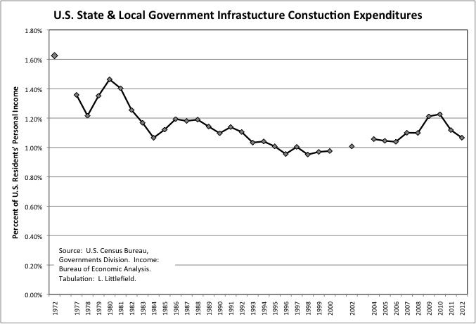
So I didn’t use the 1.63% of personal income U.S. state and local governments spent on infrastructure construction in FY 1972 as my benchmark, although others might if they want the U.S. to have the sort of infrastructure quality one finds in Europe and Asia and are willing to sacrifice some of their personal standard of living to pay for it. Instead I used the 1.36% of personal income averaged from FY 1977 to 1981. I think that is a fair guesstimate of what would have been required not to build the whiz-bang infrastructure of places like China, South Korea and Europe, but just for the generations born from 1930 to 1958 to bequeath to younger generations something as good as, if slightly different than, what they had inherited from those who came before.
There was a large dropoff after 1981, however. Aside from a big boost from the federal “stimulus program” during the Great Recession, state and local government infrastructure construction expenditures fell below 1.2% of personal income in the 1980s and have been around 1.0% of personal income since. While infrastructure advocates often exaggerate the extent of the problem in pursuit of greater funding, my view is that the U.S. has underinvested in infrastructure by $807 billion dollars over the years from 1980 to 2012 (in $2012), or about $27 billion per year. That is the additional money that would have been required just to keep the infrastructure we had, let alone improve it.
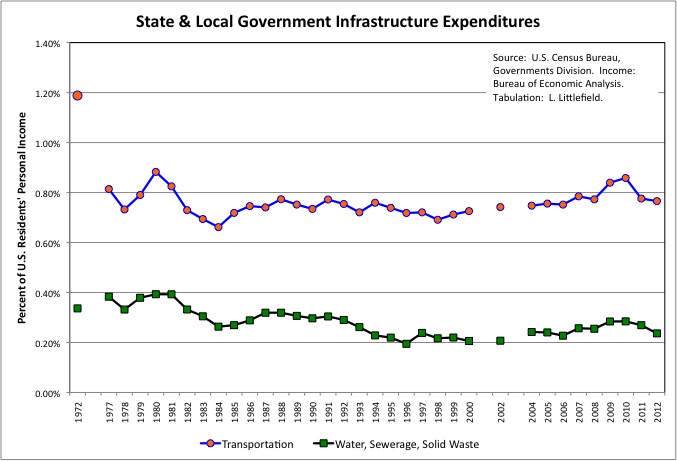
One thing I wondered is whether, in the wake of the environmental movement and the Jane Jacobs school of anti-Robert Moses city planning, transportation infrastructure construction had been cut but water, sewer and solid waste construction had increased. That thought was apparently based on my New York City experience, and not applicable elsewhere. Transportation capital construction did fall sharply from FY 1972 to FY 1977, and more after 1981, but environmental construction did not increase. In the end when measured as a percent of personal of income it has fallen more than transportation construction. Perhaps because federal money continued to be available for transportation, but less so for water and sewer systems.
So where has the level of infrastructure construction been lowest?
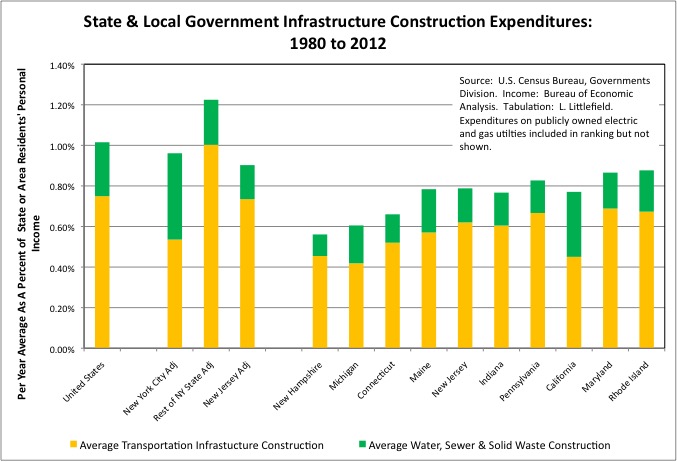
Not in New York. This is the one and only category in this analysis in which New York City doesn’t have the most sold out future of all. Compared with a U.S. average of 1.1% of personal income, including electric and gas utilities (not shown in chart), the New York City’s infrastructure construction expenditures averaged 0.96% of personal income per year over the 1980 to 2012 period. It should have spent $40 billion more, or $1.3 billion more per year, according to the baseline. If New York City were a separate state, that infrastructure investment shortage would have ranked 37th among 50 states and the District of Columbia, not 51st (the overall ranking), at 8.43% of one year of city residents’ personal income.
This makes sense when one considers that virtually every bridge and transit line in the city, and quite a few roads, have been extensively rebuilt since 1980. Of course given that the city’s infrastructure was left to fall apart in the 1950s and 1960s, that level of expenditure certainly didn’t put the city ahead, and frankly hasn’t allowed the city to fully catch up. And with money borrowed to pay for all of this, in effect a physical disaster was converted into a financial disaster, all without any significant expansion of transportation capacity.
Despite all that reinvestment, if New York City were a separate state its average transportation infrastructure investment per year, as a percent of its residents’ personal income, would have ranked 48th, or third from the bottom. The U.S. average from 1980 to 2012 was 0.75% of personal income, compared with 0.54% in NYC, 1.00% in the rest of NY State, and 0.73% in New Jersey.
One of New York City’s distinguishing features, however, is that while transportation construction expenditures have been much lower than the U.S. average as a percent of city residents’ personal income, environmental construction expenditures have been much higher. The federal Environmental Protection Agency has forced the City of New York to spend $billions on new sewage treatment plants, water filtration plants, and stormwater catchment tanks. And the closure of the Fresh Kills landfill required the creation of an entirely new solid waste infrastructure.
One hopes than at some point the need for environmental construction will slow, and whatever money is left can be shifted to transportation. The city’s water mains and sewer lines aren’t getting any younger, however, and one of its Upstate aqueducts is leaking and needs to be replaced. The city’s environmental engineers and consultants will likely come up with other uses of any money they can get. Meanwhile, the next MTA Capital plan remains unfunded, replacement of some of its rail and subway signal systems is overdue, and system expansions seem to be going nowhere despite the crush of soaring ridership.
As for the Rest of New York State and New Jersey (with part of the Port Authority included), transportation infrastructure construction expenditures have been higher as a percent of personal income in the past, but environmental construction has been lower. Does that make sense? Well, the city of Syracuse now claims its sewer system is collapsing, and wants the rest of the state to pay for a replacement. And in Suffolk County, population 1.5 million, most residents still rely on private wells and cesspools. The Long Island Sound is being polluted as a result.
In one includes part of the Port Authority New Jersey’s FY 1980 to 2012 transportation construction expenditures averaged 0.73% of state residents’ personal income per year, about the same as the U.S. average of 0.75%. That state’s public spending on environmental infrastructure was low, but much of the state is served by private water supply and solid waste collection, so it may have extensive private expenditures that are not being counted.
In general, however, the rest of New York State and New Jersey are not worse off than the U.S. average with regard to past state and local government infrastructure construction. The problem is that since the early 1990s, federal aid aside, that infrastructure construction has been funded by soaring debts rather than taxes and fees. The cost of past expenditures has been shifted to the future, leaving nothing to pay for the next 30 years of infrastructure construction as money is sucked away to pay for the prior generation’s party. Infrastructure construction in New York and New Jersey may be much lower in the next 30 years than in the past 30 years, leading to deterioration and economic decline. You can almost bet on it.
And while I only have data on the Port Authority for few years, I can show its debts, in particular, have soared since 9/11.
While the infrastructure is about to start deteriorating, wrecking the economy and quality of life, in metro New York, where had that already happened to the greatest extent from FY 1980 to FY 2012?
Michigan holds the bottom place in the sold out future ranking with regard to past infrastructure construction, with an expenditure gap of 19.5% of that state’s residents’ 2012 personal income. And it shows.
http://www.mlive.com/politics/index.ssf/2014/04/michigan_roads_now_among_natio.html
“Decades of underfunding have left Michigan’s highways, streets and roads among the worst in the nation, with no guarantee lawmakers will approve funding for their repair” according to Bridge Magazine. “One thing’s for sure: The longer Michigan waits to fix its roads, the more expensive the fix will eventually become for its residents.” They mean future residents. Past and present politicians and their aging constituents tend not to worry about that. “Of the 50 states, Michigan spends the least per capita on its roads and bridges, according to 2010 U.S. Census Bureau data. Michigan spends $174 per person annually on transportation. Illinois and Ohio each spend $235. Minnesota spends $315.” I’m using the same data but measuring it per $1,000 of personal income, and getting the same results.
The 1980 to 2012 infrastructure construction deficit, measured as a percent of each state’s residents’ personal income in 2012, was 18.0% in New Hampshire, and 17.1% in Connecticut. Worse than average (and average is bad enough) but not nearly as bad off as those states are Maine (13.7%), Indiana (12.94%), Rhode Island and Pennsylvania (12.0%). Excluding publicly-owned electric utility construction California infrastructure construction has also been low, and has been particularly low on transportation. Its 1980 to 2012 spending gap totaled $191 billion, or 10.6% of the total 2012 income of California residents. Imagine what that state would have if it had spent that much more on infrastructure over 30-plus years, and got fair value for the money.
Speaking of fair value, these figures only measure what was spent, not what was received in return. Pennsylvania, for example, as spent $billions on new highways in exurban and rural areas, even as highways, bridges and transit systems in cities and established suburbs were allowed to fall apart.
New York and New Jersey have spent on fancy stations rather than track capacity, and have been massively overcharged by contractors. Perhaps because those contractors are manipulating the bidding process. Perhaps because those contractors are trying to force the MTA and Port Authority to pay for past pension increases and underfunding in the multi-employer pension funds associated with union construction, paying for past private construction as well as current public construction. Private companies can switch to non-union construction to avoid this burden of underfunded construction pensions, and more and more are doing so. Leaving the government to also pay the private share of the past pension bill, by law.
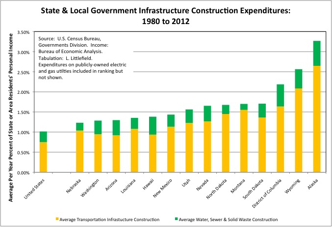
On the other end of the spectrum, Alaska and Wyoming, two states flush with oil revenues and federal money in recent decades, spent the most per year on state and local infrastructure construction from FY 1980 to 2012, as a percent of their residents’ income. Alaska ranked first in transportation construction expenditures during the 1980 to 2012 period, but it used oil taxes and federal money to build bridges to nowhere as a jobs program. That state and Wyoming represent a particular brand of Republican politics that would be difficult to duplicate nationally. Everyone lives off massive government spending but everyone is against, and doesn’t have to pay, taxes.
The District of Columbia is an overestimate, because all the construction for the Metro transit system is reported there. That system also serves Virginia and Maryland.
It turns out that several large, low population, low density states such as Nebraska, Utah, North Dakota, South Dakota New Mexico and Wyoming spent the most on infrastructure construction as a percent of their residents’ personal income from FY 1980 to FY 2012, not the least. So much for the idea that high debt and high infrastructure investment are both concentrated in urbanized areas. If I were to pick one part of the country where low investment is concentrated, it would be New England. Boston’s big dig aside. Lots of young people are moving to metro Boston and expecting to organize their lives around its transit system. That transit system, however, is in a state of collapse due to low investment for decades.
http://wgbhnews.org/post/mbtas-real-problem-political-hypocrisy-not-cold-and-snow
New York’s future.
While not every community has public water, public sewers, and public transit, airports, and seaports, every community has schools. When tabulating education capital construction expenditures over 30-plus years I included Elementary and Secondary Schools and “Other Higher Education,” but excluded “Higher Education Auxiliary Expenditures,” which includes facilities such as dorms and sports stadiums. Because once again I believe there has been overinvestment in visible frills and underinvestment in basic necessities.
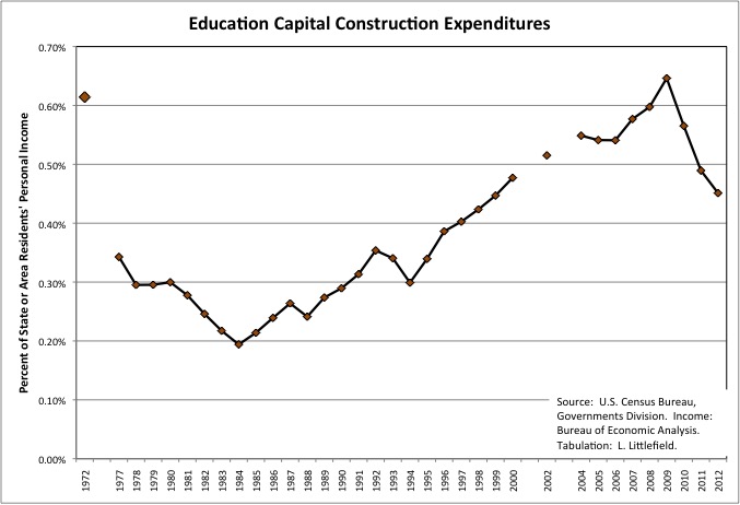
Looking data for all state and local governments in the U.S. combined, the trend in state and local government education capital construction expenditures makes sense. Such expenditures were high in the period through the early 1970s, as schools, colleges and universities were built for the large “baby boom” generation, equaling 0.61% of U.S. residents’ personal income in FY 1972. But with the much smaller “baby bust” generation following (Gen X), education construction expenditures plunged to 0.19% of U.S. residents’ personal income in FY 1984.
Then the children of the baby boomers, the very large “baby boom echo” generation (aka Gen Y and the millennials), flooded the schools. But unfortunately they didn’t grow up in the same places as the baby boomers themselves. So while schools in the cities and inner suburbs were left to rot, education construction expenditures soared to 0.65% of U.S. residents’ personal income in FY 2009, before falling with enrollment and state and local fiscal crises thereafter.
Adding it up, I’d say that education construction expenditures were perhaps about right in total from FY 1980 to FY 2012, though perhaps inefficient due to the abandonment of older places for new ones. But how do the states compare in these categories?
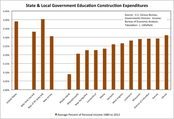
In 1980 New York City’s schools were a wreck after years of disinvestment. Bricks were falling off the buildings, and many schools still burned coal. In the mid-1990s, as part of a deal to implement the STAR system, which shifted overall school aid to the rest of the state, New York City was allowed to borrow money to rehabilitate its schools. New buildings were also constructed as part of the re-boot of CUNY, notably a large one-building campus of Baruch College. From FY 1980 to FY 2012, however, the city’s annual education construction expenditures only averaged 0.33% of city residents’ personal income, below the U.S. average of 0.39%. That would have ranked 37th if NYC were a separate state. At the U.S. average NYC would have spent $7.6 billion more.
Despite NYC being allowed to borrow, most of the school construction expenditures took place in the rest of New York State, where education construction expenditures averaged 0.40% of area residents’ personal income per year from FY 1980 to FY 2012, above the U.S. average despite very limited population growth. Spending there peaked at 0.77% of personal income in FY 2002, during former Governor George Pataki’s last re-election campaign.
Education construction expenditures have been relatively low in New Jersey, and would have ranked 11th from the bottom among states at 0.31% of state residents’ personal income on average per year from 1980 to 2012. The bottom states include (in order) Rhode Island at 0.09%, Massachusetts at 0.21%, New Hampshire, Connecticut and Maine at 0.23%, and Vermont at 0.26%. New England in other words. The region where young people are leaving, Boston aside.
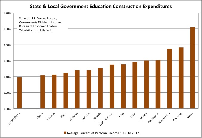
And where were education construction expenditures relative high, on average, from 1980 to 2012 relative to state residents’ personal income? In low tax, high spending Alaska and Wyoming. And in fast growth states such as Arizona, Washington, Utah, Nevada, Georgia and Texas.
Texas is a low tax state, but this compilation has shown that if you adjust for state residents’ personal income, it does spend on schools and transportation, at least in comparison with the states around it. Then again it can afford to, because its FY 2012 taxpayer pension contributions, as a percent of the personal income of state residents’, were among the lowest in the country. And it is to pensions, like inadequate capital investment an off the books debt, that the next post will discuss.