
Just based on the news, it would be easy to believe that not much had changed for the federal government during the Obama Administration, other than Obamacare. After that program passed, barely, the Republicans took Congress, and there has been a stalemate – with shutdowns, possible defaults, and a sequester that was meant to force compromise by taking both sides hostage, but turned out to be the actual public policy.
Now that I’m looking at the data, however, I see things completely differently. Obamacare is nothing but a blip in the relentless increase of health care as a percent of the federal budget, mirroring its ongoing increase in the economy as a percent of GDP. The sequester actually did shrink federal spending in the limited areas to which it applied, something people don’t realize because the limited federal government operations people actually see have continued to stagger on the for the moment. Meanwhile, demographic and economic changes have completely re-shaped federal expenditures based on programs that were enacted before Obama and the Tea Party were even elected. Notably the increase in the share of the population that is age 65 or over, and the share of the workforce that is working poor rather than lower middle or middle class. The result is a government completely transformed in a way that is in once sense alarming, but in another sense hopeful.
This is the third in a series of posts on the federal budget, one that began with an overview that contains a spreadsheet that presents the data in tables and a few charts, and explains how it was tabulated.
The Phony Federal Campaign and Our Real Future
Since my main interest is state and local government policy, and plenty of people analyze and discuss federal policy, I only do this sort of tabulation on the federal government every four years. I’m adding some charts as I go, and will re-post the spreadsheet when I’m done.
A second post was on federal revenues, by type, from the end of the 1970s to the present, as a share of the economy.
Federal Revenues: Recent History
That is roughly the length of time I’ve been following public policy, and can therefore link changes in the data to changes in policy that I can remember. This post is on federal expenditures over the same period.
I focus on our state government, which recently had the heads of both houses of the legislature convicted of corruption, for this reason. Of the three levels of government the federal government collects the most money in taxes, but it pays most of it right back out again in payments to individuals, aid to state governments, and interest on the national debt. It actually does very little directly other than the military and the post office. Local governments do most of the work of government, but they do this work under rules set by, and primarily paid for by, the federal and state governments. It is the state governments that actually make most of the key decisions on the margin.
Others have put it this way: the federal government is an (social) insurance company that also has an army.
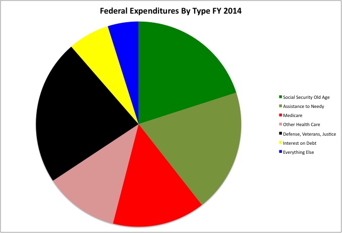
This clearly shows in a chart of FY 2014 federal expenditures. Social Security payments to seniors accounted for more than one-fifth of all federal expenditures, or 4.1% of the entire economy (GDP) that year. Other cash payments, such as SDI for the disabled, SSI, and block grants to states for what is left of “welfare,” income-restricted voucher programs such as SNAP (food stamps) and Section 8 housing, and grants to states for social services such as foster care for children and services for the disabled and addicted, equaled 3.9% of GDP or just under one-fifth of federal expenditures. That is 40 percent of the federal budget in money just taken in from people and paid out to people.
Then there is health care, paid by the federal government directly to health care providers via private insurance companies or processors Medicare. Funneled through the states via Medicaid. And other health care programs. Medicare, mostly for those age 65 or over but also for the disabled, by itself accounted for 3.0% of GDP in FY 2014, or nearly 15 percent of federal expenditures. The largest component of other health care expenditures is Medicaid, in theory for the poor but in practice also mostly for seniors and the disabled. As I noted here:
Medicaid By State and Age in 2001 and 2011
In FY 2011, among those states had reported their Medicaid data, payments to those 65 and over accounted for nearly 31 percent of all Medicaid expenditures even though most of those over 65 are also eligible for Medicare. Basically anyone who develops a mental disability in late old age is going to require custodial care. And anyone who requires custodial care and is not rich is going to end up on Medcaid.
While I’ve included federal agencies such as the National Institutes of Health and the Centers for Disease Control in “other health,” most of the spending in this category is also money just taken in and paid out again. Including the Obamacare subsidies, for example. Taken together “Other Health” accounted for nearly 12.0% of federal expenditures in FY 2014, or 2.4% of GDP. Taken together, Medicare and Other Health expenditures accounted for 26.3% of federal expenditures in FY 2014, or 5.3% of GDP.
We are already up to two-thirds of federal government expenditures, and for the most part federal agencies haven’t even done anything yet.
Interest on the national debt, despite rock bottom interest rates, equaled 1.3% of GDP in FY 2014, or 6.53% of federal spending. That is also just money taken in and paid out. Now we are up to more than 72 percent of total federal spending. Approaching three-quarters, and based on the trend likely to get to three-quarters very soon.
You might think that all the action in Congress, and all the press conferences by members of Congress and Senators, would be about this part of the federal budget. Not so. For the most part whatever is going to happen to federal government expenditures in this nearly three quarters of the federal government happens automatically based, on existing federal law and changes in the economy and demographics. And changes in existing federal law are rare.
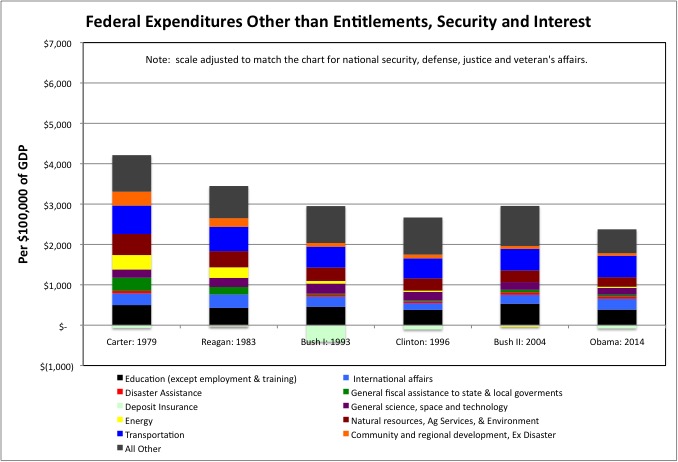
What is left is actual federal operations, which can be divided into two categories. And it is these two categories that were the subject to automatic budget cuts under the federal “sequester” in place for much of the Obama Administration.
National defense, homeland security, and services for veterans, along with the federal court system and FBI and the rest of the Justice Department, accounted for just under 23 percent of federal expenditures in FY 2014, or 4.7% of GDP. And everything else – all of it – accounted for less than 5.0% of federal expenditures, or 1.0% of GDP. Less than the interest on the national debt, even at rock bottom interest rates.
Even that is an over-estimate. Included in these categories is not only money for actual federal employees doing work today, but also money for retired federal employees no longer working. As at the state and local level, as fiscal crises have intensified and current employment has fallen, money for the retired has taken up a larger and large share of the federal budget. More and more, the federal government is paying for past spending on the military and everything else, with current spending on the military and everything else even less consequential than it seems.
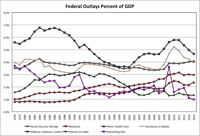
This situation has built up over the decades, and is continuing to move in the same direction. Federal expenditures, when measured as a percent of GDP, are affected by the economy, and thus the level of GDP and the share of the population that is needy, as well as changes in public policy. Even so a chart showing data for every year does give indications of the longer-term trend.
With regard to defense, federal policing and other security, expenditures increased from 5.6% of GDP in 1978 to a peak of 6.8% of GDP in FY 1983 as part of the Reagan defense build up. Expenditures then trended down to a low of 3.6% of GDP in 2000, due to three factors. Increases in GDP and in the 1980s and 1990s, which reduced the economic burden of a given level of federal expenditures. Falling spending on veteran’s benefits as the huge number of veterans from WWII began to pass on. And the “peace dividend” of lower spending on the active military, with the end of the Cold War against communism.
What followed was an increase in defense and homeland security spending in response to 9/11 and as part of the wars in Iraq and Afghanistan, driving spending in this category up to 4.6% of GDP in 2004. And then another jump to 5.8% of GDP, due to falling GDP in the Great Recession and the surge of troops in Iraq that began in 2007. With the sequester in place and the economy slowly recovering, spending in this category fell back to 4.7% of GDP in 2014.
The growth of health care spending as a percent of GDP, meanwhile, has been nearly unrelenting. With the exception of the huge late 1990s economic boom, the growth of Medicare never fell much behind the increase in GDP from FY 1978 to FY 2011, before finally backing off slightly from that year to FY 2014. Other Health Care expenditures were generally flat as a share of GDP in the 1980s, but have surged since then during recessions. Again the only significant decrease in Other Health spending as a percent of GDP, despite slow GDP growth, was between FY 2010 and FY 2013, after the passage of Obamacare.
In fact, given the rising cost of health care, our aging population making more people eligible for Medicare, the addition of a prescription drug program to Medicare under President Bush, the expansion of Medicaid to more children under President Clinton, and more and more people becoming eligible for Medicaid under pre-Obamacare rules due to the Great Recession, the increased spending under Obamacare really doesn’t even register on this chart. Unless Obamacare is the reason spending fell as a percent of GDP, which I’m not sure I believe.
Adding it up, total federal expenditures were about the same percentage of the economy (GDP) in FY 2014 as they had been in FY 1978. But health care expenditures have risen from just 9.0% of the budget in FY 1978 to 26.3% in FY 2014. At 5.3% of GDP in FY 2014, expenditures in this category are forecast to rise to nearly 6.0% of GDP in FY 2020.
While Medicare expenditures have increased relentlessly as a percent of GDP, for a long time Social Security expenditures for seniors did not. That is because with women fully integrated into the labor force, and the entire Baby Boom of working age, the retired didn’t increase that much as a percent of the population from the early 1980s to the mid-2000s despite longer lifespans. This was a period when labor force participation among people age 16 and over was at all-time highs.
Social Security increased from 3.5% of GDP in FY 1978 to 4.3% of GDP in FY 1983, when the 1983 Social Security “reform” jacked up Social Security taxes on those still working, and increased the retirement age from 65 for those born in 1938 and earlier to 67 for those born in 1960 or later. High labor force participation and a booming economy reduced Social Security expenditures to 3.3% of GDP in FY 2006. But the Baby Boomers are now retiring, GDP grown has been weak, labor force participation has plunged, and Social Security has since soared to 4.1% of GDP as of FY 2014. It is forecast to reach 4.5% of GDP in FY 2020.
The Assistance to the Needy category has had its ups and downs over the decades, rising and falling as a percent of GDP with the share of the population poor and unemployed and moving in the opposite direction of GDP. It is the broad category of expenditure most affected by the economic cycle. And yet there is a long-term trend. Since the early 1980s most peak levels of expenditure as a percent of GDP, during the worst of a recession, have been greater than or equal to the one before. Most low levels of expenditure relative to GDP, during the peak of a boom, have also been higher. So the long-term trend is up. Matching up with the fact that for most people the 2003 to 2007 economic expansion wasn’t much of a recovery, and the expansion from 2009 to today has been even worse.
The peaks for expenditures in the Assistance to the Needy category have tended to occur some years after the economy has started to recover, because modern economic recoveries take a long time to trickle down. Spending on Assistance to the Needy peaked at 4.3% of GDP in FY 1983, 3.8% of GDP in FY 1993, 3.8% of GDP in FY 2003 – and 5.2% of GDP in FY 2010. And hit bottom at 3.1% of GDP in FY 1989, 3.2% if GDP in 2000, and 3.4% of GDP in FY 2004. It was 3.9% of GDP in FY 2014, and though it probably has gone lower since.
Even so, it is likely that federal expenditures on Assistance to the Needy will bottom out at a low point that is higher than past lows. This is not because federal programs have become more generous to the poor. If anything, starting with the cuts in federal housing expenditures under President Reagan and continuing with the anti-welfare crusade of the mid-1990s, the reverse has been true. Rather, the long-term trend is up because a higher and higher share of working age Americans are becoming working poor or worse, as the share of income at the top has grown and the share in the middle has gone down. A situation that became stark starting with the Great Recession.
And what expenditures on “Everything else?” As relentlessly as federal expenditures on health care have increased as a percent of GDP, so have expenditures on most of the federal government decreased. These have become almost as cyclical as Assistance to the Needy. The huge expenditures required to bail out the Savings and Loan industry during the administration of the first President Bush, the airline industry in the wake of 9/11 during the administration of the second President Bush, and Wall Street and the auto industry during the Obama Administration, stand out as exceptions to the downward trend. Huge decreases came later in the Obama Administration, as the “Stimulus Package” expired and the “sequester” began.
Bailouts and stimulus packages aside, federal expenditures on “Everything Else” fell from 3.7% of GDP in FY 1978 to 1.5% of GDP in FY 2007 – and 1.0% of GDP in FY 2014. Most of the federal government is wasting away to nothing.
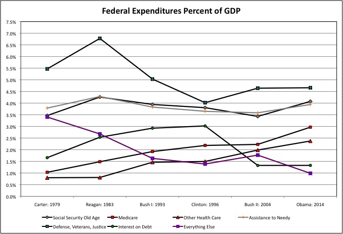
This can be seen even more clearly in our chart of benchmark years for each President only, meant to try and take the business cycle out of the presentation. Health care expenditures increase as a share of GDP for each President, with the increase sometimes concentrated in Medicare and in some cases concentrated in Other Health Care expenditures.
Expenditures on “everything else” increased slightly, and briefly, under the second President Bush, with the increase almost entirely in the Education category (a result of “No Child Left Behind”). And then resumed the downward trend, with “compassionate conservative” increase in education spending under Bush almost fully reversed by FY 2014 and only the additional federal regulations remaining from that legislation.
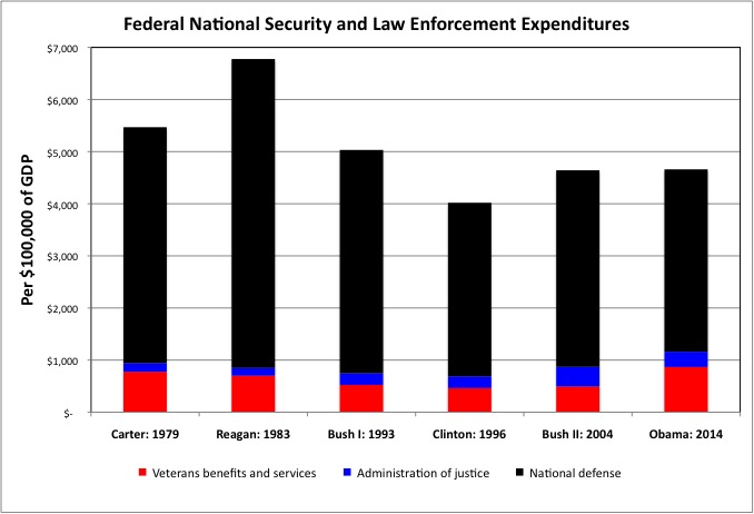
Meanwhile, despite the “end” of two wars and the sequester, National Security spending during the benchmark year for President Obama was as high as it was under the second President Bush. Why? We have not begun to pay for those wars. Yes spending on National Defense and the Department of Justice have fallen as a share of GDP. But with so many wounded and troubled former soldiers returning from the battlefield, spending on Veteran’s services has soared. Despite the passing on of the last eligible WWII veterans, many veterans of Korea, and the first of the Vietnam veterans.
Just as state and local government spending is rising, but actual public services are shrinking as money is shifted to the retired, so defense and security spending is stable but more and more military spending is going to retired and disabled veterans. The militarists may demand more money, based on what is happening to those on active duty. But in terms of what Americans are paying for defense and security, they have no greater case than the United Federation of Teachers in New York City, which is also demanding more money.
Give that the level of federal debt has soared, as shown in my first post in this series, it is only because of near zero interest rates that spending on the active military and most other federal services hasn’t been cut even more. Gross interest on the federal debt soared from 1.7% of GDP in FY 1979 under Carter to 2.9% of GDP in FY 1993 under the first President Bush. No wonder people cared, briefly, about what that national debt was doing to the American people, a phenomenon that gave us the third party campaign of Ross Perot and “Lead or Leave,” an organization of young people concerned about generational equity that appeared in 1992 and then faded into the dustbin of history. As the generation after Generation Greed turned out to be Generation Apathy.
https://en.wikipedia.org/wiki/Lead_or_Leave
With the Federal Reserve, under Alan Greenspan and then Ben Bernanke, keeping interest rates lower than they had ever been in peacetime, interest on the national debt fell to just 1.3% of GDP in FY 2004 and FY 2014. But much of the current federal debt is in short-term U.S. Treasury bills and notes that have be continually re-borrowed. The average interest rate on the gross federal debt was just 2.4% in FY 2014. It has been 4.8% as recently FY 2006. If the average interest rate were to return to that level, interest on the national debt would double to 2.6% of GDP. Although some of that is money the federal government owes to itself, it is likely that if national defense and entitlements were not slashed, spending on “Everything Else” would have to fall by – more than 100 percent – to keep the debt from exploding and eating everything else.
What is eating everything else, and certain to continue to do so, is what is often called “entitlements” but is otherwise known as “Outlays for Payments for Individuals.” Including retirement benefits for what was once a much larger federal government (and, for some reason, railroad industry). This is the subject of a separate table in the spreadsheet, in the source data, and the chart below.
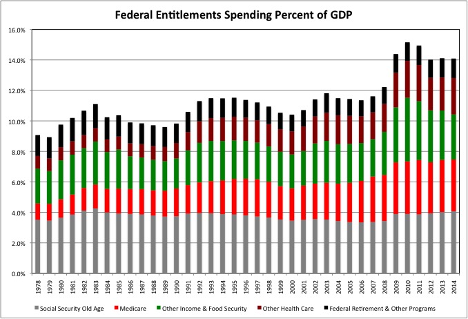
Money in from people, and money out to people. The latter has increased from 9.4% of GDP in FY 1978 to and 11.8% of GDP in FY 2004 to 14.5% of GDP in FY 2014. And it is projected to be at 15.3% of GDP in FY 2020.
The first of the Baby Boomers reached age 65 in 2012. The share of the population that is over age 65 started to increase rapidly that year and is set to continue increasing over the next decade and a half. This will cause the cost of federal old age benefits to soar.
An aging population, however, has already affected federal expenditures — based on federal disability income payments. The number of disabled workers soared from just 4.4 million in 1996 to 6.2 million in 2004 to nearly 9 million in 2014. The percent of the working age population that was disabled increased from 2.4% in 2004 to 3.3% in 2014. In 2014, only 0.1% of those under age 30 were disabled, compared with 6.6% of those age 50 to 54, 10.1% of those age 55 to 59, and 15.7% of those age 60 to the federal retirement age. So as the age wave has moved into the older but still pre-retirement age groups, this has caused about half the increase in disabled workers and federal disability payments as a percent of GDP.
The share of workers that is disabled, however, has been going up within each age group as well, aside from the youngest workers. The reasons are likely part health-related and part economic. From a health perspective, rising disability before age 65 could be the result of increasing obesity and depression. And from an economic perspective, workers who might be employable when the labor market is tight are passed over when jobs are scarce. Why give an aging worker, whose mental ability, mental health, or physical health limits their productivity, a wage and salary job with benefits. When a young college graduate could be hired to work for almost nothing for as an intern for a couple of years, and then as a freelancer with no benefits?
Of the 6.5 million disabled workers age 50 and over in 2014, 1.6 million qualified as a result of mental disabilities, and 2.4 million as a result of musculo-skelatal and connective tissue disabilities such as blown out knees, wrecked shoulders, and bad backs. The number of disabled workers in the latter category doubled from 2004 to 2014. The total number of workers with musculo-skelatal and connective tissue disabilities increased by 1.25 million from 2004 to 2014, including an increase of nearly 1.2 million for those ages 50 to 65 alone.
As the economy has recovered, total expenditures on aid to the needy have once again started to fall as a percent of GDP, as would be expected. Even so, however, some of the increase in federal expenditures on the needy, notably SNAP (food stamps) and the EITC (earned income tax credit) is permanent, as I explained here.
The New War on the Working Poor
First, from the bottom a larger share of Americans who might once have been entitled to very little under the “welfare” system have spent at least some time in the workforce over the past 20 years. Perhaps they used to hustle a few bucks working off the books, something that entitled them to nothing, but were subsequently able to land a low wage job, entitling them to unemployment insurance. That means the cost of unemployment insurance is higher that it once was, because such people would not have received it.
Second, from above American business continues to succeed in reducing the wages and benefits of most American workers, causing more and more of them to qualify for benefits for the working poor. Many of those receiving unemployment insurance, food stamps, the EITC or disability insurance today were once part of the middle class, or are the offspring of those who at one time were in the middle class. The great economic innovation of the past 30 years, the one that top executives have paid each other so much money for achieving, has been to pay U.S. workers less but still sell them more, with debts covering the difference. But the Great Recession exposed how much poorer Americans really are. They are now working poor, not middle class, and their eligibility for public benefits reflects this.
Our population is getting older. Labor force participation is down. The average worker is getting poorer. The average adult is getting fatter and sicker. There are fewer intact families and less family support. Jobs are very temporary, even among those who still have actual jobs. Unions have disappeared except in the public sector where they have become another part of the ruling class getting richer as the expense of most workers. People are moving around the country, spending childhood in one state, their working years in one or more different states, and their retirement in yet another state, leaving friends, family, church and community behind – often far behind. More people are dying early, and becoming disabled early. With a cradle to grave welfare system and an otherwise fractured society, a relationship with the federal government is becoming the only relationship most Americans will have from cradle to grave.
All these factors are likely to turn the federal government, more and more, into just an insurance company that also has an army, a government that is less and less able to accomplish much of anything else. Trying to change this long-term trend, given our economic, demographic and social conditions, would likely cause a social collapse with far more suffering and early death than is taking place already.
As my generation approaches old age and my children attempt to move into the workforce and, perhaps eventually, form new families, how do a feel about the trends in federal expenditures? These trends are alarming from a generational equity point of view. But hopeful from a government organization point of view, with the federal government focused on fewer, bigger things. The latter is good news, because the poorer generations following in the wake of Generation Greed are going to have to get the most out of the resources they have, in government and otherwise. I’ll discuss my opinions on federal trends further in my next post, the last one in this series.