
In 2014 and 2015, I compiled extensive data, and published a bunch of posts, based on Census of Governments data from the U.S. Census Bureau. One can find that data on this page.
The Latest Public Finance Spreadsheets
While Bureau only conducts a Census of Governments every five years, it conducts surveys of state and local government employment and finances every year. The survey size is generally large enough to produce estimates of the totals for the U.S. and all the states, except for some years when budget cuts prevented the work from being done. This year data for FY 2014 will be made available, and I intend to compile it for comparison with FY 2002.
The first analysis, based on recently-released data on state and local government employment and payroll, is described below. As is my custom, while the spreadsheet with the tables is linked at the end of this post, my analysis and understanding of what it means will be presented in a later post. What I’d like is for people to read the background information presented below, download the spreadsheet, look at the tables, and make up their own minds before reading what I have to say about it.
The Census Bureau’s state and local government employment and payroll data is located here.
http://www.census.gov/govs/apes/
State and local government employment and payroll is presented for the full range of state and local government functions, from Elementary and Secondary Education to Water Supply to Parks and Recreation.
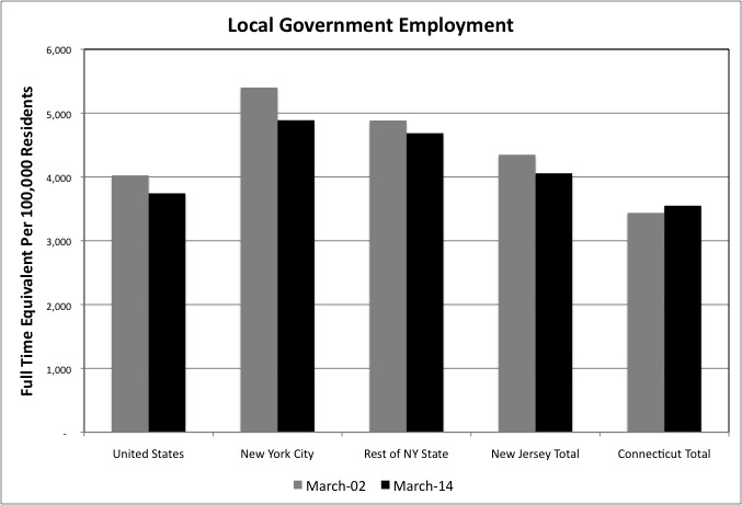
At the risk of repeating myself, and in case there is someone reading through my posts on public employment for the first time, here is the background on the data. Every five years, most recently in 2012, the U.S. Census Bureau conducts a Census of Governments, which allows data to be compiled on the employment, payroll, revenues, expenditures and debts of all the local governments, added together, in each county in the country. Because this data includes everything – municipalities, counties, school districts, other special districts – it can be directly compared with the City of New York, which is all of the above.
In non-census years, the Bureau conducts a survey of local governments, and provides estimates for all local governments totaled together for each state and the United States. That is what this data is. Individual unit data for the City of New York and Port Authority is always included as well, and this allows me to create data for New York City, and thus for the rest of the New York State by subtraction. The other data in my tables are for the United States, New Jersey, and Connecticut.
Several adjustments are required to make comparisons between these areas meaningful.
First, I have divided up the Port Authority employment and payroll between New York City (and state) and New Jersey, adjusting state totals accordingly (the Census Bureau assigns the whole agency, including operations in New Jersey, to NYC local government). I assign 2/3 of Port Authority Air Transportation employment and payroll to New York City, and 2/3 of the agency’s Water Transportation employment and payroll to New Jersey, etc.
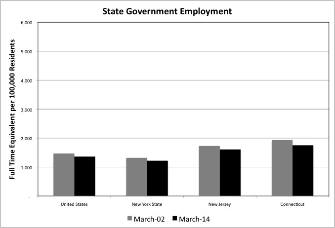
Second, the division of responsibilities between state and local government in different places has to be accounted for, to the extent it can be. Most transit agencies are classified as “local government,” but those in New Jersey and the portion of New York State outside New York City are generally classified as “state government.” I add that employment back to the local government totals for these areas. New Jersey and some other states have taken over local elementary and secondary schools in some cities, also classifying their employment and payroll as “state government.” To make the per-capita figures comparable with New York City, I re-classify that data as local government also.
Third, the government often acts through the contracts with the private and non-profit sectors, and some private industries substitute for what is generally public employment. Additional data is thus required to show the additional workers funded by state and local government spending, and the private employment that substitutes for what is public employment elsewhere.
In general the health care and social services sectors are mostly funded by federal, state and local government programs or subsidies. So is the heavy construction (infrastructure) industry.
Some people substitute public schools for private schools. In some places solid waste collection is contracted out by local governments, or paid for individually by customers, rather than having public sanitation workers pick up the trash. Some places have public water and sewer, others have private water and septic service. The City of New York subsidizes non-profits to run its museums, zoos, and even some of its parks, while elsewhere public employees do the work. Comparable private employment is provided in each of these categories to make the picture complete.
For example, in FY 2014 New York City had 588 Transit employees per 100,000 residents, far above the national average of 74, but that is because New York City has a lot of mass transit. On the other hand, the city had only 462 employees per 100,000 residents in industries related to the private automobile, compared with a national average of 1,313. What New Yorkers must pay, in taxes and fares, to support all those government transit workers is offset through the ownership and use of fewer private cars. As we shall see, however, that isn’t true in the hospitals industry.
The private sector data used was downloaded from the Bureau of Labor Statistics, from the Quarterly Census of Employment and Wages.
http://www.bls.gov/cew/
This private sector data it isn’t completely compatible with the public employment data from the U.S. Census Bureau, because the Census Bureau data is for “full time equivalent” employment, with part time workers added up to a smaller number of full time workers in proportion to their hours. In the private sector data presented, each worker counts as one, whether full time or part time. Still, placing the private sector data on the same page as the public sector data gives a more complete picture of the scope of state and local government activity.
In the data as presented, I divide full time equivalent employment by each state or area’s population to get the number of state and local government employees in each category per 100,000 residents, using population estimates from the U go to the website.S. Bureau of Economic Analysis. For Elementary and Secondary Education employment, I also include a comparison between New York City and the rest of New York State based on the number of students, as reported by the New York State Department of Education. Student enrollment data for the U.S., New Jersey, Connecticut and other states will be available from another Census Bureau dataset later this year.
What I am prepared to say about what my analysis shows, before getting into function-by-function detail, is that in the United States, New York City, the Rest of New York State and New Jersey – and probably elsewhere – state and local government employment decreased relative to population from FY 2002 to FY 2014. In some cases substantially.
Same scale.
States and localities have faced rising Medicaid, pension and employee and retiree health insurance costs in recent years. In many cases public employees were getting richer, in particular due to increased retirement benefits. Most Americans, on the other hand, have gotten poorer, and this decreases their income, consumer spending and property values. Which puts downward pressure on state income tax revenues, local property tax revenues, and sales tax revenues for both levels of government. While some places, notably New York City and State, increased tax rates to make up for this, other places did not. Poorer private sector workers can thus afford fewer public sector workers to serve them, relative to their level of population.
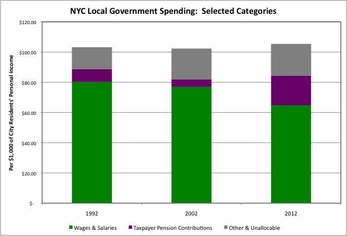
As I noted in my review of public finance, NYC residents are spending about the same share of their income on public employees as they did 20 years ago, but a rising share of that money is going to pension and health care benefits (which shows up as “other expenditures” in Census Bureau data). That leaves less money for cash pay, and thus leads to fewer public employees.
In places where the population is growing, as in NYC, sometimes the ratio of public employment to population fell only because public employment did not keep up with population growth. In places where the population is stagnant or falling, however, the number of state and local government workers fell in absolute numbers.
In some cases it could be argued that fewer public employees are needed. School enrollment is falling in many places as the large “Baby Boom Echo” generation reaches adulthood, reducing the need for teachers. In other cases rising population without rising public employment has diminished public services, as on the New York City subway. I’ll go over the trends for each government function, and link back to the more detailed discussions based on Census of Governments data, in the next post.
For average (mean) payroll per worker, I’ve have calculated the percent more or less than the national average each category of public employee was paid in March 2014. The data is total payroll divided by the number of full time equivalent employees that March. These figures are not really comparable unless one considers the higher cost of living (associated with higher average private sector wages) in Downstate New York, most relevantly with the high-paid finance sector excluded.
The data for “Rest of New York State” is fairly useful for local government employment, but not useful for average pay because the cost of living in two areas of the rest of the state – the affluent Downstate Suburbs and Upstate New York, are so different. For FY 2012, thanks to the more detailed data available from the Census of Governments, I was able to tabulate employment and payroll data for these areas separately.
When making comparisons based on pay per employee, remember the following.
First, a lower employment level per 100,000 people is often associated with high average pay, because the low employment level is indicative of work contracted out. For example, the Port Authority of New York and New Jersey has very few actual employees in the Air Transportation function, and these are paid a lot of money. That is because they are mostly high level contract managers, with private companies doing most of the work of actually running the airports.
Second, average pay often rises when local government employment decreases, and falls when local government employment increases. This is because most public employees get automatic increases in wages during their careers, eventually receiving promotions away from having to provide direct services – by patrolling the streets or teaching in a classroom for example. In a fiscal crunch new, low-paid workers are either not hired or perhaps laid off, leaving higher paid workers still on the job and thus increasing average pay. When tax revenues roll in, on the other hand, hiring accelerates and a larger share of the workforce is in its low-paid early years.
Third, in some places teachers are paid only during the school year but in NYC school year pay is averaged over the entire year. That makes NYC’s pay seem lower compared with other places in March than it is in reality over a year.
This database doesn’t just compare state and local government employment and payroll from place to place, but also does so from one time to the next. The year I have chosen for comparison with FY 2014 is FY 2002.
That comparison is imperfect. While 2014 (and 2016) are about as good as the economy is going to get in the “new normal,” 2002 was a recession year. March 2002 was also just five months after 9/11, and the average pay of NYC police officers, firefighters and sanitation workers that month was inflated by post-9/11 overtime. For these functions, the FY 2002 pay per employee data is therefore not meaningful for comparison.
I have nonetheless decided to compare FY 2014 data with FY 2002 because doing so allows a comparison between the last NYC budget before the start of the Bloomberg Administration, and the last Bloomberg budget.
The spreadsheet with the data is here.
You’ll see several tabs on the bottom, with the data as downloaded, an employment table and an average pay table for “local” government, and an employment table and an average pay table for “state” government. Along with the charts included above.
A more complete dataset of the private sector data I downloaded is here, in case anyone wants to use to analyze the health care and social services sectors in more detail.
Covered Employment Gov-Related-14
Bear in mind that the payroll data in that dataset is for the entire year of 2014, rather than just for March alone as in the Census Bureau’s data. According to the Census Bureau, the average (cash) payroll per full time equivalent employee in New York City for local government elementary and secondary education was $5,189 for the MONTH of March. According to the Bureau of Labor Statistics, the average (cash) payroll per employee (whether full time or part time) in New York City for private elementary and secondary schools was $51,310 for the YEAR of 2014. This is an example of the many types of comparisons the data can be used for, over and above those I intend to make myself.