
Data from the U.S. Census Bureau’s American Community Survey (ACS) data was released a couple of weeks ago, and I’m surprised how little coverage of its findings there has been in the media. Most of what I have read, moreover, compared 2015 with 2014, or with 2010, and finds that the economy is getting much better for many Americans.
That, however, is not a meaningful comparison if one is looking to the long term, or trying to explain why so many Americans feel so much worse off. One would expect that people would become better off in the recovery from a deep recession, or worse off in the aftermath of the peak of a bubble. Politicians, seeking to make points for their sides, often base their talking points on data from such non-comparable years, but that is disingenuous. As it happens, there are enough economic similarities between the first year of American Community Survey data, in 2005, and the latest year, 2015, to make a comparison between them meaningful. What follows is a discussion, with 26 charts, of the economic trends I found most interesting from that comparison – for the United States, New York City, and New York State, New Jersey and Connecticut. Let’s take a break from the fantasy and deception of politics and look at some reality.
The data is taken from the “Selected Economic Characteristics” summary tables of ACS data, as found on American Factfinder.
http://factfinder.census.gov/faces/nav/jsf/pages/index.xhtml
The summary tables DP01 to DP04 are not yet front and center on this site for 2015, but one can find them by selected the ACS for the data source and searching for them. “Selected Economic Characteristics” is DP03. A spreadsheet with the data as downloaded, and “output” table comparing 2005 with 2015, and all the charts used in the rest of this post, is here.
Someone else looking at the output table might find other trends of interest that I have not chosen to highlight. That table includes everything. And it wouldn’t be that hard to use American Factfinder to download and compare these places using the Democratic, Social, and Housing characteristics data or to compare individual NYC boroughs or other areas. In any event, my quick and dirty discussion follows.
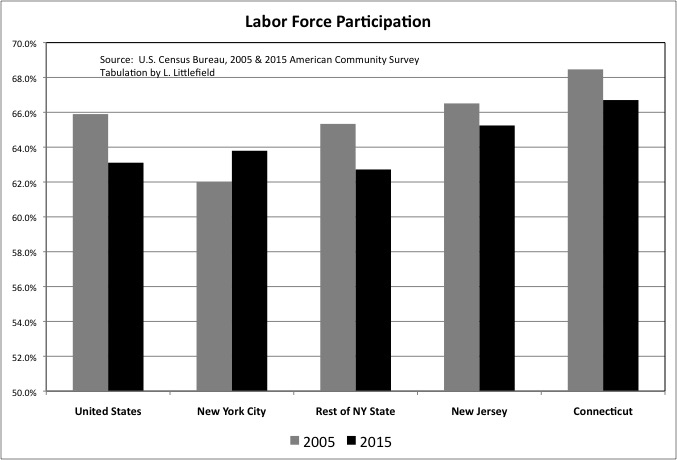
One of the most discussed trends of the past decade has been the decline of labor force participation, as the large Baby Boom generation retires and many long-unemployed workers give up looking for jobs and drop out. ACS data shows New York City bucked the trend and now, after decades of having a reputation as a place where people lived off the government rather than working, has a higher labor force participation rate than the rest of New York State and the U.S. as a whole, while still trailing New Jersey and Connecticut. Note that this data, and the rest, is by place of residence, for those living in NYC not all those working in NYC.
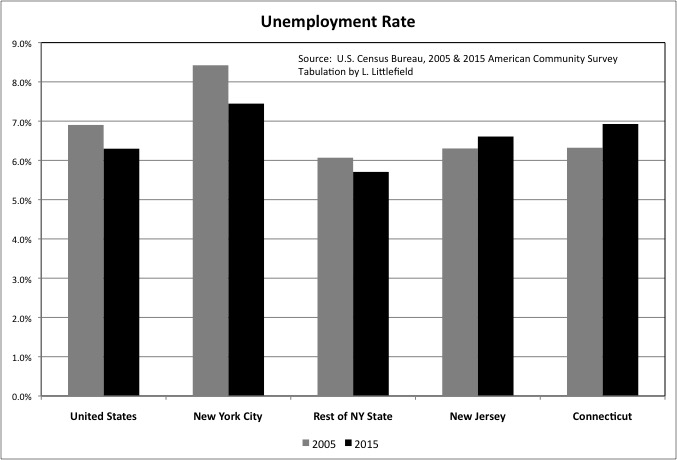
Falling labor force participation has taken the gleam off a falling unemployment rate in the U.S. as a whole, since the share of the population actually working is still lower. Nationally what used to be called the “misery index” – inflation plus unemployment – is at an all time low, but people are still miserable for reasons discussed later. Unemployment, moreover, was higher in 2015 than it had been in 2005 in both New Jersey and Connecticut.
The self-reported unemployment of the ACS is always higher than the official unemployment rate reported by the Bureau of Labor Statistics. The BLS will count you as out of the labor force, rather than unemployed, unless you are taking specific steps to find a job.
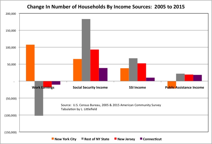
With more city residents active in the work economy, the number of NYC households with earnings from work was more than 100,000 higher in 2015 than it had been in 2005. In the rest of New York State the number of households with work earnings was lower by 100,000, with smaller decreases in New Jersey and Connecticut.
Showing the impact of aging boomers, the number of households with Social Security (old age) income increased by 22.9% in the United States, compared with 9.1% in New York City, 14.9% in the Rest of New York State, 10.7% in New Jersey, and 10.4% in Connecticut.
More and more households are collecting Social Security disability income (Supplementary Security Income — SSI) as well, in part because many aging workers are no longer economically active but have not yet reached the age for old age Social Security benefits. The number of households with SSI income increased by 49.2% in the U.S., compared with 18.3% in New York City, 43.4% for the Rest of New York State, 55.6% for New Jersey, and 49.2% for Connecticut.
Meanwhile, the number of New York City households with income from traditional “welfare” sources was lower in 2015 than it had been in 2005, extending the decline of the prior ten years.
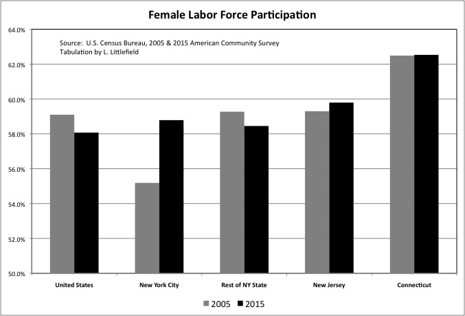
Just as today, prior to the 1960s New York City adult residents had also been more likely to be active in the workforce than the U.S. average, and the key reason was that NYC women were more likely to work outside the home. So it is no surprise that a surge in female labor force participation has been a big factor in the city once again having a higher labor force participation rate than the U.S. and the rest of NY State. NYC women still trail those in Connecticut and New Jersey when it comes to working and seeking work outside the home.
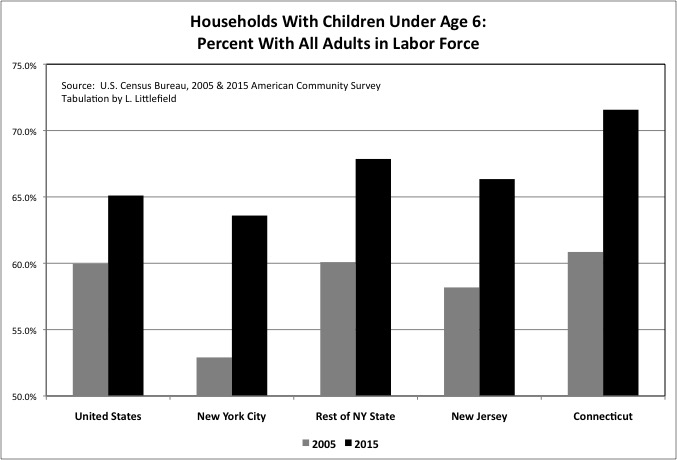
While more and more boomers head off to long retirements younger generations will never see, the share of households with children under age 6 that have all adults in the workforce continues to rise. New York City, in particular, had a huge increase, one reason that city parents presumably appreciate the city’s universal pre-school program.
The gap in labor force participation between pre-school parents and those with school-age parents (ages 6 to 17) is closing, though it has not closed completely. In the U.S. as a whole 65.1% of households with children under age 6 have all adults in the labor force, compared with 70.3% for those with children ages 6 to 17. For NYC the figures are 63.6% and 66.9% respectively.
The increase in labor force participation by pre-school parents surprises me, because I recall reading that millennial women (not to mention men) are more likely that the Boomers to stay at home with the children. Perhaps that trend is only a reality for affluent people known to the media, with everyone else having to do more and more work by necessity.
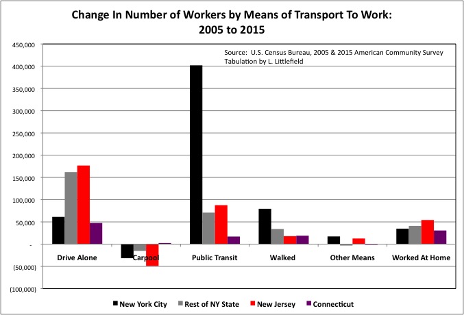
Millennials famously are more likely to have a preference for an urban, non-driving lifestyle compared with prior generations, and the share of workers driving alone to work was somewhat lower in 2015 than it had been in 2005 in the U.S. as a whole and throughout the Northeast. Even with that lower share, however, with the total number of workers rising the number of NYC residents driving along to work still increased by 61,300 in absolute numbers, with larger increases in the Rest of New York State, New Jersey and Connecticut.
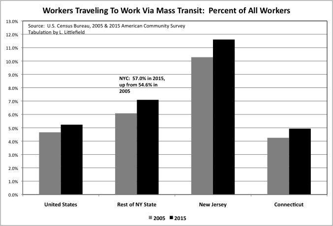
The preferences of today’s young adults mean that the share traveling to work by mass transit is rising in the U.S. as a whole, around the tri-state area, and in much of the country. Even as transit service is being gutted due to soaring public employee pension costs, past debts, and inadequate past infrastructure investment left behind by more affluent, preceding generations.
In New York City, where 57.0% of resident workers used mass transit in 2015, the number doing so was up by 402,000 from 2005. The NYC percentage is too high to show on the same chart as other areas. It is likely that many of the additional workers residing in the Rest of New York State, New Jersey and Connecticut and using mass transit (up 70,900, 87,600 and 17,100 respectively) are traveling to jobs in NYC, although reverse transit commuting and transit commuting within the suburbs have also increased.
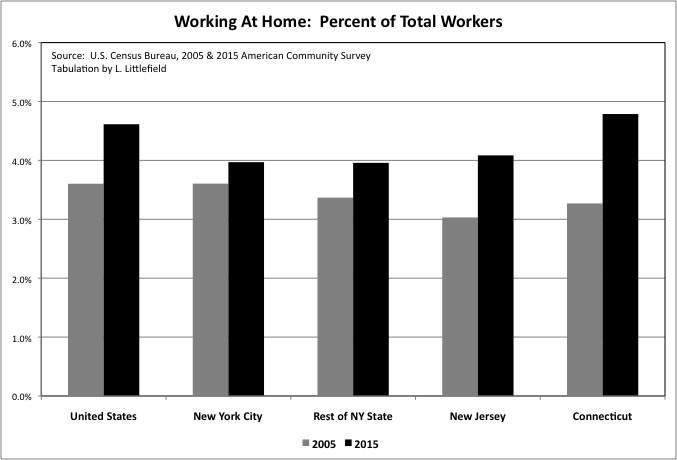
An increase in working at home is another trend associated with younger generations and internet technology, but in this case the data shows NYC trailing the U.S. and Connecticut and merely matching the Rest of New York State and New Jersey. It turns out that many seek the social aspect of working, one reason that even independent workers are renting workspaces from growing companies such as WeWork.com.
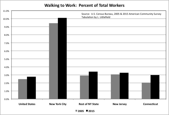
The share of workers who are walking to work is also on the rise, albeit to only 3 percent of workers in most places. In New York City, whose density puts more job opportunities in walking distance, more than 10 percent of all workers now walk to work.
One “dog that did not bark” involves the number of people using “Other Means” to travel to work, which would include both Uber and Lyft (and other taxi and car services) and bicycling. This increased by just 17,300 in New York City from 2005 to 2015 according to ACS data, while falling in the Rest of New York State. Riding a bicycle at a moderate speed requires about the same amount of effort as walking, but is times as fast. That means that three times as many destinations are within bicycling distance as are within walking distance at the same travel time, and bicycling should, in theory, be three up to three times as popular as walking.
As for the Uber boom, for nearly all workers the cost of a paid taxi ride is too high to be used for a regular commute, App or no App. Uber and Lyft, in my view, are only useful for the wealthy and for non-work trips.
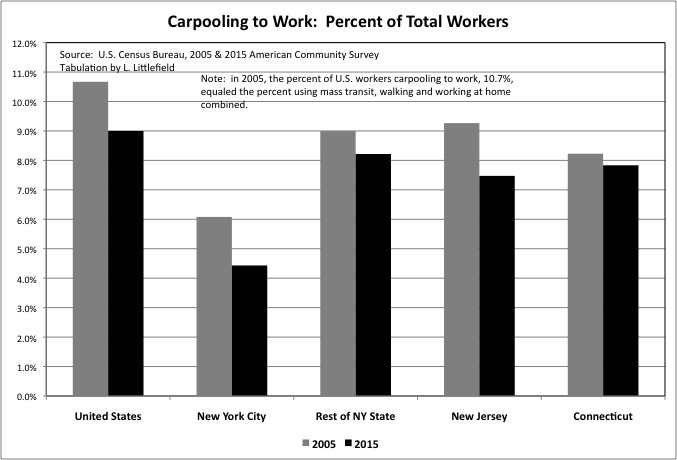
What is affordable to the middle class is carpooling, but for this type of commuting the trend is decidedly negative and has been for decades. To put the importance of this in perspective, 2005 the share of U.S. workers that traveled to work via carpool, at 10.7%, was still as high as the share traveling via mass transit and walking and working at home put together. By 2015 only 9.0% of U.S. workers traveled to work via carpool, and the share doing so fell in the Tri-State area was well. In the suburbs, where most Americans live and densities are too low for economically and environmentally efficient mass transit, carpooling and bicycles are the most realistic alternatives to driving alone.
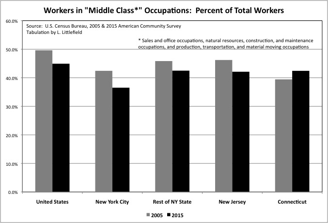
One reason for the decrease in carpooling may be the decrease in the share of the workforce in occupational categories I have grouped as “middle class”: sales and office occupations, natural resources, construction, and maintenance occupations, and production, transportation, and material moving occupations. In general these are occupations that require at least a high school education and some additional training or a college diploma, but not a post-graduate degree or some special gift. They tend to pay middle wages.
And, relevant to the decline in carpooling, they tend to provide steady, predictable schedules that allow co-workers to share rides. Fewer workers have such predictable schedules, and unpredictable schedules also reduce the ability to use carpools for non-work trips. To reverse the decline in carpooling, and thus reduce the cost of living by increasing the share of households that don’t need a car or can have just one rather than two or more, would require some form of “dynamic carpooling” that uses information technology to arrange a different carpool for every trip. I discussed this issue in this post.
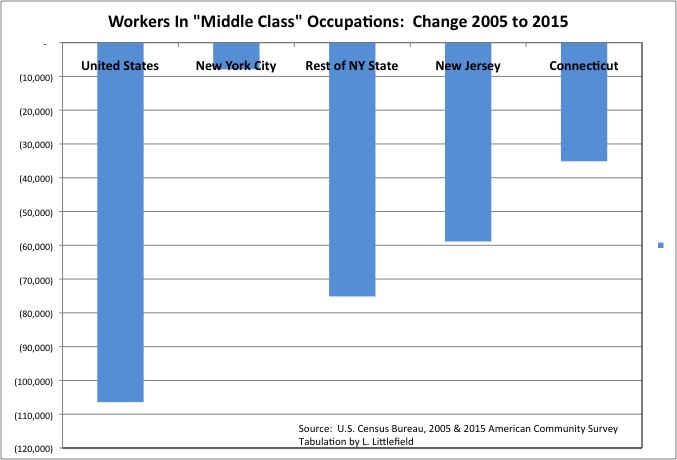
It isn’t just the share of total workers in “middle class” occupations that was lower in 2015 that it had been in 2005, it was their absolute number – by more than 100,000 in the U.S. as a whole, 75,140 in the Rest of New York State, 58,900 in New Jersey and 35,100 in Connecticut.
For the U.S. the big decrease in workers in “middle class” occupations – of more than 1 million – was in “natural resources, construction, and maintenance occupations.” Employment in the construction industry decreased due to the bursting of the housing bubble, the densification of workers in office space and falling office space demand, the rise in the internet and decrease in demand for brick and mortar retail space, and falling infrastructure investment. Manufacturing industry employment also fell, as many goods that the U.S. produces rather than imports are also linked to the maintenance and expansion of the built environment. The number of U.S. workers in “sales and office” occupations was slightly higher in 2015 than 2005, despite the advance of information technology, but it was down by 33,200 in the Rest of New York State, 66,500 in New Jersey, and 11,100 in Connecticut. .
“Middle class” jobs have been leaving New York City for places with lower labor and real estate costs for decades. Back offices linked to NYC companies, and production and warehouse operations serving NYC consumers, are often found in the surrounding suburbs. And even when “middle class” jobs are located in the city, suburbanites who commute in tend to hold them, as city residents are more likely to hold post-graduate degrees or have special talents – and are also more likely to have little education and no training at all. Due in part to a school system designed to shift some children to gifted programs and selective high schools while depositing the rest in the social landfill.
During the 2005 to 2015 period, however, the city’s economy grew fast enough that the number of city residents holding jobs in “middle class” occupations fell only slightly. It seems that only slightly fewer “middle class” people, perhaps those from elsewhere, chose to live here.
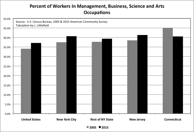
While less likely to work in “middle class” occupations, city residents are more likely than the U.S. average to work in high-skill, high-pay “management, business, science, and arts occupations.” The absolute increase in the number of NYC residents working in those occupations was 336,158 from 2005 to 2015, a stunning gain.
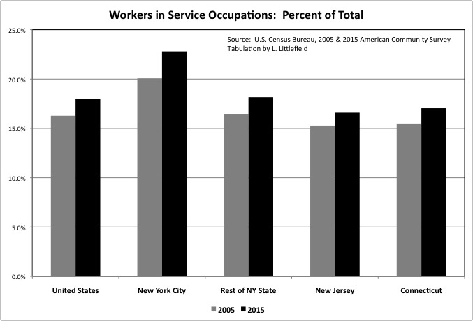
With some exceptions, workers in “Service” occupations require the least amount of education and training and earn the least amount of money. Just looking at a quick table of U.S. data from the 2015 ACS, the median earnings of workers in “management, business, science and arts” occupations was $62,255, compared with $37,397 for “sales and office” occupations, $40,928 for “natural resources, construction and maintenance” occupations, $36,820 for “production and material moving” occupations – and just $26,834 for “service” occupations. “Service” workers include “protective service” occupations such as police and fire, with the median earnings of $50,594; the median earnings in other service categories is even lower.
The share of workers in low-paid “service” occupations, like those in high-paid management, business, science, and arts occupations,” has been going up in the U.S. and throughout the Tri-State area. A relatively high share of NYC residents are in service occupations, at 22.8%. The number of city residents working in service occupations increased by 222,300 from 2005 to 2015. The direction of the U.S. economy, and even more so the NYC economy, could be described as more people and the top and more people at the bottom who serve them.
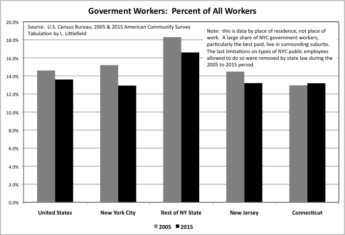
According to the Census Bureau’s “Class of Worker” data, most workers are private wage and salary earners: 80.3% for the United States, 80.4% for New York City, each up a couple of percent between 2005 and 2015. The share of workers who are government employment fell over those years, from 14.6% in 2005 to 13.6% in 2015 in the U.S. as a whole, as the soaring cost of retired public employees reduce the number of active workers taxpayers could afford. The trend of a decreasing government share of workers was repeated for NYC, the rest of New York State, and New Jersey during these years. But with slower employment growth overall, in these places the number of government workers actually fell in absolute numbers by 9,300 in NYC, 49,300 in the Rest of New York State, and 17,900 in New Jersey.
This is data by place of residence, not place of work. Government accounts for a smaller share of the employment of NYC residents, in part, because many NYC government jobs are held by residents of the suburbs. Local governments elsewhere in the state are allowed to require their workers to live in their community, and provide hiring preference for those who already live there. But the City of New York NYC has been prohibited from enacting residency requirements by New York State legislation enacted over the decades.
The first NYC public employees allowed by state legislation to live outside the city, in places with a lower total tax burden and better public services, were the best paid – teachers, police officers, firefighters, and transit workers. That was in the early 1960s, just before the crime rate soared, the transit system collapsed, and the school system also collapsed. I’d call that insider trading. Between 2005 and 2015 that privilege was extended to the rest of the workforce, with the state first allowing sanitation workers to live outside the city over the City of New York’s objection, and then the city acquiescing to a state law prohibiting residency requirements for the rest of the city’s workforce. And the share of NYC resident workers with government jobs fell from 15.2% in 2005 t 12.9% in 2015.
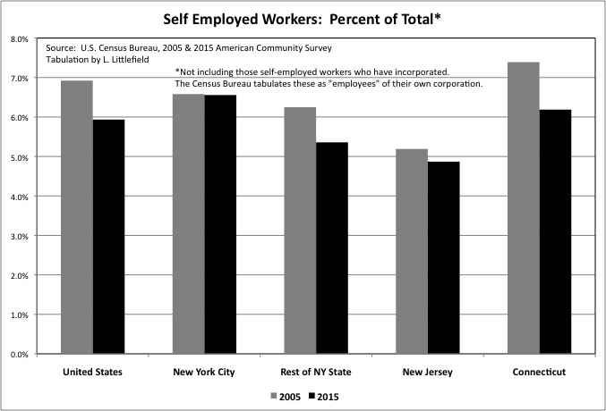
One of the much discussed labor trends of recent years has been the rise of the “gig” economy, with more and more workers laboring as freelancers, independent contractors, or entrepreneurs. According to the ACS, however, self-employed workers in the U.S., self-described, dropped from 6.9% of U.S. workers in 2005 to just 5.9% in 2015. U.S. self-employment fell by 511,000 in absolute numbers over the decade. Self-employment also dropped from 6.2% of workers to 5.4% to the Rest of New York State, from 5.2% to just 4.9% in New Jersey, and from 7.4% to 6.2% in Connecticut. Only NYC bucked the trend, with the share remaining at 6.6% (now far more than those other areas) and the absolute number rising by 35,300.
This could mean a variety of things. First, self-employment as measured by the U.S. Census Bureau has always been lower than self-employment as measured by the Bureau of Economic Analysis, based on the number of people filing IRS 2014 Tax Schedule C – “profit or loss from a business.” For thing, the Census Bureau tabulates self-employed workers who have incorporated as wage and salary “employees” of their own corporations, which may be technically correct in an accounting sense but I believe is incorrect as a matter of social statistics. For another thing those who are both wage and salary workers and self employed, a waitress who is also a self-employed actress to take a stereotypical example, is counted as both by the BEA but just one by the Census Bureau.
There is also the varying nature of self-employment. Some are self-employed because they are entrepreneurs or value the freedom of working for themselves. Others because they are powerless in the labor market and, though employees in all but name, are classified as “independent contractors” so the employer can avoid legally mandated benefits for employees, such as paying Social Security taxes and Obamacare.
In the latter case falling self-employment may be good news. Crackdowns on misclassifying employees may be working. Or, with more workers retiring and fewer unemployed, employers may have decided that locking in workers – rather than having them make daily comparisons with what they could be getting paid by other employers – may now be the employer’s interest. Whereas before they believed that paying people only as needed was better for business, because another desperate worker would always be available the next day.
It may also be, however, that entrepreneurship and creativity are on the wane, with fewer new businesses and more powerful and potentially abusive oligopolies in more and more industries. The data implies the number of new businesses with one or more employees has been falling, as I discussed here.
The American and New York Economy: Stagnation and Oligarchy or Renewal and Entrepreneurship?
So why are people unhappy if the “misery index” is low? Income.
Coverage of the 2015 American Community Survey has focused on the big increase in income in 2015 compared with 2014, a trend trumpeted by the Obama Administration. But, as mentioned, that is not unexpected in an economic recovery. The question is, what took so long?
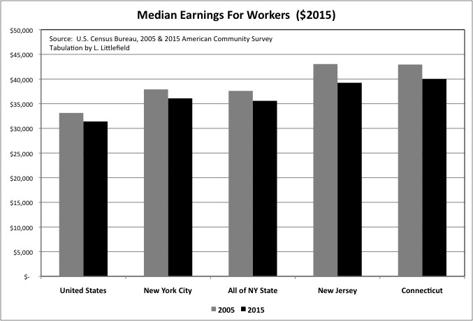
When 2015 is instead compared with 2005, a similar year with regard to the business cycle, one finds that the inflation-adjusted median work earnings of workers has fallen – by 5.2% for the U.S., 4.8% for New York City, a stunning 8.8% in New Jersey, 6.8% in Connecticut — and 5.4% for New York State as a whole. (I can’t calculate a median for the “Rest of New York State,” but given that the drop in the state as a whole is much higher than the drop for NYC, clearly the drop for the portion of NY State outside NYC is higher still).
What if we find from next year’s ACS that there was another big increase in income in 2016, compared with 2015? In that case, the proper comparison would not be 2015 or even 2005 but rather with 2006, another year into the prior recovery. And 2017, if income is still rising, should be compared with 2007, the peak of the last economic cycle. If you look beyond the business cycle, the long-term work earnings trend is negative.
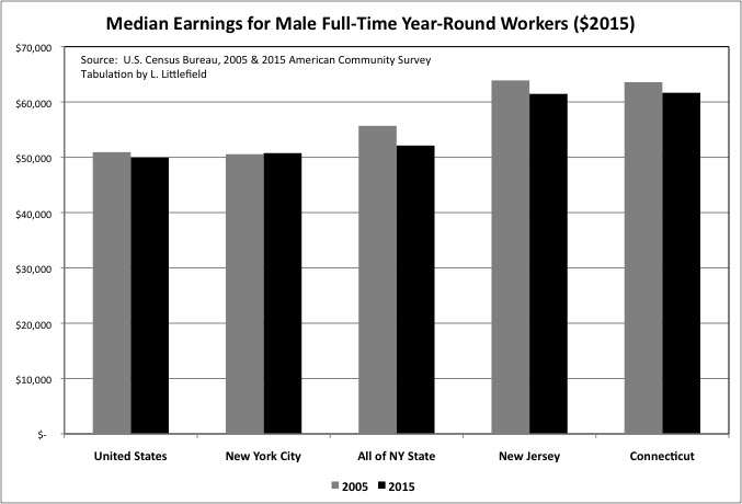
Even if the gig economy is going away, the loss of steady work still seems to be a negative for workers. For U.S. and New York City, those able to work full time rather than part time, and to avoid being idled part of the year, have not experienced as much of a decline in income. The median earnings of U.S. male full-time, year-round workers was only 1.9% lower in 2015 than it had been in 2005, while in NYC male earnings increased 0.4%. But even if male full-time, year-round earnings have not fallen that much in the U.S. as a whole, it has fallen quite a bit in many states and metro areas. The decreases were 3.8% in New Jersey and 3.0% in Connecticut over a decade.
The “Mancession” aspect of the Great Recession, with employment declines in traditionally male industries such as Construction, probably contributed to this trend. Nationally, this was partially offset by a surprising increase of 522,900 jobs in the “Agriculture, Forestry, Fishing and Hunting, and Mining” sector, driven in large part by the “fracking” boom in oil and gas production. With OPEC slashing prices, however, that boom is also now going in reverse.
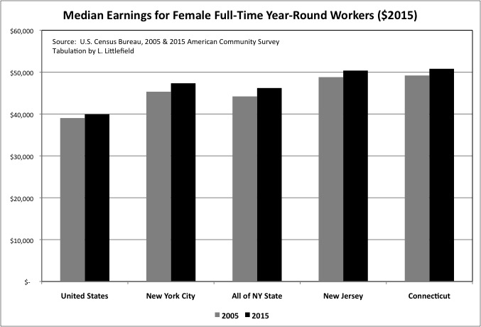
The inflation-adjusted work earnings for females working full-time and year-round has been rising long term, and also increased from 2005 to 2015. But it may be that fewer women were able to achieve full-time, year-round status. The bottom line: despite the earnings gains of women working full-time year-round, the median earnings of workers have fallen over this economic cycle. And the one before. And probably the one before that, too.
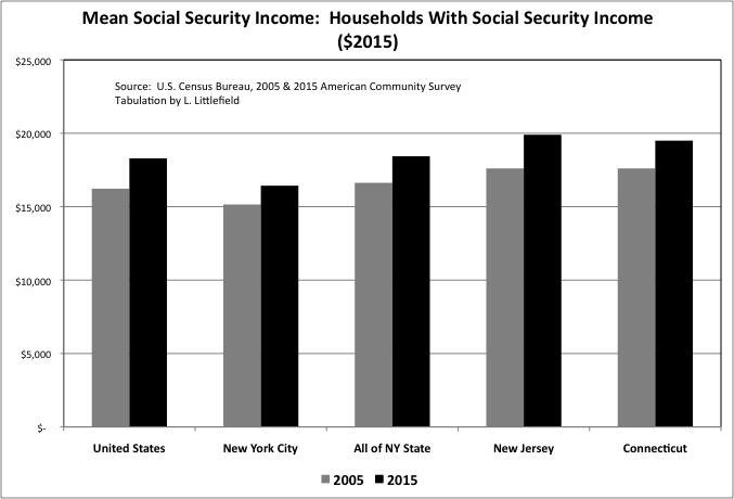
Meanwhile, the mean Social Security old age income of households who received it increased from 2005 to 2015, adjusted for inflation. During this decade members of the less well off “Greatest Generation” were dying off, and members of the “Richest Generations” – those born between 1930 and the late 1950s – were moving into retirement. Based on their higher career earnings and, for Baby Boomers, increased number of two-income workers, those now retired are entitled to receive more in Social Security benefit payments. And yet seniors have been some of the most vocal disenchanted Americans during the past few years.
Among the most recent retirees, it is likely that income other than Social Security income is falling. In part due to the zero interest rates on their savings needed to keep the value of paper assets – including their own – from collapsing. In part because they are less likely than retired members of the Greatest Generation to have a lot of savings to begin with.
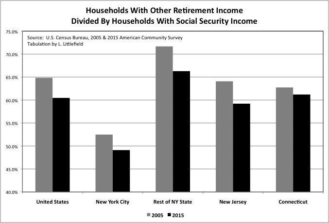
Because people can receive other retirement income, such as pensions, annuities, and 401K and IRA withdrawals before collecting Social Security, we can’t calculate the actual share of Social Security recipients that also have other retirement income. But by dividing the number of households with other retirement income by the number of households with Social Security income, we can get an idea.
It has been said that only half of current workers have anything other than Social Security coming to them when they get old, but that may not be much of a change. For the U.S. as a whole the number of U.S. households with other retirement income was only about 65 percent of the number of households households with Social Security income in 2005. Noted Robert Shiller in Phishing for Phools, not counting work income and other transfers such as veteran’s benefits, Social Security accounts for 94 percent of the total income of the 20 percent worst off people now over 65, 92 percent of the income for the next fifth in the income distribution, 82 percent of the income of the middle fifth of the income distribution, and 57 percent the income of those in the 60th to 80th percentiles. “Only for the top 20 percent is Social Security less than half of unearned income. But even for this top category, skewed as it is inclusion of the well-pensioned and very rich, it is far from a do-without; it is still 31 percent.”
This isn’t getting better, as the generations on the wrong end of multi-tier contracts reach old age. The number of U.S. households with other retirement income as a share of households with Social Security income fell from 64.8% in 2005 to just 60.5% in 2015. Presumably not because those already receiving pension, annuity and retirement account income stopped getting it, but rather because fewer recent retirees have other income compared with the generations that are dying off. Similar declines were observed in New York City, the Rest of New York State, New Jersey and Connecticut. According to Bloomberg News:
http://www.bloomberg.com/view/articles/2016-07-19/why-trump-s-prosperous-supporters-are-angry-too
Here is an unsettling statistic about the U.S. economy, although like many scary things, it reveals its full problematic nature only with scrutiny: “The Center for Retirement Research at Boston College reports that for those on the cusp of retirement – workers between the ages of 55 and 64 – the median balance in household 401(k) or IRA accounts is $111,000.” That is from the new Oxford University Press book “Empire of the Fund: The Way We Save Now,” by William A. Birdthistle, a law professor at Chicago-Kent College of Law.
These days, the 20-year retirement is extremely common, and savings must hold for longer yet for those who will live to 90 or 100 years old. For a 20-year retirement, that $111,000 in savings can work out, under plausible assumptions, to no more than $7,300 a year. And that is the median, so half of America’s older workers are in a worse situation.
This is the consequence of low savings of the past 35 years, as Americans attempted to maintain – or even increase – their standard of living even as they were paid less by their employers.
In the 1970s, a much poorer America had a savings rate that once reached 15 percent and hovered above 8 percent as recently as the early 1990s. Since then the American savings rate has fallen and has settled in the range of about 4 to 6 percent.
As for today’s 45-to-69-year-olds, only 36 percent claim to be engaging in net savings. And only 45 percent of all people earning $75,000 to $100,000 a year claim to have net positive savings, as measured in 2012. That helps explain why the typical Trump voter in the Republican primaries earned a relatively high income of about $72,000 a year and still worried about his or her economic future.
The savings problem thus is about the scarce virtues of temperament, patience, and discipline. American savings rates started to fall in the 1980s, and rising asset prices during that time set a problematic dynamic in motion. As homes and stock portfolios rose in value, many Americans concluded they didn’t have to lay aside much for their nest eggs. Asset markets would do their savings for them.
Unfortunately, the same dynamic of selling affected the political preference for tax cuts rather than setting aside the money needed to pay for Social Security when the Baby Boomers retire, or for public employee pensions.
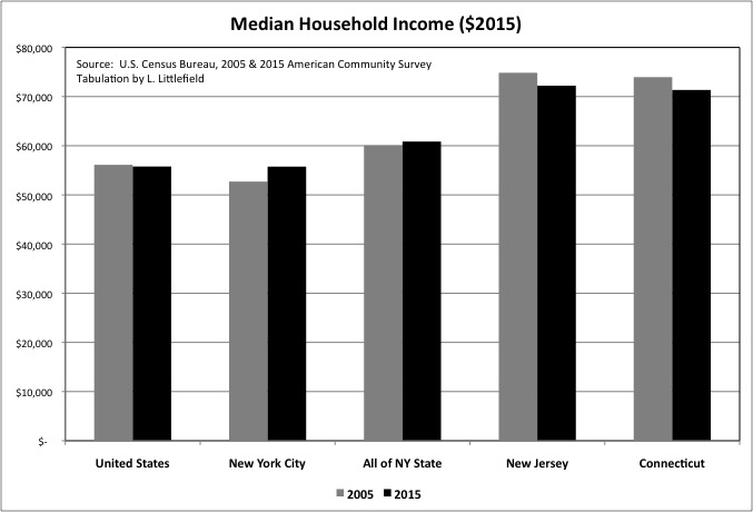
Despite both work earnings and retirement earnings falling, U.S. median household income was only slightly lower, by 0.6%, in 2015 than it had been in 2005, after adjustment for inflation. That may be because more people are choosing to live in larger households, with more income sources with only household by those doubled up with parents, children, or roommates to save money.
Median household income increased by 5.8% in New York City over those years, to about the national average (though with a higher cost of living and, in particular, housing). In New York State as a whole, however, median household income increased just 1.3%, implying a decrease in the portions of the state outside New York City. Median household income fell 3.5% in both Connecticut and New Jersey, albeit to and from very high levels.
With median household income falling slightly for the U.S. as a whole over the cycle, it is fair to assume that many places suffered decreases offset by other places with increases. Perhaps half of all Americans and American communities are worse off, perhaps more. And income doesn’t capture the decrease in spending power, because for nearly 30 years Americans had enjoyed a phony prosperity by failing to save for retirement and running up their debts.
http://www.bloomberg.com/news/articles/2016-04-01/the-credit-collapse-opened-the-door-for-trump-and-sanders
Americans lost so much in 2008 — jobs and homes, incomes and wealth — that the recession still dominates the public mood three elections later.
They lost something else too, something less talked-about on the campaign trail: a credit lifeline. For households before the crash, borrowing made good times better and hard times bearable. It held out the promise of a step up, even for the millions of working-class Americans whose wages had stalled. Paying down debt after 2008 had the exact opposite effect, amplifying the hurt and anger — and sapping the recovery.
“If you take the credit away, people are going to feel poor,” said Lucia Dunn, an economics professor at Ohio State University who led a study on household debt and the stress it caused.
Retrenchment came in two main varieties: by choice and by force. Some borrowers, seeing the devastation around them, scrounged up the cash to reduce debt. Others went bust and saw their homes go into foreclosure, or lost access to credit as banks clamped down.
In both cases, living standards took a hit. Between 2000 and 2007, borrowed money was adding about $330 billion a year to Americans’ purchasing power, according to the Federal Reserve Bank of New York. By 2009, households were diverting $150 billion to pay back debt — a swing of almost half a trillion dollars, even without counting the impact of lost jobs.
The same factors: failure to save, rising debts, and the earlier retirement on richer terms that many in older generations received – have affected entire communities with regard to state and local government, as showed in a series of posts starting with this one.
Sold Out Futures: A State By State Ranking Based on the Census of Governments
In addition to their own falling incomes, many Americans are facing increases in state and local taxes, further decreasing their standard of living, and public service cuts, reducing their quality of life. Moreover, what some are willing to admit (but others, notably Donald Trump, are still lying about) is that those born after 1957 will also face lower Social Security benefits as a result of past federal policies and their own lower average incomes.
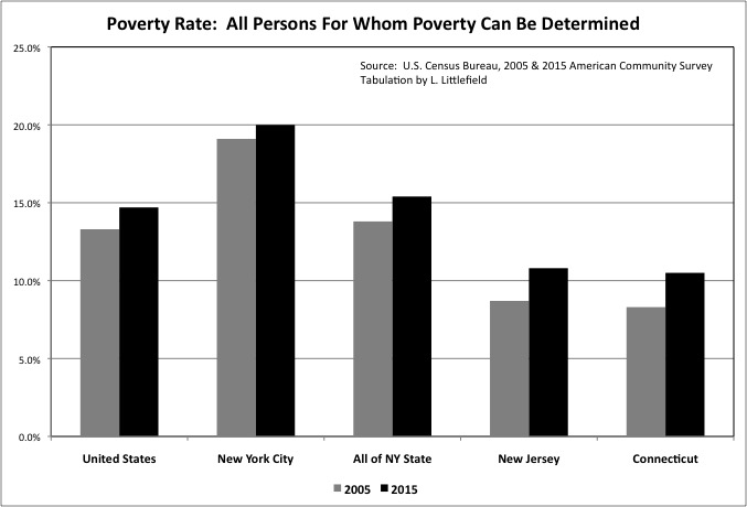
What has been true of median income has also been true of poverty. The limited reporting on the American Community Survey has emphasized the large reduction in U.S. poverty from 2014 to 2015. Given the stunning rise in poverty during the Great Recession it is certainly good that the poverty rate is falling. But look beyond the business cycle, and compare 2015 with 2005, and the real news is that the poverty rate is now higher – in the U.S., New York City, New York State as a whole, New Jersey, Connecticut, and presumably elsewhere.
The U.S. increase was from 13.3% to 14.7%, with an increase from 19.1% to 20.0% for New York City, 13.8% to 15.4% for all of New York State, 8.7% to 10.8% for New Jersey, and 8.3% to 10.5% for Connecticut. New York City is known for its high poverty level. The gap between NYC, the U.S. average and the rest of the state is decreasing, but not for good reasons.
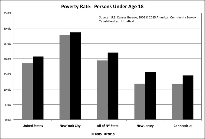
The poverty rate was already high in 2005 – and up over many decades – or American children. The U.S. poverty rate for those under age 18 increased from 18.5% that year to 20.7% in 2015. The increase in New York City was from 27.7% to 28.6%.
Family decline is one reason, and yet another way that younger generations are poorer, on average, than those who came before. Only 7.7% of U.S. married couple households with related children were poor in 2015, compared with 14.3% for New York City, 8.9% for New York State as a whole, 5.5% for New Jersey, and 3.7% for Connecticut. Poverty rates for children in single-parent families are much higher. But even among married couple families with children, the poverty rate was higher in 2015 than it had been in 2005. The increase was from 6.9% to 7.7% for the U.S., and 11.1% to 14.3% for New York City.
The poverty rate, moreover, is based on income and doesn’t include the entire decrease in spending power and the standard of living. Millions of families lost their homes to foreclosure from 2005 to 2015, often because they borrowed against their homes to finance consumer spending or the soaring cost of their children’s college.
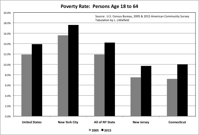
With a rising share of workers in low-paid service occupations. And a rising share of those over age 50 early retired into Supplementary Security Income (SSI). Poverty also increased among those ages 18 to 64 – from 11.9% to 13.9% for the U.S. as a whole, 15.6% to 17.6% for New York City, 11.9% to 14.2% for New York State as a whole, 7.5% to 9.7% for New Jersey and 7.2% to 10.0% for Connecticut. The falling U.S. minimum wage over the long term, adjusted for inflation, is a factor here. State and local government increases in the minimum wage by similarly be a factor in the increase in income from 2014 to 2015.
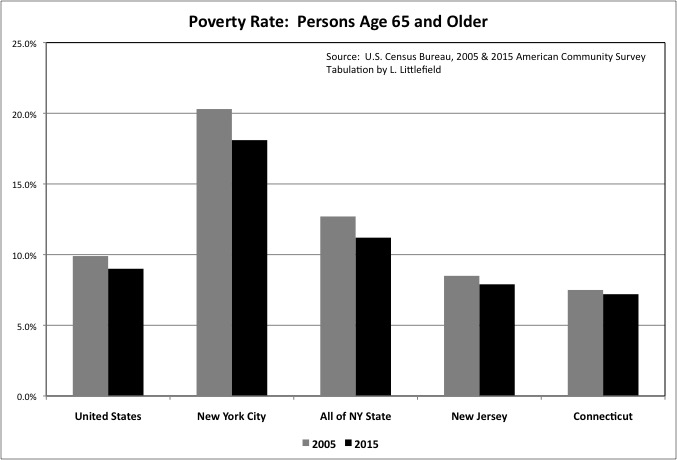
Looking over the business cycle, rather than just 2014 to 2015, the only age group with a falling poverty rate is the age group that had the lowest poverty rate already – those age 65 and over. The poverty rate for this group fell from 9.9% to 9.0% in the United States, 20.3% to 18.1% in NYC, 12.7% to 11.2% in New York State as a whole, 8.5% to 7.9% in New Jersey, and 7.5% to 7.2% in New Jersey.
Social Security is keeping today’s seniors, who at each phase of their lives have been the richest generations in U.S. history, out of poverty. But that doesn’t mean they are as well off as they want to be, expect to be, feel they are entitled to be. And thus their voting patterns. And those who follow will likely be even worse off, on average, when they become old themselves, as they have been throughout their lifecycle.
It is not that Americans are poor. May people who have seen their incomes fall could certainly afford the standard of living the “middle class” enjoyed in the 1950s and 1960s, and was very happy with at the time, and a moderate number of years in retirement relative to the number of years worked. With better health care and information technology and some other improvements. But they have been conditioned to feel impoverished if they do not have more than that, more like what they had during the years of phony, debt-fueled prosperty.
So there you have it. Those who have benefitted from the economic trends over 35 year, those who want to believe or at least pretend that things are fine, can point to low unemployment, low inflation, and a big increase in income and decrease in poverty from 2014 to 2015. But this ignores the fact that adjusted for the business cycle income is falling, poverty is increasing, and more and more Americans are facing the consequences of being paid less and not saving for retirement.
More fundamental measures of social well being than the American Community Survey are flashing red, notably the increase in the death rate and decrease in life expectancy for those born after 1957 or so.
Death is the Ultimate Statistic II: The Most Important News In Ten Years
And now there is another measure of social distress. How could Donald Trump, or all people, be so close to becoming President? Depression and desperation. Every vote for Trump is yet another indicator of just how bad things actually are.