
For decades New York State’s Medicaid program has been the most costly in the nation, with a disproportionate share of the spending New York City and a virtually unique state policy of shifting some of the non-federal share of the cost to local governments. Before the cost of all the retroactive pension increase deals of the past 15 years started to hit home, Medicaid spending was the biggest cause of local government fiscal distress in New York, and a major issue in state politics. And yet through the 1990s and into the mid-2000s Local 1199, the hospital workers’ union, and the Greater New York Hospital Association routinely paid for TV and radio commercials threatening to let our babies die unless we increased their funding even more.
Eventually there was enough of a backlash that our special interest-funded state legislature agreed to make changes. Under pressure from Nassau County executive Tom Suozzi and his “Fix Albany” campaign the legislature adopted a cap on the increase in the local share of Medicaid in 2006. If the legislature wanted to increase spending faster, the state government would have to impose all of the sacrifices required to pay for it.
http://www.osc.state.ny.us/localgov/pubs/research/medicaidupdate.pdf
There were press reports that New York’s Medicaid spending subsequently slowed, and with the federal Affordable Care Act now the leading driver of change in publicly-funded health care, New York’s Medicaid spending has mostly fallen out of the news. So is the problem solved? Let’s look at some data and see what it says.
With some difficulty and some assistance, I managed to get the Medicaid Statistical Information System (MSIS) State Summary Datamart from the Centers for Medicare and Medicaid working on my I-Mac.
I would have looked at the numbers for 1992, 2002 and 2012, as I am with most other data this year (with the 2012 Census of Governments coming out), but early 1990s Medicaid data is not readily available and very few states have finished reporting for 2012. In fact five states – Idaho, Kansas, Maine, Oklahoma and Utah – have not finished reporting for 2011. So instead of comparing New York’s Medicaid program with the U.S. average, I’ll have to compare with the average and totals for the other 45 states plus DC, for both 2001 and 2011.
In addition because New Yorkers expect more from government than those in states with below average Medicaid spending, such as those in the South and West, I also compare New York with the total/average for its adjacent states – New Jersey, Pennsylvania, Vermont, Massachusetts, and Connecticut. So there is no need to argue that it doesn’t really matter much that New York’s Medicaid spending is higher than Mississippi.
I generally try to adjust the level of government spending and taxes in downstate New York for the higher cost of living and average income here, but since the available data is statewide, that is not possible for Medicaid. Downstate New York accounted for 78.5% of New York State Medicaid spending according to data for New York State – in 2007, the latest data by county the state has made available online. However the statewide per capita income level for the adjacent states was $50,057 in 2011, nearly identical to the $51,914 for New York State, so the amount residents of those states can afford to pay for Medicaid without being excessively burdened is also similar.
Average income also tends to correlate with the overall cost of living, and the federal government uses average wage and income data to decide on regional cost of living adjustments for payments under the Medicare program, which it administers and pays for. Both in New York State and in the adjacent states as a whole, per capita income is well above the U.S. average (for available states) of $42,481 in 2011. So how about Medicaid?
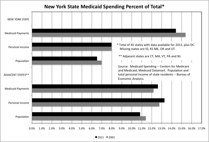
As the first chart shows, New York State accounted for 14.4% of total (of 45 states & DC) U.S. Medicaid spending in 2011, despite accounting for just 6.5% of the total U.S. population and 8.0% of total U.S. personal income. The high spending relative to the income of state taxpayers is particularly burdensome because the federal government only pays for 50 percent of most Medicaid spending in New York, compared with a federal share of up to 75 percent in some other states.
http://aspe.hhs.gov/health/fmap12.shtml
So even if New York’s Medicaid costs were no higher than average, its taxpayers would still face a greater burden due to the lower federal share. Exacerbating this, the local government share of Medicaid imposed by New York State varies from county to county, with a higher local share for the types of services and populations that are concentrated in New York City, and a lower local share for the services and populations that are more prevalent elsewhere in the state. So the local share for New York City is higher than elsewhere in the state. Or at least that was the case a decade ago, when information on the federal, state and local share of Medicaid by county (and for NYC) was routinely made available in the New York State Statistical Yearbook. Once some folks in NYC notices the disparity (I pointed it out) that data ceased to be published.
Most of the adjacent states, due to their higher average incomes, also have a federal Medicaid share of 50 percent, or slightly higher. These states collectively accounted for 12.6% of U.S. Medicaid payments in 2011, greater than their 10.8% of the U.S. population but less than their 13.3% of U.S. personal income. Relative to their personal income, residents of these states were far less burdened by Medicaid than residents of New York.
New York State’s share of total Medicaid spending fell slightly from 15.4% in 2001 to the still high 14.4% in 2011. Its share of total population also fell, as its population growth is slower than the U.S. average. But its share of U.S. personal income stayed about the same, thanks to ongoing pillaging on Wall Street. Thus Medicaid was slightly less burdensome for New York taxpayers in 2011 than it had been in 2001, though still burdensome.
In the adjacent states, also in the slow-growth Northeast, the share of total population also fell from 2001 to 2011 but the share of total personal income increased. Collectively, these states became richer relative to the U.S. average and even relative to New York State. The adjacent states’ share of total Medicaid spending also increased.
New York State may account for a very high share of total Medicaid spending for one of two reasons (or a combination): a high share of Medicaid beneficiaries relative to population, and/or high Medicaid spending per beneficiary.
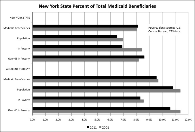
In FY 2011, New York State accounted for 8.1% of total Medicaid beneficiaries, but only 6.5% of total population. But some the difference is explained by New York’s above average poverty – the state accounted for 6.9% of total poor people and 8.6% of total poor people age 65 and over. I discussed the unusual distribution of New York’s poverty population in this post last year.
http://larrylittlefield.wordpress.com/2013/04/08/has-new-york-city-recovered-from-the-1970s-poverty/
Unfortunately, while the federal Medicaid matching share penalizes states with relatively high per capita incomes, such as New York, it does not benefit states with relatively high poverty, also like New York. Generally high per capita income and low poverty go together; New York is an exception.
The adjacent states are more typical. They accounted for 9.6% of total Medicaid beneficiaries in 2011, lower than their 10.8% share of total population. The share of total people in poverty, at 8.3%, and total people age 65 and over in poverty, at 10.6%, was also below their share of total population.
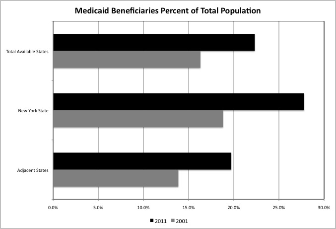
Substantial increases in the percentage of the population that benefits from Medicaid were expected as a result of the Affordable Care Act (aka Obamacare). Because New York already had the most generous eligibility requirements, and programs such as Family Health Plus, one might have expected a much smaller increase in enrollment here than elsewhere, with other previously less generous states catching up. Instead some other states refused to expand Medicaid eligibility despite a 100 percent federal matching share for the new enrollees, and New York’s Medicaid beneficiaries increased substantially as well.
In 2001 Medicaid beneficiaries accounted for 18.8% of total New York State residents, compared with just 3.9% for the adjacent states and 16.3% for the total (once again, 45 states plus DC). In 2011, Medicaid beneficiaries had jumped to 27.8% of the population in New York State, 19.7% in the adjacent states, and 22.3% for the total. That’s an increase of 900 basis points for New York, 590 for the adjacent states, and 600 for the total. Already higher that average, New York’s Medicaid enrollment as a percentage of the population also increased more than average over a decade.
This is not as bad as it seems. A much larger share of population has, de facto, been covered by Medicaid off the books. For a typical bottom half American household both living paycheck to paycheck and uninsured, any significant illness or injury is likely to make them “poor” and “medically needy” under the requirements of the Medicaid program. As my boss once put it, we already have universal health insurance; the problem is that it is Medicaid and it sucks. The only difference is that now more of those same uninsured, financially insecure people are already in the Medicaid system before a health crisis hits – and perhaps more likely to receive preventive care and avoid one.
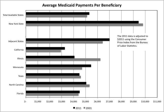
With more beneficiaries who are not sick, elderly or disabled on Medicaid, one would expect spending per beneficiary to decrease. And, after an adjustment for inflation, that is what happened in New York State, where average spending per beneficiary fell from $9,812 in 2001 (in $2011) to $9,445 in 2011. Even with the decrease, however, New York’s average Medicaid spending per beneficiary remained sky-high relative to all available states in total ($5,316), the adjacent states ($7,011), and other major states. Only Alaska is higher, and only DC and North Dakota come close.
So looking at Medicaid spending as a whole one cannot say “the problem is solved” in New York, although in some ways it may have gotten slightly better from 2001 to 2011. Moreover, New York’s taxpayers may not be done paying for those past years. After audits, the federal government is demanding that the state repay $1.5 billion in federal Medicaid payments for excess, inappropriate and/or fraudulent payments at intermediate care developmental centers
and for other types of care.
http://www.timesunion.com/local/article/A-200M-Medicaid-bill-5652767.php
“In areas such as home health care, continuing day treatment, orthodontic and dental coverage, and traumatic brain injury programs, the federal agency’s Office of Inspector General found millions of dollars in improper payments” according to the Albany Times Union. “Many of them were for services that were not provided or were duplicative billings. Auditors found many of the services were covered without properly documenting need.”
That is the minimum identified so far, and for just one year – 2010. And, of course, since the federal share is only 50 percent, that implies this New York’s taxpayers have already paid $1.5 billion per year, minimum, on excess, inappropriate and/or fraudulent payments. And that amount may double if the federal government refuses to match it, and demands it back. I wouldn’t be spending that Wall Street fine money that is being paid to the state yet. Since New York State has already collected taxes on the financial pay and corporate profits associated with those financial misdeeds, the rest of the country may not like the idea of New York profiting again off those misdeeds – and off Medicaid fraud. The Congress may be looking to get all that Wall Street fine money away from New York.
The following spreadsheets have data for every available state, with data on Medicaid spending and beneficiaries and spending by type of service and by age.
Medicaid By Service 2001 and 2011
Medicaid by Age And State 2001 and 2011
I intend to write about this data, but will be going out of town, so the next post may be delayed. The charts are already finished, however, and in the spreadsheets. Those who prefer to make up their own mind rather than just reading my comments on the data are welcome to see them in the interim. Here are some of the highlights.
- After spending about 90 percent more than the U.S. average per beneficiary on inpatient hospital care in 1997, the earliest year I still have on my computer, New York spent 40 percent less than average in 2011. But to make up for it the number of Medicaid beneficiaries receiving care in New York soared to more than 25 percent of the U.S. total, and the hospital industry ended up with as much money as before. This is an ongoing pattern with Medicaid – they get it one way or the other.
- New York’s Medicaid spending on basic care, including spending on physicians, remains relatively low.
- New York’s spending remains relatively low or average for children, but very high (though not as high as it was) on seniors. New York’s spending is very high on nursing home alternatives such as home health care and personal care, but it is high on nursing home care as well.
- New York’s per beneficiary spending on Intermediate Care Facilities for the Mentally Retarded soared from about 120 percent above average in 2001 (more than double) to 211 percent above average in 2011 (more than triple). It is for this category of care that the federal government is demanding $1.3 billion back for one year and $15 billion overall.
- New York’s overall Medicaid spending per beneficiary, however, fell from 91.4% above average in 2001 (when the state’s per capita income was 14.4% above average) to “just” 77.7 percent above average in 2011 (when per capita income was 22.2% above average, thanks to falling incomes elsewhere in the U.S.).
- New York’s overall Medicaid spending per beneficiary, however, fell from 91.4% above average in 2001 (when the state’s per capita income was 14.4% above average) to “just” 77.7 percent above average in 2011 (when per capita income was 22.2% above average, thanks to falling incomes elsewhere in the U.S.).